The launch of a brand new website is an exciting time for any organization. We’ve helped scores of mission-driven clients evolve their brand, add new features, and meet the needs of their users through our full service website redesign process. But, what are you doing to ensure your site design is relevant in between redesigns? A design audit is an easy, low-impact way to extend the life of your website and ensure it’s still making an impact while keeping budget intact.
The Problem
Following the launch of a new website, we often add new features and make updates over months and years — content changes, new elements added to pages, revised navigation structures — the site grows beyond where it was at launch day. That’s both the beauty and the problem with the web. As an ever-evolving landscape, adapting to new user needs and changing business goals is why it’s so important to build flexible, CMS-powered websites. The problem arises when a website ages and changes are made that either introduce new content structures or stretch the existing design to a point beyond its intended purpose.
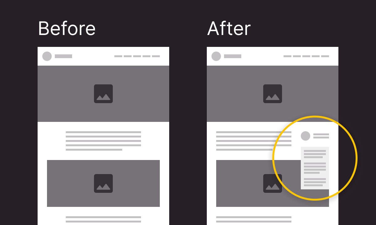
For example, a new website might launch with a simple article page with the text centered on the page. A few months later, it’s determined that articles need a sidebar with author information and related content. The text gets pushed to the left and the sidebar is added. But what about the images within the content? Maybe the design intended for images to extend beyond the column of text, adding more visual interest to the page and providing breaks between sections of content. With a sidebar, those images will probably need to fit within the text column because that extra room is no longer available. This scenario, combined with a multitude of other updates and changes, could introduce usability issues or dilute the effectiveness of the design.
A website evolving over time isn’t the only reason to conduct a design audit. Perhaps you’ve heard input from your users about challenges they’re having using your site. Hearing from actual users is the best way to know if you’re meeting their needs. If that’s not an option, analytics can tell you plenty about the effectiveness of your website. Google Analytics 4 includes a number of ways to review the paths your users are taking when they visit your site. Are those paths the desired route you want users to take? Where are they browsing and getting stuck or leaving your site? Is there a key action you’re hoping users will take and it’s just not happening? (Check out our Senior Strategist, Kelsey Boyd’s post on analyzing analytics for a deeper dive). All of these issues point to problems that arise in the life of a website.
Maybe you are considering a redesign. Writing an RFP for a site redesign can be a daunting task. A design audit could give you just what you need to write an informed, focused RFP that clearly defines the needs of your website from a design perspective.
The Solution
A design audit is an excellent option to get things back on track; shoring up inconsistencies in the design system, establishing plans for adapting the design to new content structures, and making sure the new features and content are working to meet user needs and organizational goals.
A design audit can come in a number of forms. Here are three we’ve used most often:
- A comprehensive review looks holistically at a website, reviewing key pages across the site. It looks at brand consistency, content strategy, navigation patterns, and accessibility issues related to the design itself.
- A process review applies the same approach as a comprehensive review to a specific section or process of a website or application.
- A navigation review is a user-centric audit of navigation structure to identify architectural issues within the navigation as well as design patterns that could improve its usability.
Ultimately, a design audit is a flexible way to identify key changes that will make a huge impact in connecting with your audience, representing your brand, and achieving your goals.
The Process
Discovery
We begin a design audit with a period of discovery where we review existing materials. We’ll look at brand guidelines to gain an understanding of your brand and how it should be represented. Existing goals and KPIs clearly document what you’re trying to accomplish and how you’re measuring success. We’ll want to know as much as we can about your audiences and how they’re using your website. Finally, we’ll take a look at your analytics data to inform any recommendations around navigation and content strategy.
We’ll also want to hear any known pain points you’re hoping to address with the audit. What are you hearing for your users, both internally and externally? Are there parts of your website you know need design help?
Review
With all that in hand, we move on to our review. With a comprehensive review we’ll start with key pages, looking at typography, basic elements like buttons and forms, components that might be used across the site like calls-to-action, and the general page layout and its responsiveness across screen sizes. We’ll also review navigation as it appears in the header of the site, the footer, in-page navigations that are contextual to the content, search features, and of course how each navigation element adapts to different screen sizes. We’ll make sure there are clear calls-to-action, review text density to ensure text is readable, and look at the use of imagery to ensure it’s consistent and aligned with your brand guidelines. Finally, we’ll take a high-level look at the accessibility of the site to identify color contrast issues, improper heading structure, calls-to-action violations, and problems with line length. This accessibility review is focused primarily on the design aspects of the site and isn’t meant to be a full accessibility audit (although we do offer those).
Report
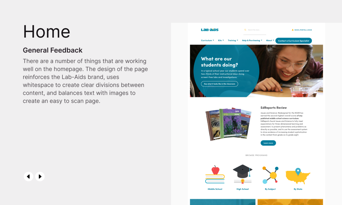
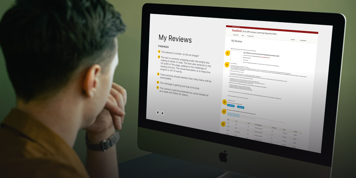
Finally we’ll deliver a thorough report that documents all of our findings. In the report we’ll include screenshots of each page that highlight all of the issues we found. We’ll also document high-level recommendations for each page and whether it’s serving its purpose. We’ll also include a complete list of specific issues found on each page and our expert recommendations for how you can address the issues we’re seeing.
We offer three levels of audits tailored to your site’s needs. A small audit will look at roughly 10 pages, medium: 20, and a large audit will review 40 pages. These sizes let us stay focused on what will provide the most impact to your website’s design. This might be the solution you need to extend the life of your website in between full website redesigns. Want to know how a design audit could level up your site? Get in touch.
Read This Next
- Celebrating Science: A New Logo & Identity for Sanford Lab’s Annual Science Festival
- 6 UX Exercises to Keep Users at the Center of your Website Redesign
- 6 Guidelines for Accessible Website Design
- Design and User Strategy Workshops Lead to Peak Performance for the City of Boulder’s New Site
- 5 Design Ingredients to Make a Great Website


