The web is a valuable tool that allows users to perform seemingly unlimited tasks, including everything from making a donation and completing city- and government-related activities to purchasing products and catching up with friends. Given the extraordinary opportunities the web provides, website accessibility is vital. Without an inclusive website design, UX, and architecture, you’re not only barring equal access to those with disabilities but also blocking your own content from reaching the widest possible audience.
At Aten, testing our client’s sites against accessibility standards is a vital part of our process, and starts in the strategy (read our blog about inclusive user outreach) and design phases of a project. Accessible design typically generates better navigation, more readable text, and better functionality on myriad devices. And who doesn’t want that?
Let’s take a look at six accessibility standards based on the Web Content Accessibility Guidelines (WCAG), a set of international guidelines set forth by the World Wide Web Consortium. The following primer will help you understand what each standard entails, who it serves, and how you might test for it. Plus, it provides examples of these accessibility principles in action.
Your entire site must be responsive
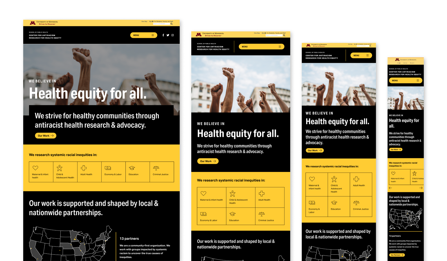
All designs should be completely responsive and adapt to all screens, no matter the browser, device, layout or assistive technology used. Users should never have to zoom in or scroll horizontally to obtain information, unless zoom is their necessary assistive technology. Because some users rely on zoom to navigate through their everyday web experience, never disable zoom or force a user into a certain dimension.
What to keep in mind
- Some users require zoom related assistive technology, like ZoomText, to navigate the web on a daily basis.
- Design must work up to 200% of the original design and still be completely usable.
- Your design should be able to adapt easily without any horizontal scrolling or loss of information.
Who does this impact?
- Some users require devices in one fixed layout like those who have a fixed tablet on their wheelchair and do not have the ability to change orientation or sizing.
- Some users need to upload their own CSS to override basic design elements to properly see and interact with your site on their assistive devices. These changes could include font family, size, colors, line height of text, focus style and so on.
Relevant WCAG Guidelines
- WCAG 1.3.4 Orientation (AA)
- WCAG 1.4.4 Resize Text (AA)
- WCAG 1.4.8 Visual Presentation (AAA)
- WCAG 1.4.10 Reflow (AA)
Color must be used wisely and intentionally
Color is a great tool to convey important information in all design, but many everyday users have some form of color blindness. Designers need to make sure sufficient contrast is applied to all text, text over images, and interactive states, such as hover, active, and focus states as well. Not only that, but color cannot be the only means of conveying important information to a user. If someone is colorblind, or using a screen reader, then you need to make sure that information is conveyed to a user in ways other than visual means.
What to keep in mind
- Contrast applies to anything that conveys important information.
- Colors found in your branding palette must have sufficient contrast of at least:
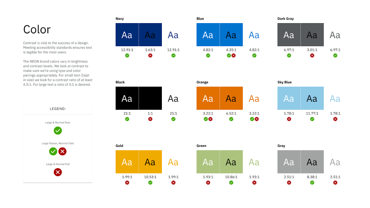
- 4.5:1 ration for normal text, images with text, or text over images
- 3:1 ratio for large text and all non-text elements that convey important information
- Note: WCAG states that large text is considered about 19px and bold and larger or about 24px or larger
- Color is not used as the only visual means of conveying information. Consider using underlines for links, incorporating icons with the color red to indicate an error on a form, or including data along with color to convey information in infographics and charts.
- Tip to consider: If you were to design a web page in just black and white, can you still understand all content and functionality found on the page?
Who does this impact?
- One in 12 men are color blind, which is a good amount of your site users!
- If a visual user cannot see something, then they cannot interact with or get information from it.
Relevant WCAG Guidelines
- 1.3.3 Sensory Characteristics (A)
- 1.4.1 Use of Color (A)
- 1.4.3 Contrast (minimum) (AA)
- 1.4.6 Contrast (enhanced) (AAA)
- 1.4.11 Non Text Contrast (AA)
Interactive elements should be limited, simple, and easy to use
Do not create something overly complicated or with too many moving parts to ensure all interactive elements are intuitive and appear interactive across all technologies including mouse, keyboard, screen reader, and touch. This is important especially since so many designs are now interacted with on touch devices.
What to keep in mind
- Users should not be required to hover to get critical information.
- Ensure autoplay videos are accessible.
- WCAG 2.2 is updating this criterion to include a AA and a AAA guideline
- The current AAA target size guideline will stay the same (44px x 44px)
- The updated AA guideline will be 24x24px
Who does this impact?
- It is frustrating for a user to select the wrong button on a touch screen because something is too small. For example, users don’t want to select “delete” when they mean to select “submit”.
- Those with physical tics, or even those who lack physical mobility of the limbs, need to be able to interact easily with any button whether or not they are using a mouse, their finger, touch stick, etc.
Relevant WCAG Guidelines
- 2.5.5 Target Size (AAA)
- 1.4.13 Content on Hover of Focus (AA)
- 1.4.2 Audio Control (A)
- 1.4.7 Low of No Background Audio (AAA)
- 2.1 Keyboard Accessible (2.1.1 --> 2.1.4)
- And many more!
Content must be highly readable
Content must be readable for both visual and non-visual users and allow users to quickly scan content and obtain necessary information. To do this, make sure all content is created semantically while also including best practices from design.
What to keep in mind
- Stick with left aligned text for most content, avoid centered text for more than 3 lines of text, and always avoid justified and right aligned text if possible.
- Line length should not exceed 80 characters per line and should always be a minimum of 40 characters per line.
- Font size must not be smaller than 12px.
- Line height must be at least 1.5 times the font size and the spacing following paragraphs must be at least 1.5 times the line height.
- Use descriptive headings to break up content.
- Avoid vague links like “learn more” or “click here.”
- Underlines should be reserved for links only.
- Avoid decorative and script font choices for body text.
- Create a clear hierarchy and system throughout your design.
Relevant WCAG Guidelines
- 1.4.10 Reflow (AA)
- 1.4.12 Text Spacing (AA)
- 4.8 Visual Presentation (AAA)
All forms should include a submit button
Help users avoid errors and unexpected interactions by including a submit button that is available via mouse, keyboard, or touch on all forms throughout your design. Forms should not change upon text input, or input selection. This is relevant to anything that requires a text input, radio buttons, checkboxes, select drop downs, etc.
What to keep in mind
- Screen reader users must be alerted if content has changed.
- Just because the page changed visually, does that mean it also changed programmatically? Will it alert the user of changes?
- Users may accidentally choose the wrong option in a dropdown.
- If this changes context, or submits, then this could be problematic for users, including visual, screen reader, and keyboard users.
- Interacting with a component cannot automatically cause a change of context.
- One element should only perform one action at a time.
- Select inputs should only function as a select, not a select and submit.
Relevant WCAG Guidelines
- 2.2.2 Pause Stop Hide (A)
- 3.2.1 On Focus (A)
- 3.2.2 On Input (A)
- 3.3.6 Error Prevention (All) (AAA)
Text should accompany all icons
Icons shouldn’t be used as the only means of conveying or labeling important information in order to avoid confusion and confirm complete understanding for all users.
What to keep in mind
- Users should not be forced to “learn” your icons.
- Icons can have multiple meanings to many users.
- The meaning of one icon can vary depending on the content of the site, or even depending on culture or geographic location.
- Icons need to make sense to assistive technology users as well.
- Text with icons should be made “visible” to screen reader users.
- Not all screen reader users are without sight. Some have cognitive issues where hearing and reading at the same time helps to comprehend, and some are low vision or completely non-sighted. So users should be able to see the text and hear the same text out loud.
- Visual meaning and programmatic meaning should match exactly.
- Some users rely on voice recognition to interact with a site. For example, If a user announces "Select, Contact, Button" for a link with an envelope icon, is that envelope icon coded as "contact" or is it "email" or "envelope" etc. If the user cannot say the programmatic language, they may not be able to interact with the element.
- What is visible to the user should match the code exactly.
- Icons should be used as a way to enhance text.
- Icons can be used to break up lots of text with some visual enhancements.
- Some users may understand the icon, some need the text, so having both creates a quick experience for everyone.
Relevant WCAG guidelines include:
If you are interested in learning more, take a look at the recording of a webinar, 6 Design Accessibility Issues and How to Avoid Them that I hosted with Ken Woodworth, Aten’s VP of Design & Partner.

