When it comes to websites, if you build it, they might come. But unless you build it—or redesign it—with the user experience (UX) top of mind, they likely won’t stay, return, nor enjoy their visit.
Effective UX not only ensures that your website redesign fulfills users’ needs but also creates positive experiences that then foster loyalty to and affinity for the brand. So if you build it with UX design baked in, they’ll come, accomplish their tasks, and happily revisit your site again and again—and you’ll meet your organization’s objectives in the process.
So how do you create effective UX design?
It’s all about establishing a crystal-clear understanding of the mission, vision, and business goals of your organization and the needs of your users. To help you do just that, here’s a primer that provides insight into Aten’s UX strategy along with six workshops that’ll help you establish a firm foundation for your website redesign.
What’s Involved in UX Design?
First, let’s level set on some UX design staples. To redesign a user-friendly experience, you must identify, scrutinize, and clarify three things: your organizational goals, user needs, and technical limitations.
- Organizational Goals: Before you can deliver an effective user experience, you need a firm grasp of who you are as an organization and how this relates to your website. Stakeholders must align on your mission, vision, and goals/objectives for the project.
- User Needs: Understanding user needs involves developing a thorough knowledge of—and empathy for—your users. This means figuring out exactly what users want to do on your website and identifying their unique challenges, attributes, personalities, demographics, etc. To do so, you must actually interact with your users. And we’re not talking about sending mass impersonal emails and wading through hundreds of responses. Personal feedback from a few people who represent your audience segments is far more effective. Thus, a core part of user-centered design is identifying users that will provide feedback and developing give-and-take relationships with them.
- Technical Limitations: While identifying organizational and user needs comprise the bulk of UX design activities, technical factors—e.g., the delivery medium, content management system, hosting platform, third-party integrations, etc.—will also impact your outcomes. Keep these factors—and any related technical benefits and limitations—in mind throughout the process.
6 Activities for a Solid UX Foundation
You must ask a host of questions that get to the heart of your users’ needs, wants, and motivations. To illustrate the importance of these questions, let me digress.
My parents owned a successful garden center in a small town in upstate New York. In addition to providing quality plants and awesome service, what set their business apart was their ability to ask a plethora of the right questions.
They didn’t just say, “What can I help you find?” They posed queries such as, “What kind of plant do you need?” “Where are you going to put it?” “How much sun does that area get?” “How much time do you have to water it?” and “Do you enjoy gardening, or do you like to plant it and forget it?”
In effect, my parents homed in on clients’ needs, challenges, personal preferences, lifestyles, etc. The answers they received guided their plant recommendations and ultimately created an amazing experience for their customers.
To create an effective UX for your website visitors, you need to do the same.
Here are six workshops and activities that we regularly use to pose the ever-critical questions that form the basis of effective UX design. Whether carried out in person (preferred) or online (still effective), the workshops help us craft a firm foundation to drive the UX design strategy.
1. Goals & KPIs
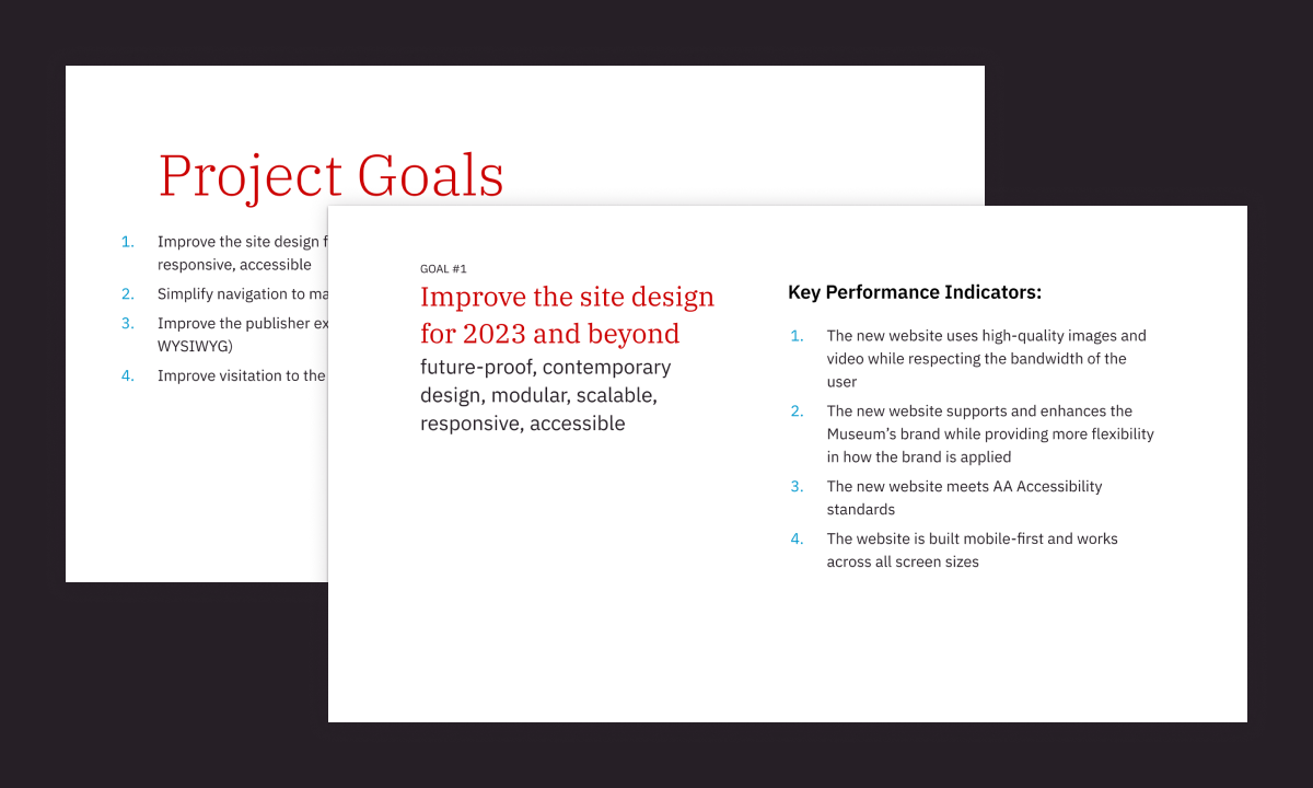
To drive success, every project must have clear goals and key performance indicators (KPIs). But particularly for UX design, goals provide an objective anchor to guide the work and prevent subjective decisions.
Who: At the start of the project, assemble a group of stakeholders from the organization. These should be people with a firm understanding of the goals of both the organization and the project itself, and the group should be broad enough to ensure that no facets of the organization are left out of the process. If you exclude representatives from key company segments, chances are their voices and goals will be heard later in the process, after you’ve already developed your strategy.
How: Once this group is assembled, the process is simple. Hold a collaborative discussion (in person or online) to identify goals, align on them, and develop KPIs for each. Here are some areas to cover.
- Why does the website exist? What is its purpose?
- What are the goals of this project? What is the group trying to accomplish?
- How will each goal be measured using KPIs to determine if we’ve been successful?
2. Brand Personality, aka This But Not That
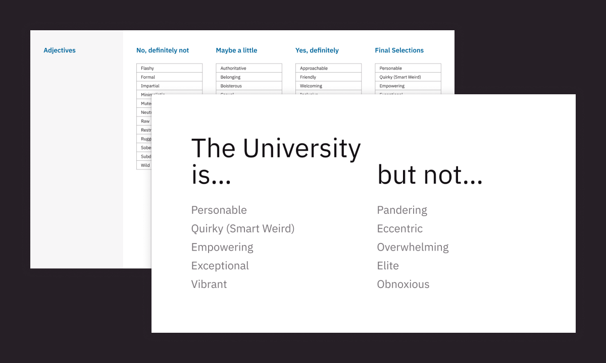
This workshop is geared at pinpointing brand characteristics and users’ perception of the brand. One approach we often use to define Brand Personality is a This But Not That activity, as we’re trying to identify key characteristics that define the brand along with the point at which that characteristic goes too far. In other words, we want this, but we don’t want to push too far so that it becomes that.
By developing across-the-board alignment early, you eliminate subjective feedback and foster decision-making down the road. Keep in mind, even if stakeholders have a good understanding of the brand, this workshop ensures that everyone remains aligned on brand characteristics and how these attributes apply to the website.
Who: Certainly, you want to secure insight from stakeholders within your organization. However, it may be equally as important to gather input from users. Internal reps offer insight on the desired brand and website personality. Users offer feedback on how it’s actually being perceived.
How: Gather internal and external stakeholders (perhaps in two different groups) and perform the following steps collaboratively. (You can do this on paper, online, via dot voting techniques, and more.)
- Identify 30 to 40 potential brand attributes.
- Sort these attributes into groups of “no,” “maybe,” and “definitely” in terms of suitability to the brand.
- Choose attributes from the “definitely” list that best describe the organization and that everyone can agree on.
- Determine where each “definitely” term goes too far. (You’re not identifying the opposite of each term. You’re identifying a characteristic like this one but that is somehow over the top and not what you want to emulate.)
At the end of the exercise, you should have a list of descriptors that look something like this:
This (But Not) That
- Personable but not Pandering
- Quirky but not Eccentric
- Empowering but not Overwhelming
- Exceptional but not Elite
3. Audiences and Personas
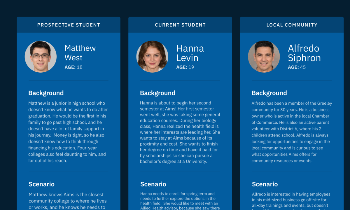
With this activity, you want to first identify the broad target-audience groups the website serves. Then, prioritize these groups and craft personas (i.e., fictional characters born of qualitative research) to represent each one. This helps the project team align on the target audiences and develop empathy for each based on the personas.
Keep in mind, you may already have personas developed for your organization. But it’s important to perform this step to ensure these audiences and personas apply to your website visitors specifically.
Who: You may think you have a good understanding of your audience groups, but someone from another department may have an entirely different perception based on their interactions. So it’s important to have reps from all factors of the organization participate in this workshop.
How: Work collaboratively to first define your audiences and then develop personas for each.
Audiences
- Define key audience groups.
- Write a one- to two-sentence description for each.
- Document how each group learns about your site.
- Identify the two to three critical tasks this group completes on the website.
Personas
- Create a unique persona to represent each audience group.
- Use info from user research (e.g. surveys, stakeholder surveys, focus groups, interviews) and add things like passions, goals, tasks, challenges, and demographic info to each persona
4. Task Analysis
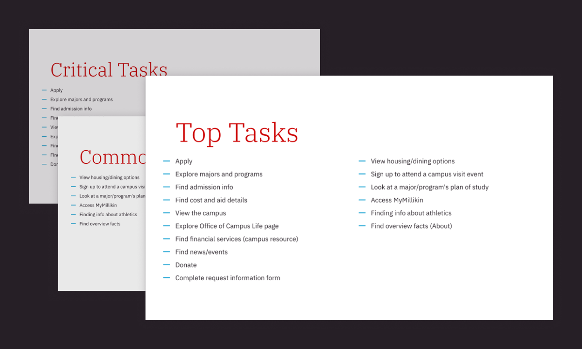
A task analysis helps identify and prioritize the top 10 to 15 user-centered tasks that should be accomplished on your website. As another alignment exercise, it helps the group understand the tasks that are important to the organization as well as the users, which can aid in decision-making during the redesign process.
Who: Ideally, both internal teams and users should be involved in this activity. If you don’t want to have users actually join in the live conversations, then poll users—or various internal personnel who regularly interact with different audience types—to ask about the most important tasks they want to complete on your website.
How: Collaborate and complete the following:
- Identify the critical tasks the organization wants users to complete.
- Make a list of the common tasks most users accomplish on your site. (Use the 80/20 rule to guide the group. If 80 percent of users perform the task, it’s common.)
- Combine the critical tasks and common tasks into a single list, and remove the duplicates.
- Prioritize the tasks with the organization and users in mind, elevating the tasks that have the most impact across audience groups.
5. Journey Mapping
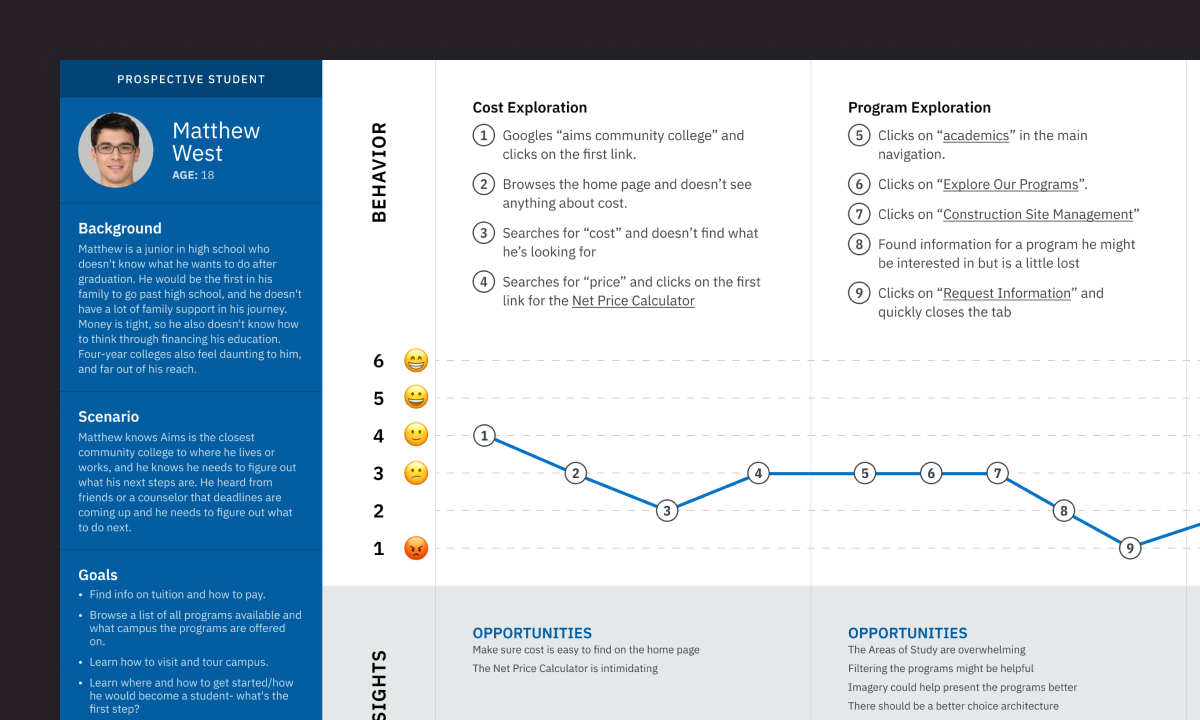
Journey mapping visualizes the process users go through to complete their goals. Unless you purposefully walk through a user experience, it’s hard to tell what’s actually happening—and not happening—on your website. Plus, this exercise can generate empathy for your users and help identify opportunities and fix journey-related issues.
Who: Internal teams typically have a decent idea of the issues users face if they simply take the time to walk through a user experience. However, it doesn’t hurt to involve actual users at some point in this process.
How: Our journey mapping experience typically involves the following steps:
- Choose a persona to focus on.
- Create a scenario based on that persona’s goals.
- Identify tasks that persona needs to complete to achieve the goal.
- Walk through the scenario noting each step necessary on your website.
- Identify opportunities for improvements.
- Map the persona’s mood through the exercise.
- Choose another persona and repeat.
Plotting the steps it takes for users to accomplish their goals can shed light on usability issues. However, by identifying how a user would likely feel at each point in the process (e.g., excited about new opportunities, frustrated with the forms, etc.) you can better understand why people might abandon your site at various points and how you can improve the UX.
6. Card Sorting
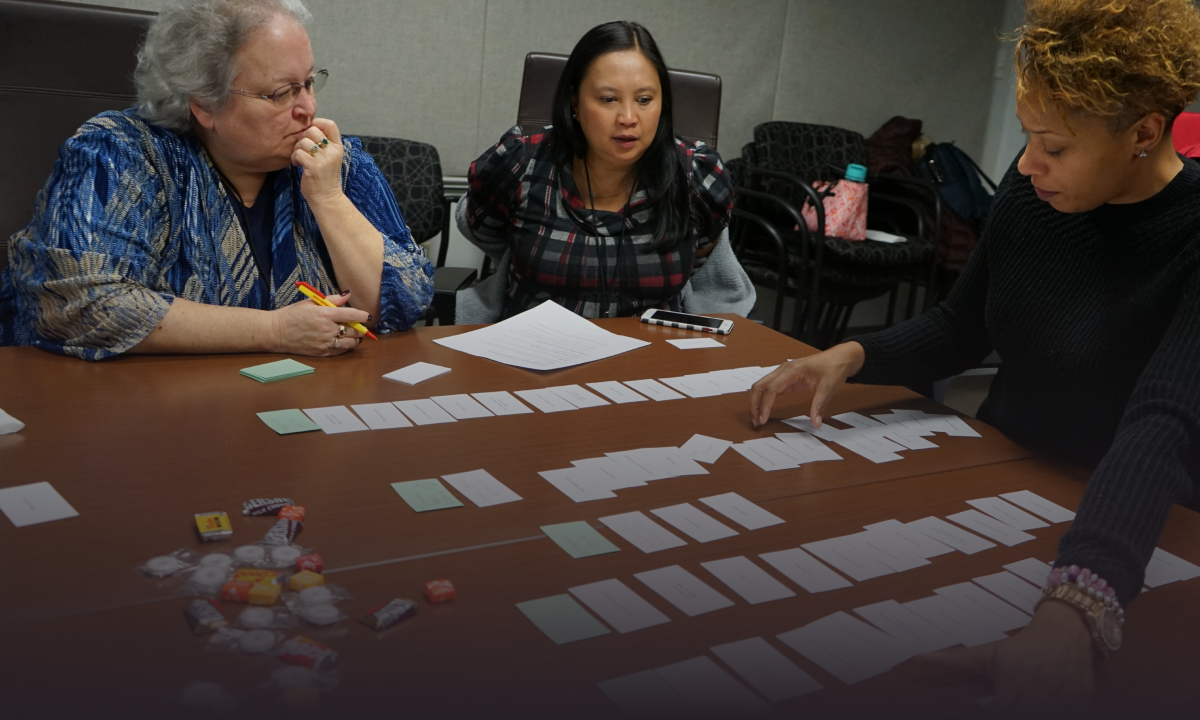
Card sorting is a UX method in which users organize website topics into groups and then categorize pieces of content. It’s typically helpful in generating and organizing ideas regarding the type of content you want on the site, and it can help inform information architecture. When we use card sorting, we’re hoping to learn how a user thinks about organizing content before we build the sitemap.
Who: Ideally, users representing each audience group should be involved in this activity. And while card sorting can be done by internal teams with a good understanding of the individual personas, you’ll get the best information from real users.
How: When running a card sort, there are two approaches you can use: open and closed. An open card sort lets users group things on their own and then create labels for the groups. A closed card sort provides labels in advance and asks users to group things into those already established groups. Either way, the basic process works like this:
- Define the topics, which are the pages within your sitemap. Keep this list to 60 or fewer to make the task manageable.
- Gather participants, enlisting real users when possible.
- Instruct each user to sort the topics into groups and then label the groups.
- Analyze results. How are your users grouping information? What kinds of labels did they use? Did their groups align with your assumptions or plans? If not, how can you create alignment?
Is your website accomplishing both your users’ and your organization's goals? Whether you’re ready for a full site redesign or want to audit the user strategy of your site, Aten can help. Let’s talk.

