What is the Sanford Underground Research Facility?
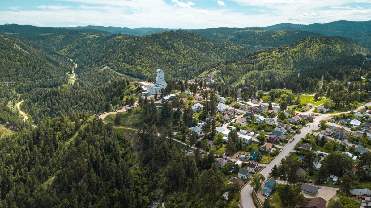
In 1965, scientist Raymond Davis, Jr. began building an experiment deep in the enormous Homestake mine in Lead, South Dakota to study subatomic particles known as neutrinos. The subsequent experiments and discoveries about the nature of neutrinos won Davis a Nobel Prize in Physics in 2002. In 2007 the Homestake mine became a part of the newly-founded Sanford Underground Research Facility (SURF). Today SURF hosts world-class underground experiments and research in the fields of neutrinos, nuclear astrophysics, life sciences, geology, engineering, and more. With a mission to inspire learning across generations, SURF uses its cutting edge research to connect educators, students, tourists, locals and more to the discoveries possible in STEM. Part of this outreach includes an annual free science festival called Neutrino Day.
What is Neutrino Day?
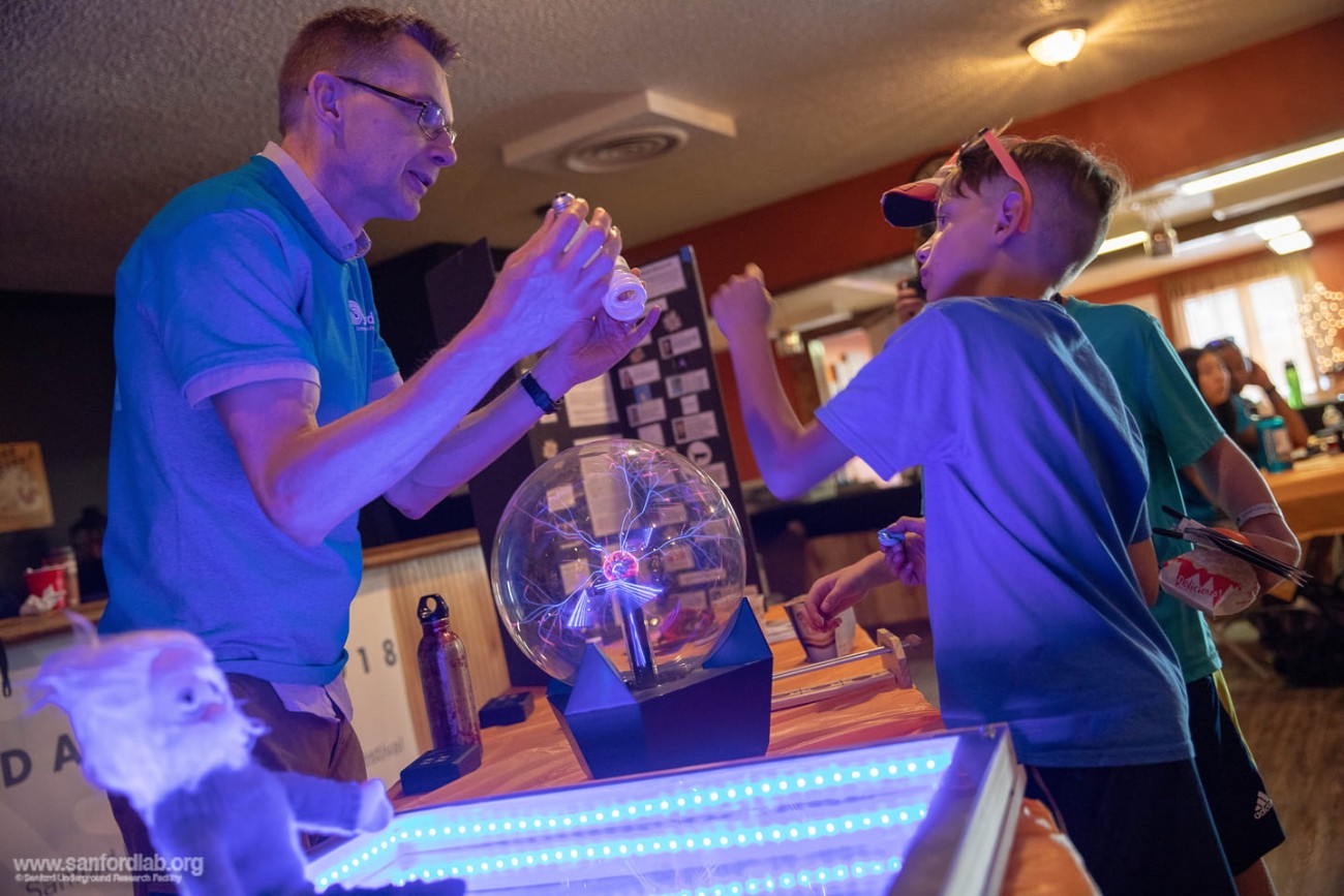
Since 2009 Neutrino Day has taken place across SURF’s facilities and public sites in downtown Lead, South Dakota. SURF hosts a variety of events including family-friendly science demonstrations, tours, hands-on activities, and more. Neutrino Day also hosts annual speakers, including leading scientists at SURF and well-known individuals in the science community.
The Project
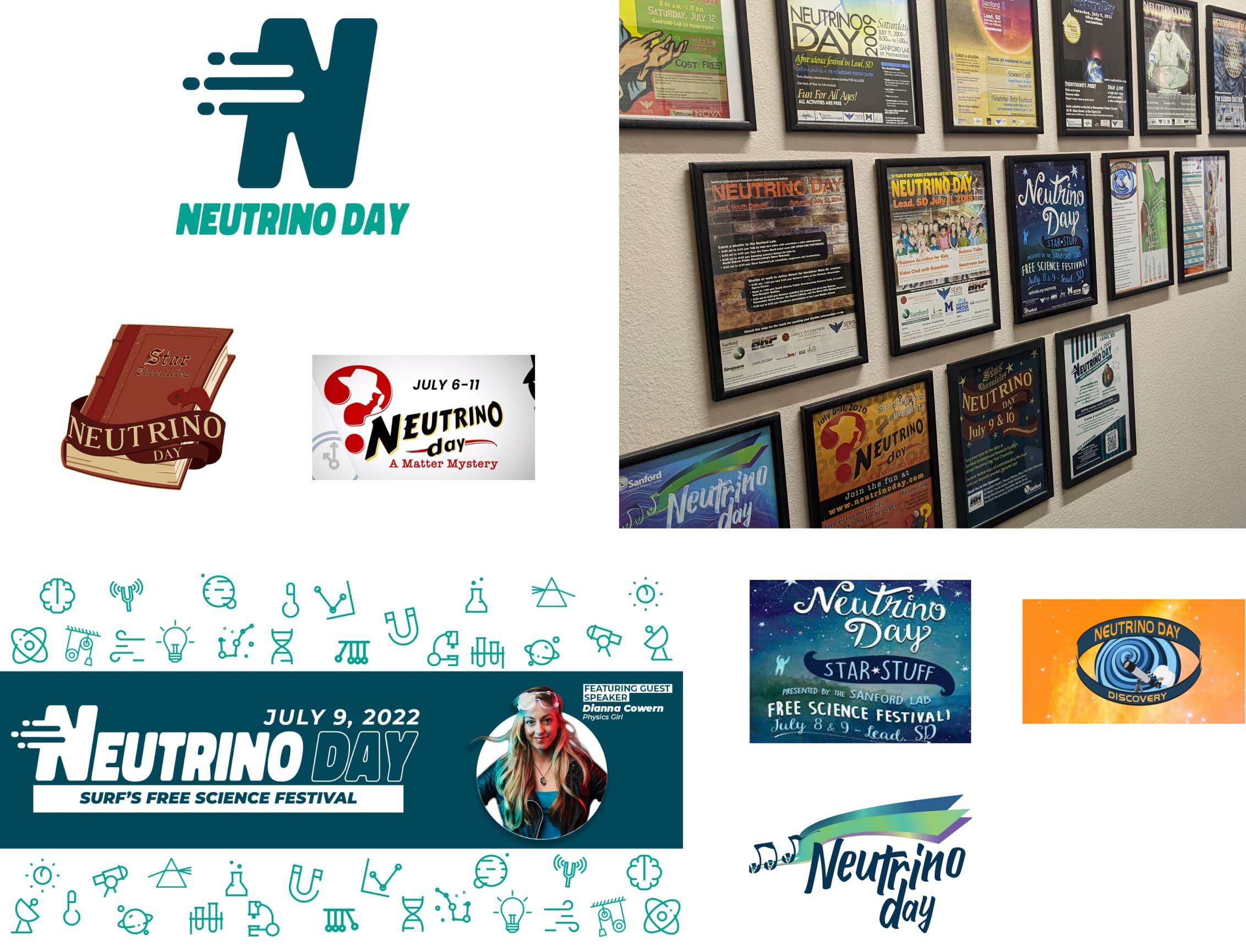
SURF approached Aten for a major website redesign for its main website. Other projects within this engagement included a redesign of the touchscreen kiosks at SURF’s Sanford Lab Homestake visitor center and a rebranding and new website for Neutrino Day. SURF’s longest-running premier fundraising event had taken on a new theme year after year. In this engagement SURF wanted to create a permanent identity for Neutrino Day and move away from ongoing themes.
Defining the Brand: Discovery & Design Workshops
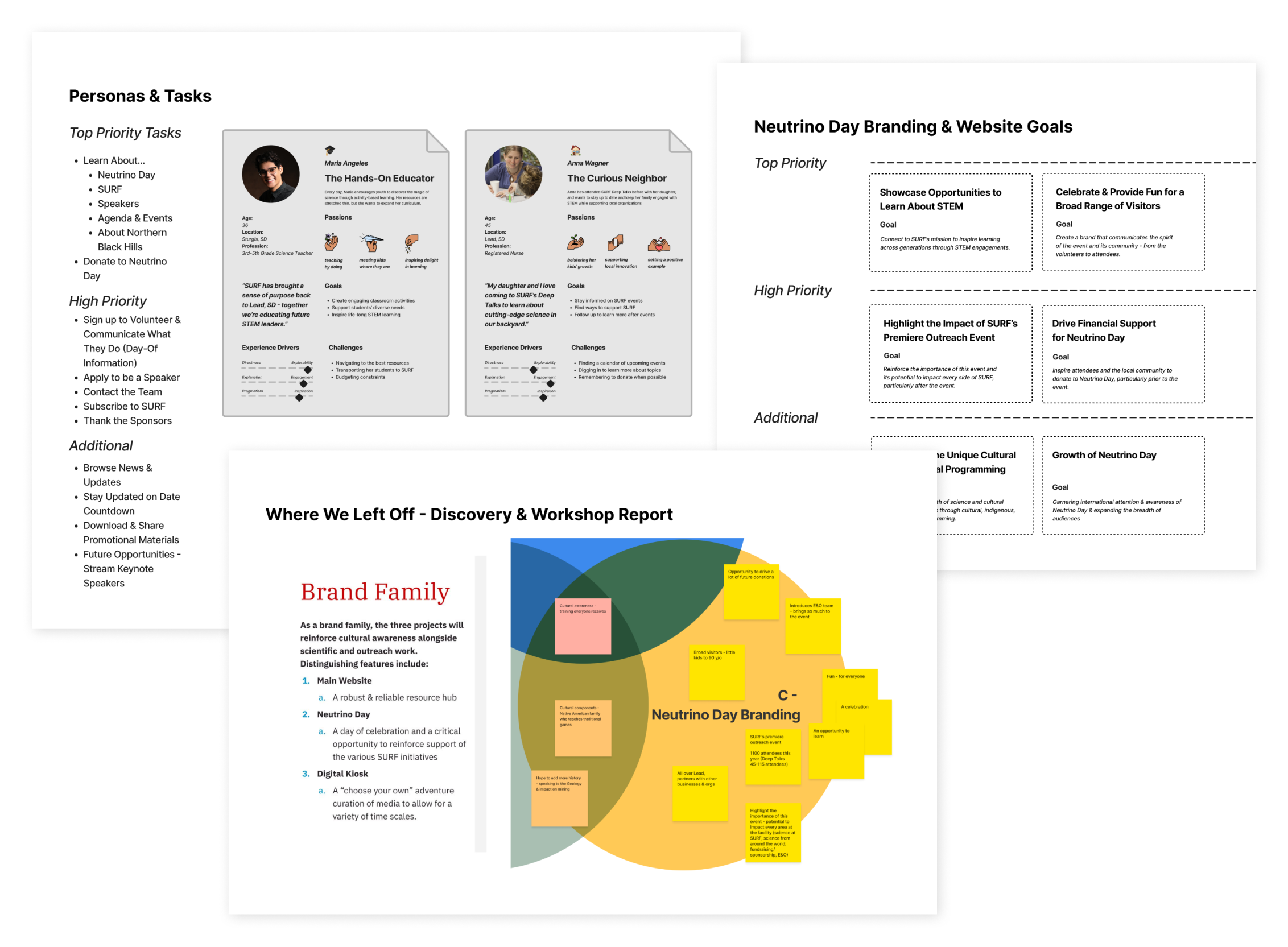
Digital Strategist Kelsey Boyd facilitated conversations with the Neutrino Day team to gather context, information, goals and aspirations through a series of discovery discussions and workshops. We found key differentiators that separated or unified Neutrino Day’s brand from SURF’s umbrella brand, developed audience personas, prioritized website goals and key tasks, and conducted a logo comparative analysis. During information architecture we developed a content strategy, including a sitemap and series of wireframes, to plan out the website and how it aligned with the high level goals.
Our key takeaways included:
- Audiences included families, children, science enthusiasts, educators, international and local scientists, volunteers, and Neutrino Day staff.
- The brand had to balance being perceived as a celebratory family-friendly event and as a host for the science community to share work among peers.
- The brand had to grow with SURF’s goals to expand the reach and variety of the event to include virtual talks, further incorporation of the arts and involvement from the local community.
Developing the Logo
Our first step was to create 4–6 unique options for a logo that each offered a compelling story, color palette and typography treatment. The chosen logo had to be visually appealing in a black-and-white setting, on dark or light backgrounds, in horizontal and logo orientations, etc. We explored a variety of themes and stories that the logo could evoke, such as:
- The three “flavors” of neutrinos, a key point of exploration in the field of neutrinos
- Dynamically explosive speed to communicate the particle physics concept
- Communities coming together
- Stylized letter “N” representing the word “Neutrino”
- The Greek letter nu, the symbol for neutrino, which looks like a slanted V when written.
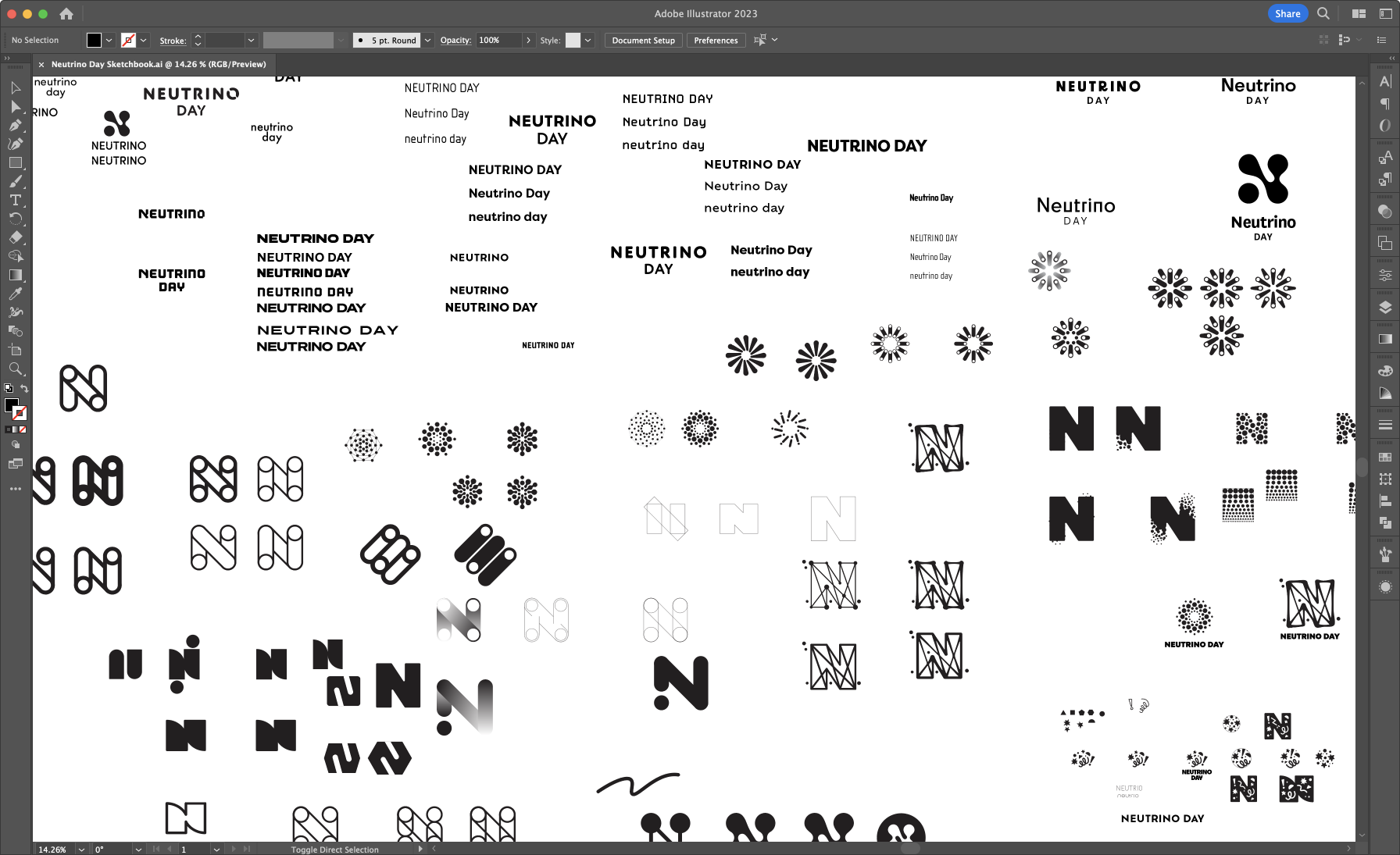
We explored dozens of ideas on sketch paper and in black-and-white versions in Adobe Illustrator:
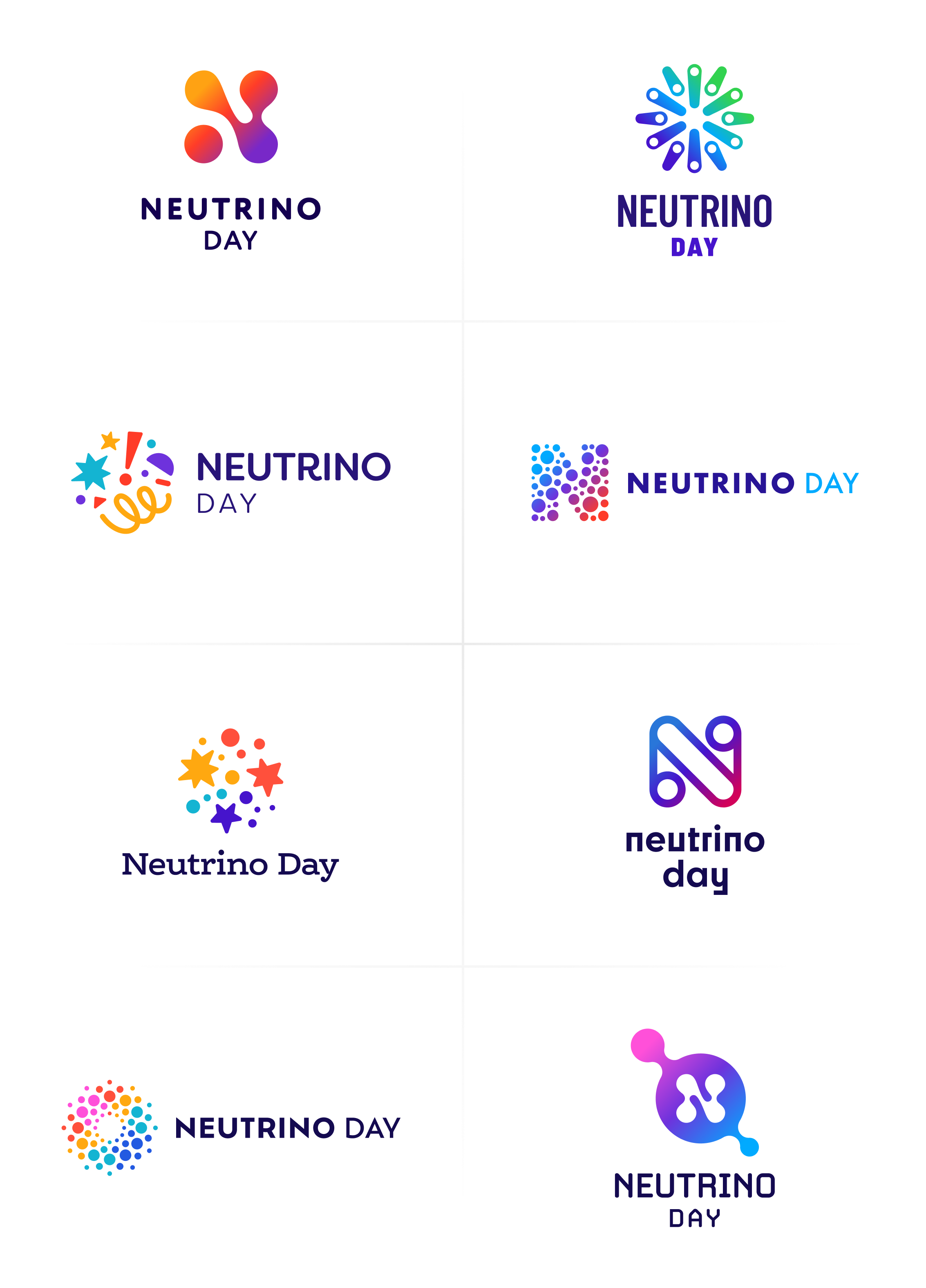
For the first presentation we selected 8 unique options:
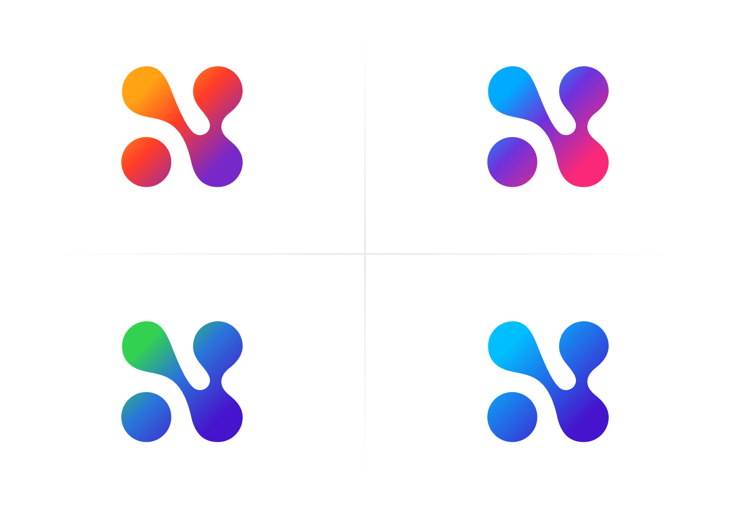
The first option was selected. After a few additional explorations around color and typography treatment, the final logo was selected.
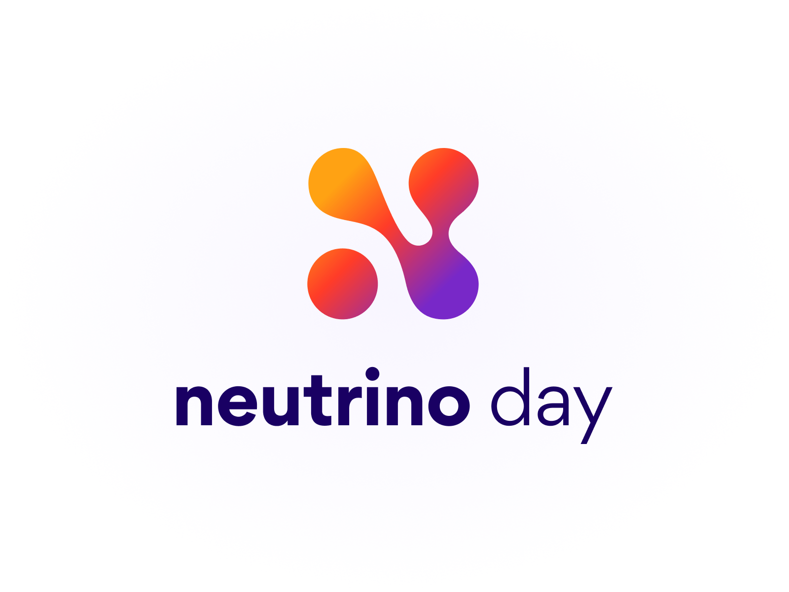
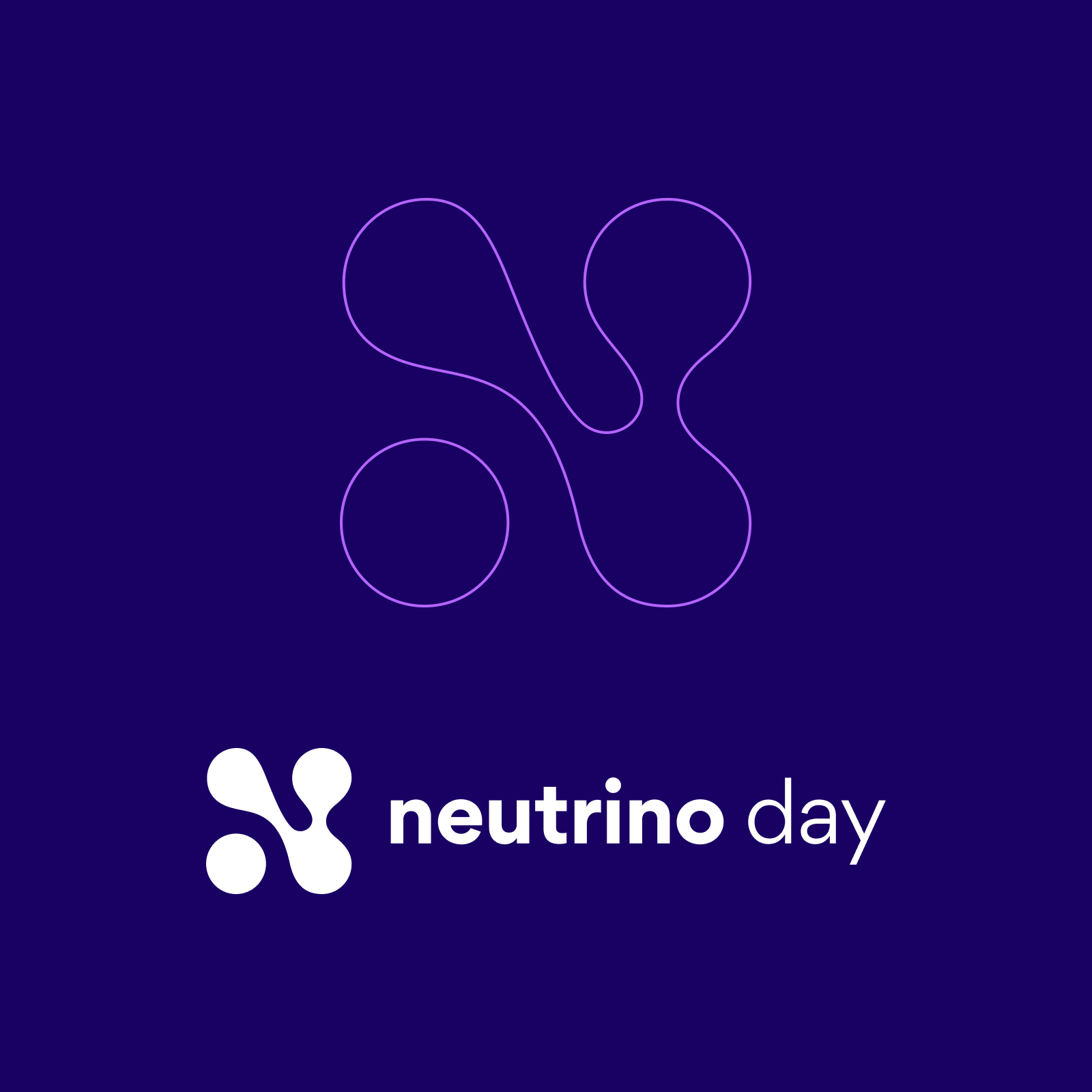
The mark takes inspiration from the spirit of Neutrino Day. The friendly, bright gradient emulates the many walks of life celebrating science at SURF; as well as the speed and three flavors of neutrinos. Hidden within the logo is the lowercase Greek letter nu, the neutrino symbol.
The team at SURF was thrilled with the new identity and launched the brand on social media with an animation created on their team:
With the Neutrino Day brand we were looking to elevate the recognition of the event beyond South Dakota. We believe our free science festival has the potential to be known nationally and internationally. We needed a world-class logo for a world class event and we couldn’t be more happy with the Neutrino Day logo. Since the reveal to the public, it’s been an absolute treat to hear public reactions on how the brand has all the right nods to the neutrino particle itself. And for those who are curious as to what those features are, I hope you’ll do a little discovery about the neutrino. That is after all, what Neutrino Day is all about, curiosity, discovery and a whole lot of fun.
— Matt Kapust. Creative Services Supervisor, SURF
The New Neutrino Day Website
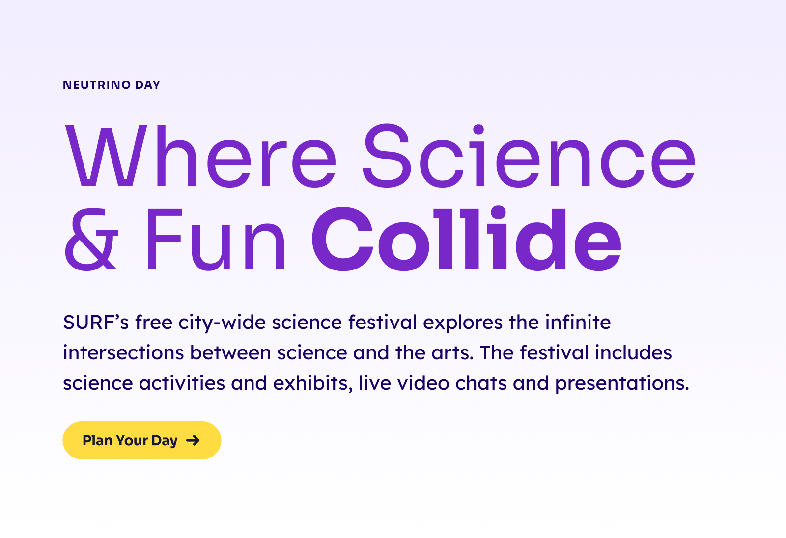
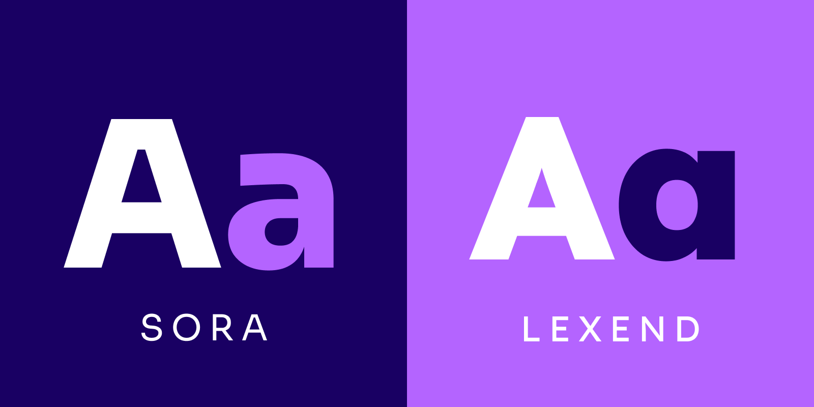
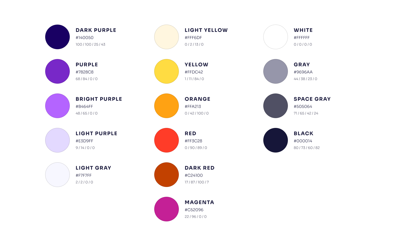
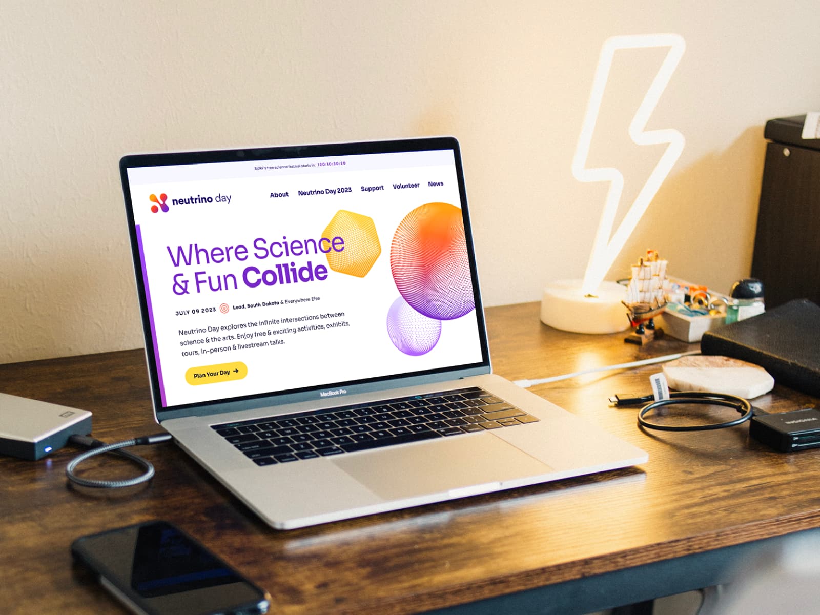
With the logo in place, we designed and developed the new digital home for Neutrino Day, further expanding its brand into a thriving identity. At the end of the website design process we documented the logo, typography, color palette, graphic styles and more in a comprehensive identity guide.

