Essential Elements of Effective Website Design to Consider for your Next Site Redesign
Designing a website is often both exciting and daunting at the same time. Unless your job regularly involves website design, you’re likely not well versed on best practices.
So let’s take a quick look at five key elements that form the backbone of effective and compelling website design, along with a few examples and implementation tips for each. Armed with a basic understanding of these tenets, your next site design project should help you to engage with your audience and meet your marketing goals.
1. Typography: Fonts, Sizes, and Spacing
In its simplest forms, typography refers to how text appears on the page. So in terms of website design, we’re talking about text arrangement, letter spacing, line lengths, font selection/size, and more.
These elements directly affect readability. For example, readability suffers due to insufficient text size, lack of contrast, improper positioning and spacing, etc. Typography can also help assign importance to various content, thereby creating visual organization and hierarchy throughout the page. Additionally, it can support (or detract from) your aesthetics, foster a consistent look and feel for the brand, and lead visitors from one point to another on your site.
Bottom line: Typography can function as a critical “look here, go there” directive for your website.
Typography Examples
Make a Statement
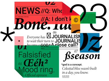
U.K. creative agency Likely Story makes a bold statement by using two to three font families throughout its portfolio. Paired with animations and effects, the typography adds wit and whimsy.
Clean & Practical
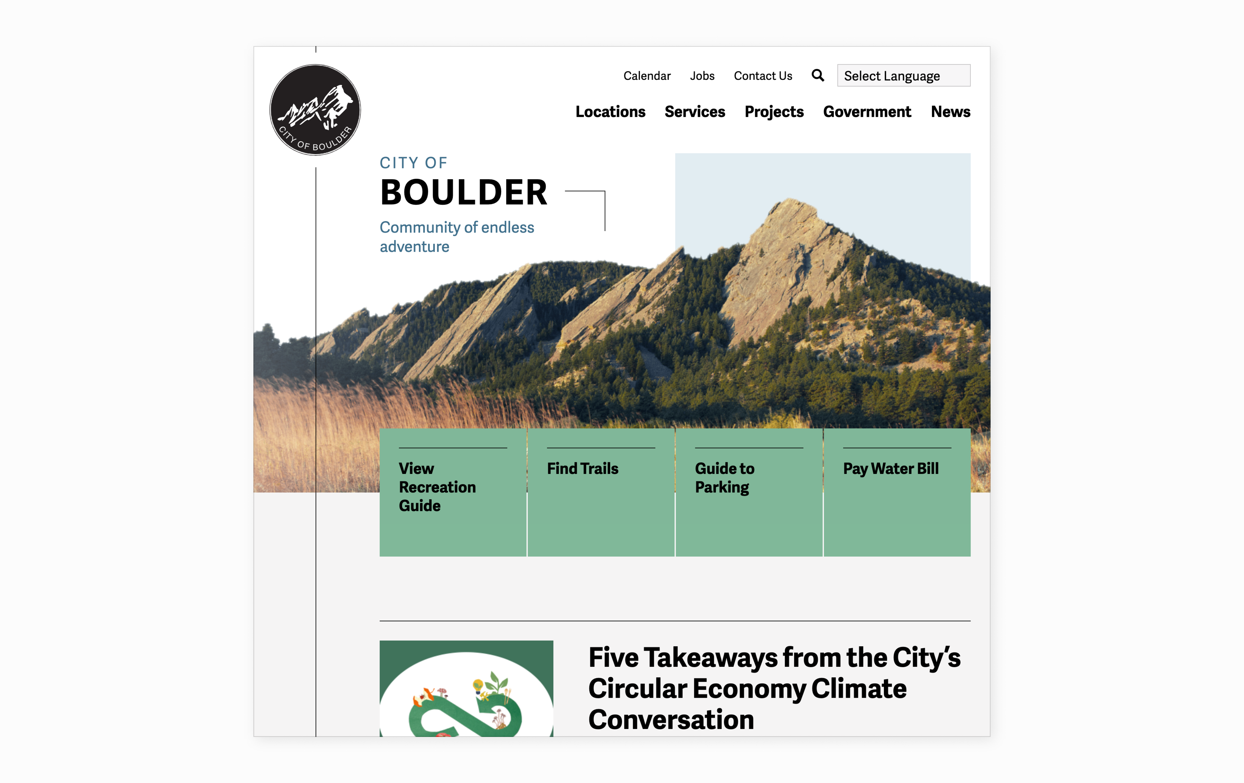
Designed by Aten, the City of Boulder website employs a clean and practical approach via the use of a single font family (Adelle Sans). (Read more about Aten’s work with the City of Boulder.)
Typography Tips
- Employ a consistent system of heading treatments to separate content.
- Enlist clear body fonts to help users skim and read menus, sections, and pages.
- Select typography that’s authentic to your brand and purpose, and steer clear of outdated, trendy, and/or pedestrian options.
2. Color: Hues You Can Use
Colors can help convey meaning, establish a theme, support brand values, and more. Plus, color has psychological effects, as different hues can not only impact moods and emotions but also subconsciously influence people to feel or act in various ways. That’s why you’ll probably never find a yoga studio painted fire engine red or an race car bathed in a soothing sage green.
Color Examples
Complex & Vibrant
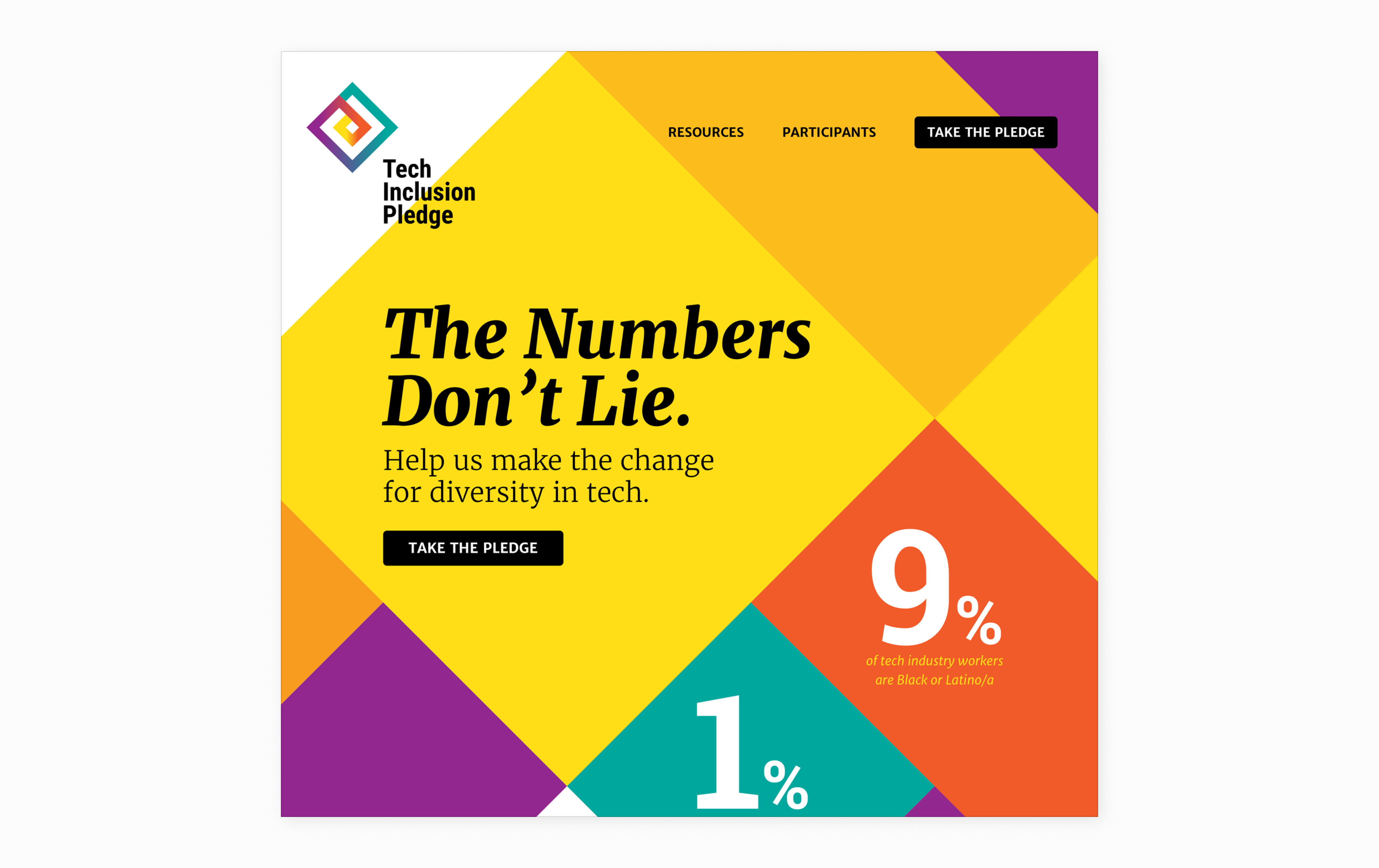
In a project for Aten's client National Center for Women & Information Technology, the team repeated the color in the logo in diamond shapes down the page. The vibrant colors represent diversity, inclusion, and innovation within the tech industry.
Keeping it Simple
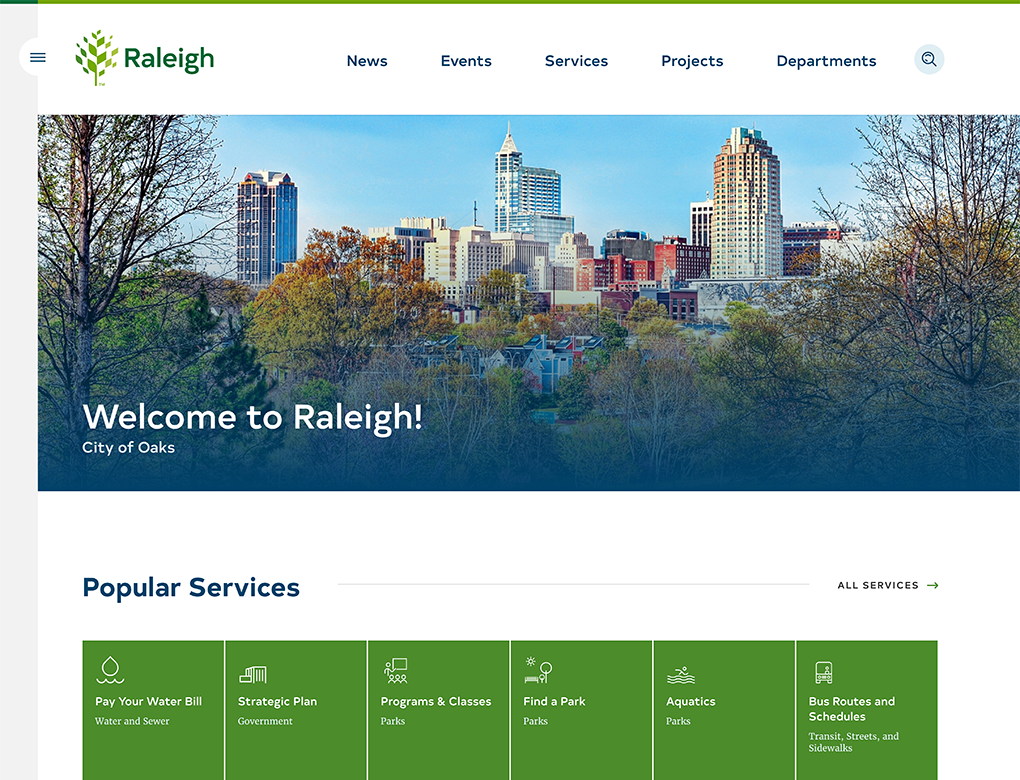
In keeping with its "City of Oaks" tagline, Raleigh, NC, presents a simple but compelling combination of varying shades of green and blue. (Learn how Aten Design Group devised a services-first digital platform for the City of Raleigh.)
Color Selection Tips
- Select colors that are relevant to your brand, purpose, and visitors as opposed to exclusively leaning into what’s on trend.
- Employ color as a UX (user experience) tool. For example, use color to group and separate sections and support messaging hierarchy.
- Ensure your color selections meet accessibility standards in terms of text size and background contrast.
3. White Space: Group(ing) Text
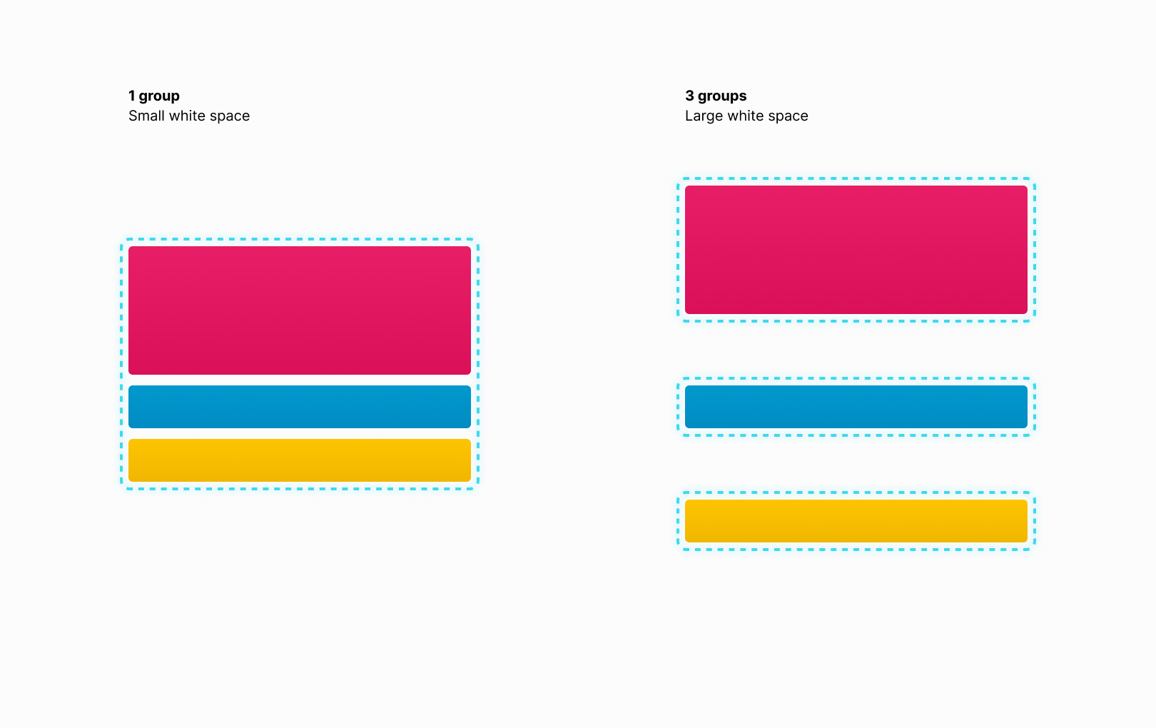
White space (which doesn’t literally need to be white) is simply the space between text, images, graphics, text sections, etc.
When you’re designing a website, white space helps to create—or eliminate—relationships between text. Positioning objects close to one another establishes one large piece of content; whereas, adding white space between objects generates visual and mental separation. Within the realm of website design, you can use white space to establish hierarchy, support a user journey, and even tell a story.
White Space Examples
Rich & Dense
Texas Monthly’s digital magazine offers a rich and dense white-space approach, as it packs in considerable content by dividing the layout into four columns and stacking content within each.
Wide & Open
Featuring a one- to three-column layout, Stacks includes generous space around each section and limited density, which helps drive a linear story and prompts people to explore the brand.
Apple’s website focuses on simplicity, as it employs clever storytelling and rich graphics surrounded by plenty of white space.
White Space Tips
- Use white space variations to create relationships between content and elements.
- Consider a variable use of white space throughout different pages. That is, contemplate which pages can use a more complex layout and which call for something simpler.
- Enlist white space consistently and systematically throughout the site.
4. Copy: Concise, Conversational, and Consistent
Effective web copy should not only inform and persuade visitors but also convey the brand’s personality and guide users to take specific actions.
That said, web and print copy are completely different animals. While print readers move in a linear left-to-right fashion, website visitors scan the page for entry points and visually ping-pong around the page.
When designing a site, copy should be concise and contain enough headings, subheadings, lists, and short paragraphs to foster easy user navigation and multiple entry points.
Copy Examples
Trello is a great example of user-focused copywriting. The productivity platform leverages SEO but employs clear, concise copy that quickly explains its seemingly complex offerings.
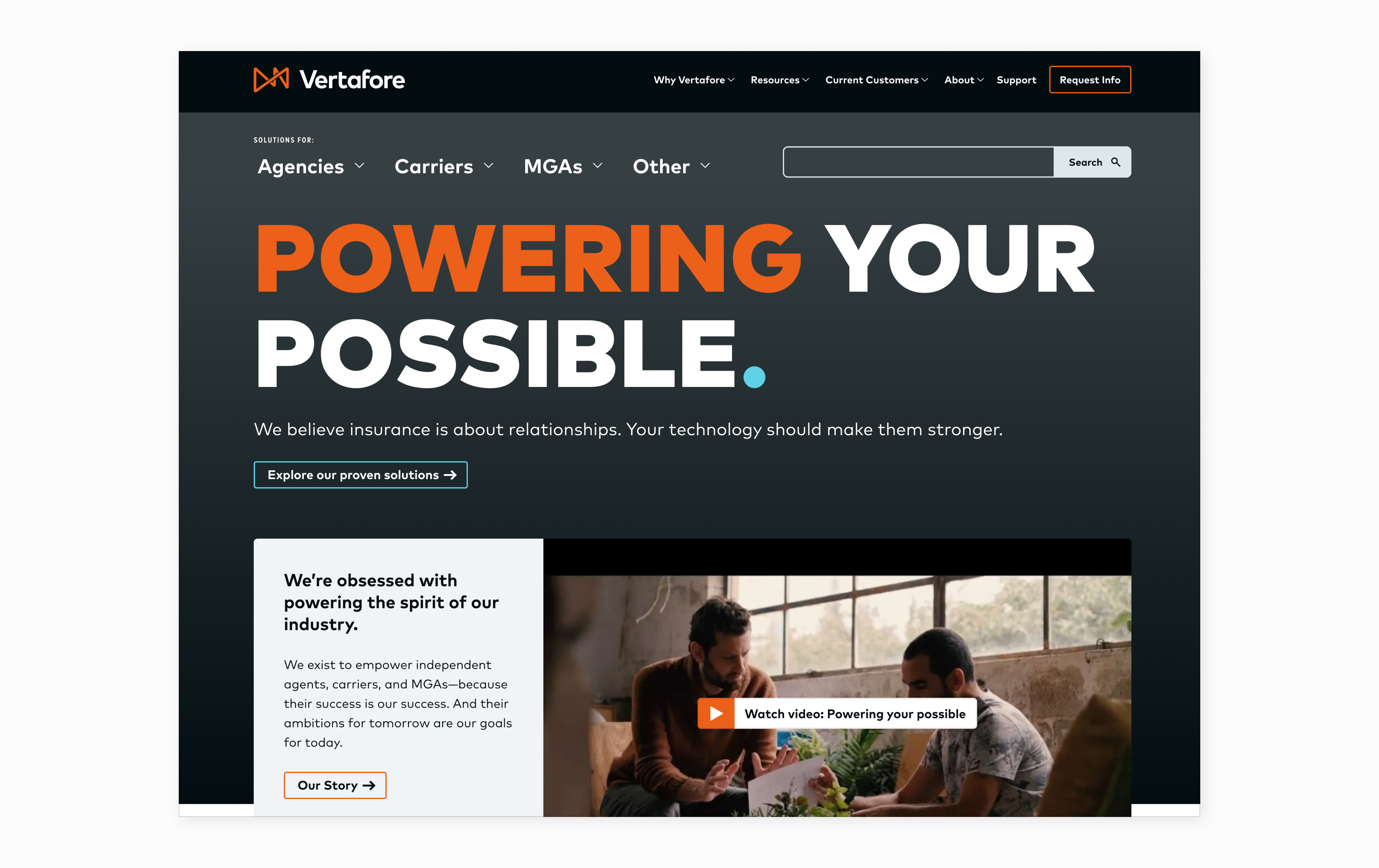
Aten client, insurance technology firm Vertafore recently switched out long sentences, sophisticated words, and unfamiliar product names for succinct text featuring carefully chosen words that allow for easy scanning.
Copywriting Tips
- Craft conversational copy that matches your brand’s personality, and employ simple language to craft a carefree user experience.
- Employ calls to action that tell users what to do and indicate exactly what they’ll get when they click.
- Write and position text to allow visitors to easily scan and locate their points of interest.
5. Media: Visually Enhanced Website Design
Media refers to the images, videos, audio, and graphics that appear on your website. While images are an obvious option, graphic designs and illustrations can provide a strong pop to the page while a series of motifs, characters, icons, etc. can effectively represent abstract ideas. Meanwhile, charts and graphs are awesome options to highlight metrics, and screenshots, images, and videos of your products and features can effortlessly explain what you do.
Media Examples
Circa delivers some killer graphic designs and illustrations, which make for a cohesive look and feel and provide depth for the brand.
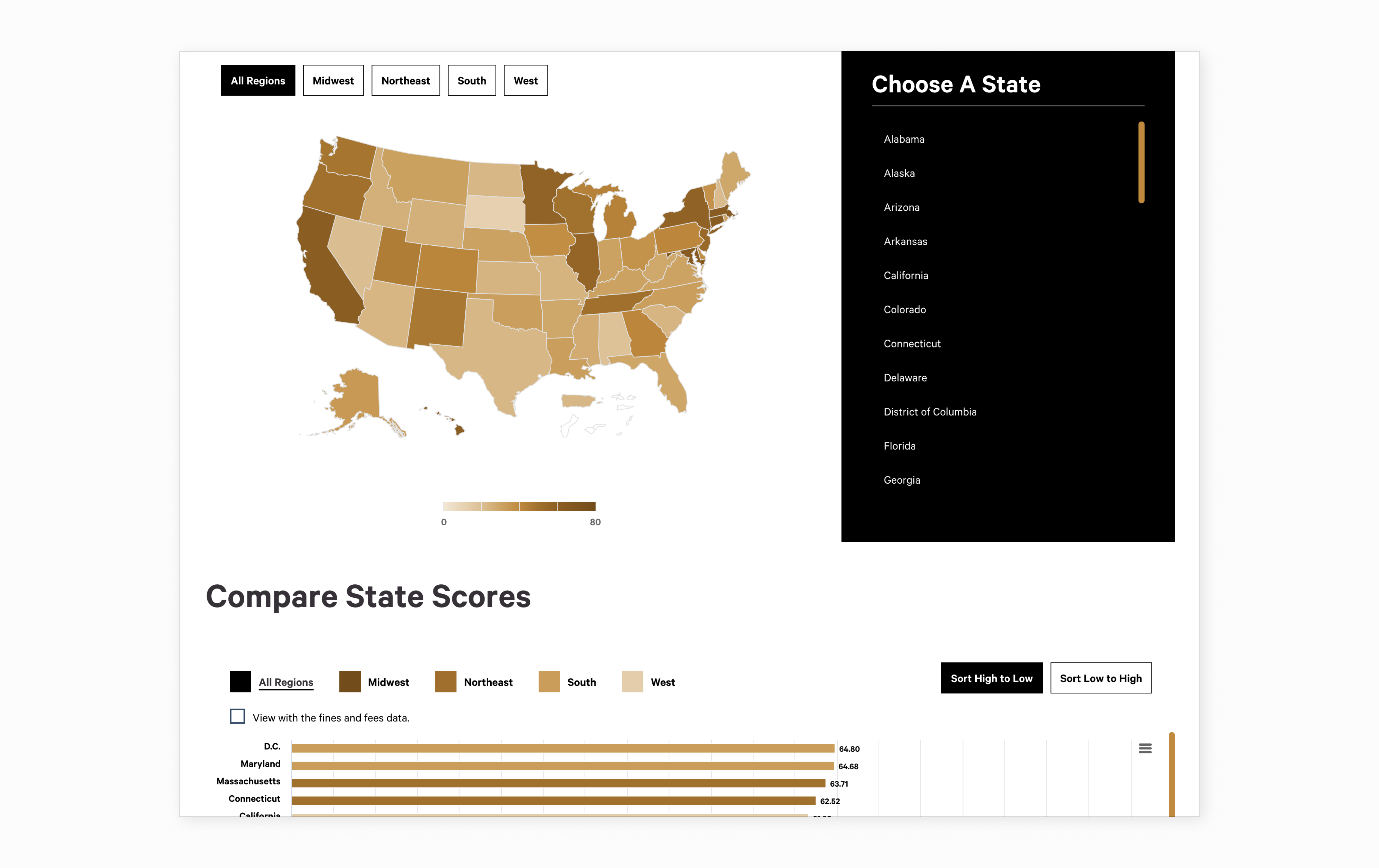
The National Center for Access to Justice uses engaging interactive charts and graphs to provide a snapshot of each state’s justice-related rankings.
Media Selection Tips
- Make sure the media targets your users and serves a purpose, such as answering a question, visualizing the topic, and/or captivating visitors.
- Confirm that media is on brand and it works well with your color palette, voice, tone, and aesthetic.
- Maintain cohesion via a collection of mediums—e.g., a large photo for the home page, custom graphic designs for blogs, and a series of icons to represent brand features—that sustain the theme and aesthetic throughout.
What’s next for your website design?
Aten’s team of talented designers and strategists offer top-to-bottom website redesign, branding reviews, design audits, UX strategy, stakeholder workshops, and user research to help you identify your goals and tap into your brand to tell your story.
We’d love to have a look at your website and discuss the potential of its design. Let’s talk.
Read This Next
- What to Expect in the Design Process
- City of Raleigh Redesigns RaleighNC.gov, a New Way to Engage Citizens
- Website Design Audits: The Secret to Sustained Impact
- Celebrating Science: A New Logo & Identity for Sanford Lab’s Annual Science Festival
- 6 UX Exercises to Keep Users at the Center of your Website Redesign

