When I talk about heading hierarchy, one question I often get is involving the component first web design approach. How do we implement an accessible hierarchy with this approach? Before we can really dive into how to work with this approach, it is important to understand what an accessible heading hierarchy is by reading A Guide to an Accessible Heading Hierarchy, and what a “component first” build approach is.
What is a “component first” approach
A “component first” approach is the idea of breaking up a site’s design content into common groupings - or components - that reuse the structure and appearance with new content throughout the design. It is flexible enough to allow variations of content, but consistent enough to work within a uniform HTML structure. Not only does this create visual consistency throughout the design, but it speeds up the design and development build.
Some common examples of components I see in many designs are:
- Accordions
- Calls to action (CTAs)
- Headings with subheadings
- Teaser lists
Implementing a hierarchy seems pretty straight forward when writing your content in your text editor, but developers often have to create these components before content is created for the page. So, how do you know which heading level to build the component with if you don’t know what the content on the page will be or how the content may vary? This starts with figuring out how each component is generally used on the page.
The first step to creating an appropriate hierarchy with this approach is to ask yourself the following questions:
- What kind of content is this component displaying?
- Does this component get used in a consistent way, or do we need to allow for variations?
- Can this content live on its own with no context, or does this always need to be a sub section to allow for proper context?
Asking yourself these questions with each component will help you decide if the component is necessary, if it can live on its own or rely on other content for context, and if you need to allow for variations and flexibility for the content creator within the user interface (UI).
Common Components
Accordions
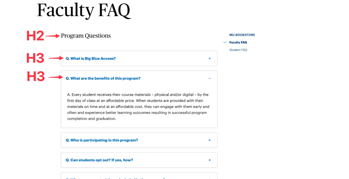
Accordions are vertically stacked interactive headings that each contain a title button that opens up to display more information.
Despite what many people think, users don’t mind scrolling. It is normal for everyone to just scroll now because of the wide variety of devices and sizes. Sometimes, it is better to display all content on the page at once when the use case supports it. We should avoid accordions when your audience needs most or all of the content on the page to answer their questions.
However, when people need only a few key pieces of content on a single page, then accordions work really well. By hiding most of the content, users can spend their time more efficiently focused on the few topics that matter to them without foraging through a bunch of content.
A great example of accordions working well are with FAQ’s.
Most of the time, long lists of accordion elements need more context to understand why they are on the page. When this is the case, each accordion heading will be an H3 because they need to exist within another heading for context. Because these accordion elements cannot exist on their own without more context, they cannot be H2s.
Calls to Action (CTAs)
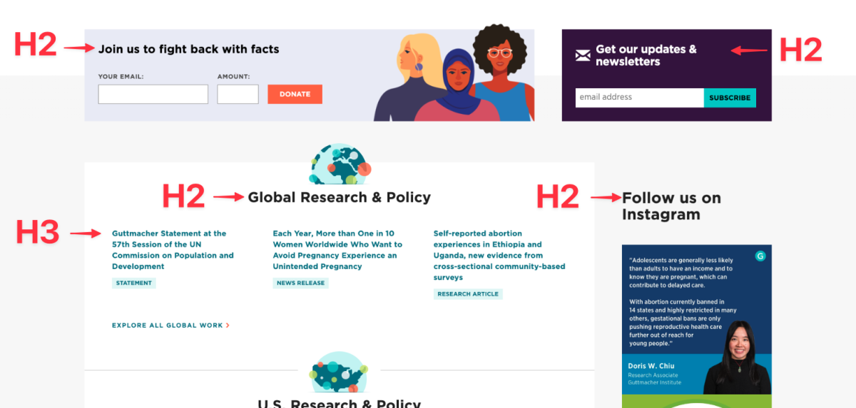
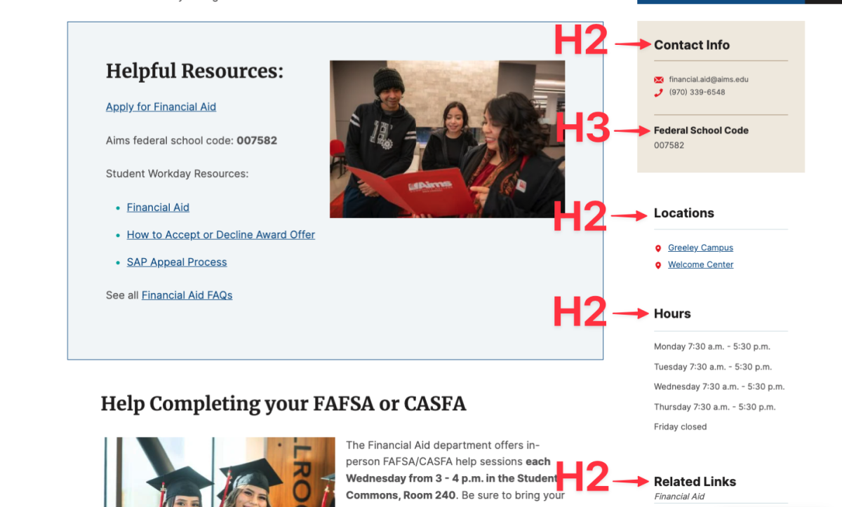
A call to action is a very common component I see on all sites. These components are usually found on multiple pages with the same content from page to page or varying content but still identical in look and style. CTAs tend to be related to the content of the site but do not rely on any other content on the page to exist. Because of this, they can live on their own, on any page, anywhere on the page without context.
Each component starts with an H2, and all following headings fall within the normal structure with H3s, and then H4s within that.
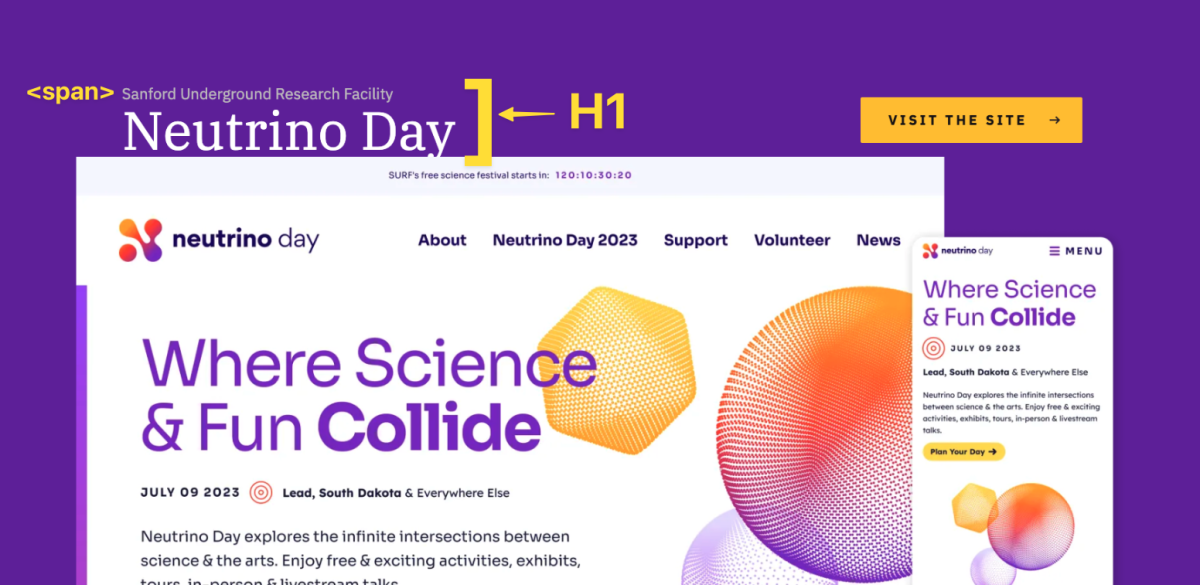
Heading with a subheading (above or below)
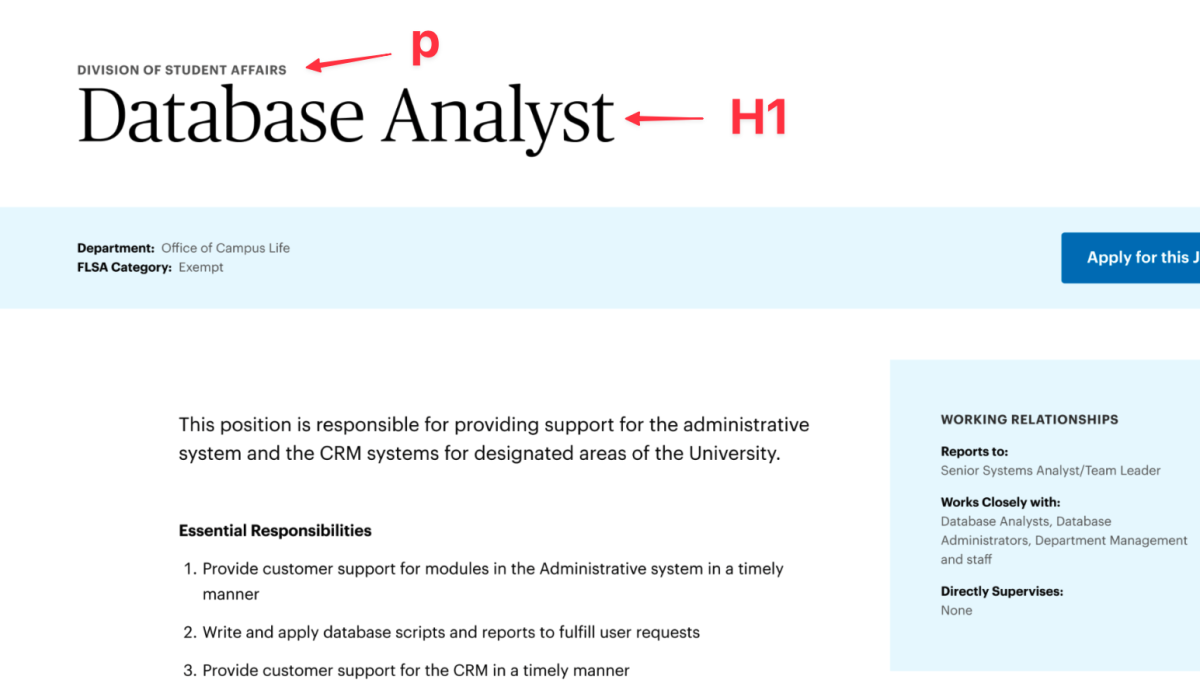
In many designs, I see that there is a major heading with a subheading or label above or below the large heading. This is where you need to ask yourself some questions to see the relationship between the two lines of text.
Are the two bits of text two complete thoughts, and one is just used as a label?
Or, are the two pieces of content all one thought or complete sentence, just styled for aesthetics or to bring visual hierarchy to the more important part of that text? If that is the case, then the entire text should be wrapped in a heading and styled with a span to visually look different. This way you visually see a more appealing hierarchy, but it is still read to a screen reader as one complete thought.
Teaser Lists
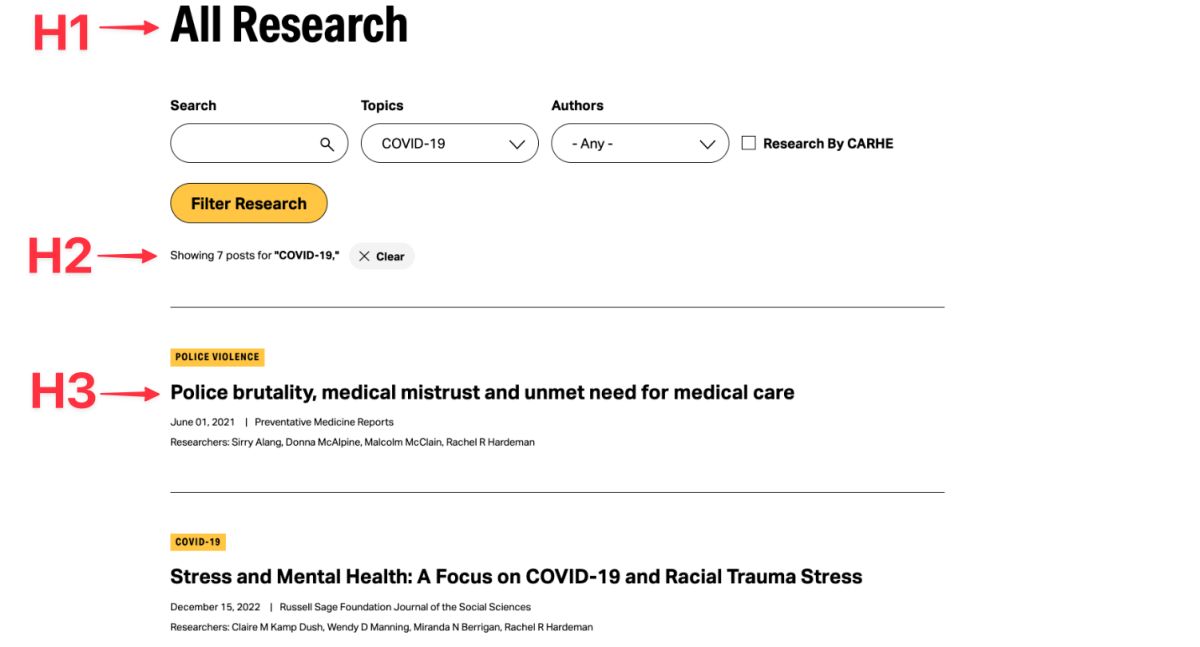
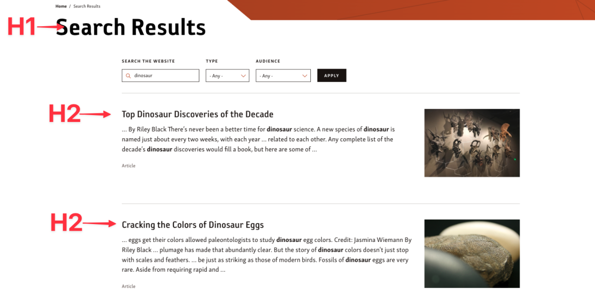
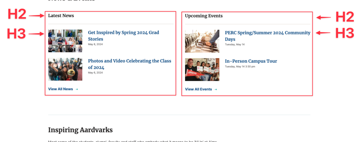
Teaser lists are something that can have various forms, but overall it tends to be a short view of a larger piece of content. Usually this is a heading, text, link, and image or some combination of those elements. You would click on the link to go to the original full page for complete details. I see teaser lists in instances like:
- Search results and category filtered pages
- Event or news listings
- People and staff listings
Many times, these list elements cannot live on their own without some kind of a context for a user to understand why they are there. Because of this, the entire block component would need an H2 to organize the list of elements that follow. Each list element is an H3 and normal heading hierarchy rules fall within each list element from there.
Allow for Flexibility
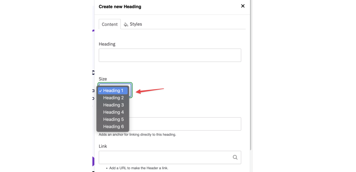
In many cases, components cannot be tied to a strict heading and need to allow for flexibility within the UI. Ideally a developer would create space for a flexible heading to allow for an H2 or H3 for example. Within the UI, the content creator can choose what makes the most sense for the content in real time.
In Conclusion
Hopefully after reading both the Guide to Accessible Heading Hierarchy article and this blog, How to Implement an Accessible Heading Hierarchy in a Component First Approach, you have a better understanding of what it takes to implement a successful heading hierarchy in your next project.
If you are still looking for some more clarity, please take a look at my webinar recording, A Guide to Accessible Heading Hierarchy for a more in-depth discussion.

