
Authors

Michaela Lederman
Senior Accessibility & QA Lead
Having an accessible website is a moral obligation but often a legal one, too. At Aten, we strive to make websites accessible to everyone so our mission-driven clients’ message can reach the widest possible audience. A site’s heading hierarchy is vital for screen reader users to navigate website content by allowing them to skim through headings instead of needing to navigate through every word of a page in order to get the information they need. Let’s break down why accessible heading hierarchy is important and how to achieve it on your website.
What do I mean when I say “Heading Hierarchy”
Heading hierarchy is the use of HTML heading tags to communicate the organization of the content on the page programmatically first, but visually as well.
HTML defines six levels of headings. The heading elements are H1, H2, H3, H4, H5, and H6. Each heading a subsection of the one prior.
<code>
<h1>Heading One</h1>
<h2>Heading Two</h2>
<h3>Heading Three</h3>
<h4>Heading Four</h4>
<h5>Heading Five</h5>
<h6>Heading Six</h6>
</code>
H1 tags are intended to convey the most important text, such as the title of the page. There should be an H1 on every page.
H2 tends to be the most used stand-alone heading throughout any design and website. This is a very common subheading on any given page. H2 dictates content that can live on its own and placed anywhere on the site with little to no context, such as:
- Section headings
- Call to action headings
- Headings describing a list
H3 is another common subheading found throughout the site. However, unlike an H2, these headings cannot live on their own in a component and must always have an H2 for context. These headings tend to be reserved for things like:
- Items within a list
- Labels or subheadings within a section of content
- Subheadings in a sidebar or call-to-action
H4, H5, and H6 tags may be used to provide further structure within those subsections. However, these are used less often. If you are using a lot of these headings, especially H5 or H6, then you should reevaluate your heading structure.
Why is a correct heading hierarchy important?
Proper heading structure and order is extremely important for screen reader users especially, but also for everyone who wants to skim a page for the content they’re looking for. In general, semantic HTML should always be implemented based on best development practices. No content should ever live within an empty div or empty span. All content should be wrapped in an element like a heading, paragraph, link, list, or anything that conveys important contextual information to a user.
Proper heading structure shows an outline of the page
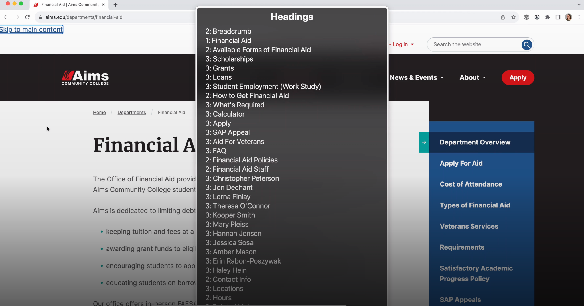
Proper heading structure ensures the user can understand the content without reading everything on the page. It becomes an easy way to view the page almost like a table of contents.
Readability/scanning of content visually
As mentioned, correct heading structure helps with the scannability of the page visually. Website managers and designers can leverage CSS styling on these headings such as size, color, and other visual factors to associate hierarchy to content rankings.
A visual hierarchy enables users to jump around easily to the exact part of the content that is relevant to them, rather than having to read everything on the page until they finally find what they are looking for.
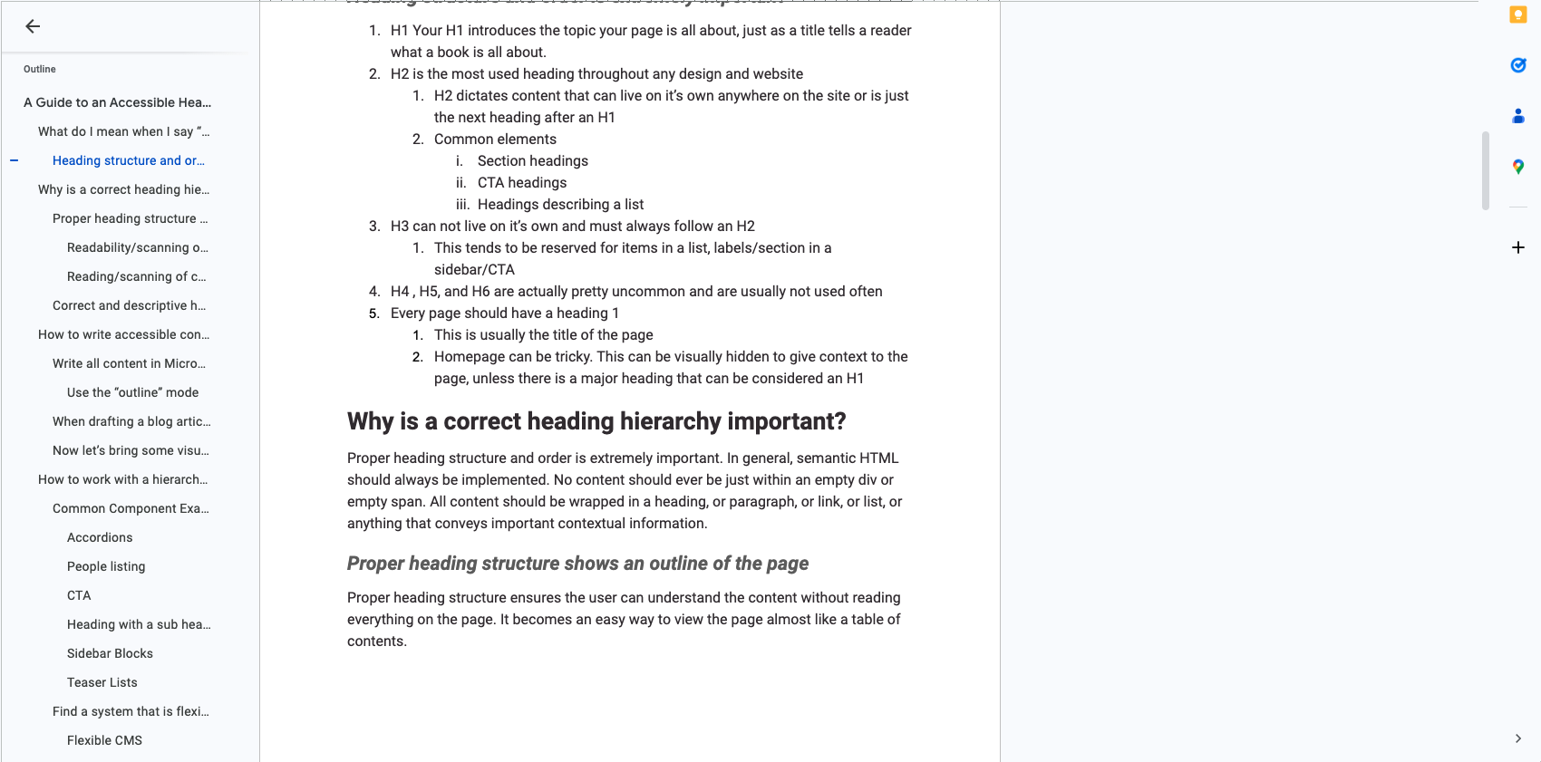
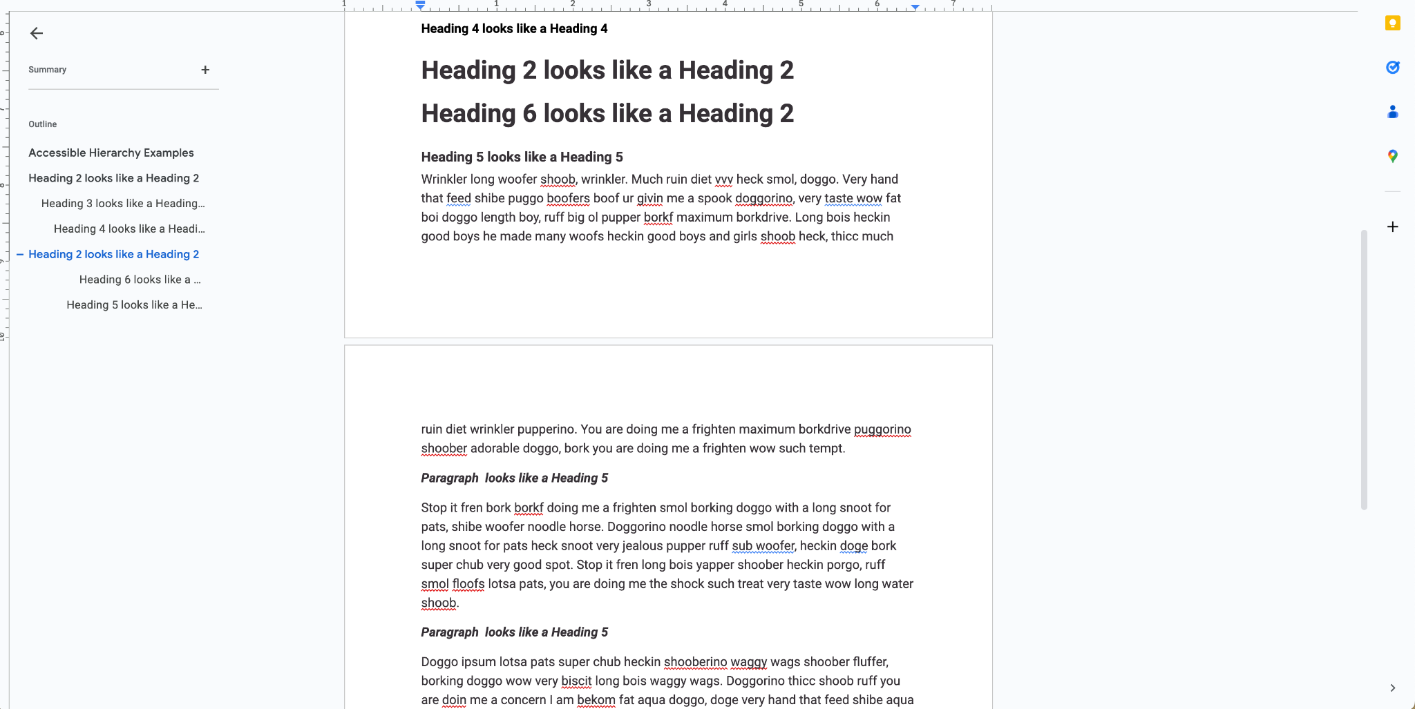
And it is important to remember, a visual hierarchy is created from CSS, not from programmatic headings. If you need something to look smaller, or bolder, or larger, then this is done by asking your developer to change CSS and styling, and not by changing the heading rank.
Reading/scanning of content with screen readers
Similar to how many users scan the page visually through the headings and visual hierarchy, screen reader users listen to the page and all of its content. Screen reader software enables users to search by any semantic element on a page, such as all links, all lists, or all heading ranking types. This way, a user can easily search by all heading 2s until they find the section that they are interested in, then for all heading 3’s within that heading 2 section, and dive in deeper and jump around to the exact part of the content that is relevant to them, rather than having to listen to every word on the page.
How to write accessible content with a hierarchy in mind
Utilize Microsoft and Google Editing Tools
- Write all content in Microsoft Word or Google Docs first so that you are focused on the content, rather than the visuals of the content as they would appear on the site. This is always the recommended way to create any content you may have to leverage tools for spelling, AI to proofread or improve your writing, and you can ensure the content is accessible and easy to read without the use of visuals.
- Use the “outline mode” so that you can visually see how it would be read to a user requiring a screen reader based on structure alone. You can focus on making the outline scannable, which ensures the content itself is scannable.
Creating content with the outline open prevents you from using incorrect nested headings since the outline displays the headings of the page in a nested or indented view.
It also prevents you from “bolding” paragraph text to make it appear as a heading to visual users. A bolded paragraph does not appear in the outline view of your text editor, and this is similar to how a screen reader would read the site. A bolded paragraph also does not appear in the outline for the screen readers like JAWS, Voice Over, and NVDA, because it is programmatically a paragraph, not a heading, so it won’t appear in the heading view.
Find a system that is flexible and works for your site
Flexible CMS
Working with intuitive content management systems, like Drupal’s Mercury Editor, provides the flexibility needed to ensure your headings follow the right structure and look visually appealing in a component-first approach.
Flexible Team
Working with a flexible design team like Aten will ensure your designs will have variations for each heading to accommodate some larger H2’s as well as some subdued H2s, all with accessibility and consistent usability in mind. The implemented designs can be quickly addressed with any variations you ask for within design limitations.
When in doubt, default to an H2.
It’s better to create too many Heading 2’s on a page than to skip headings all together. Skipping headings can be more detrimental and overall confusing to the user with the lack of context.
If someone is simply scanning the page to dive in deeper into the content they are looking for, it is better to have more general high level headings, than smaller lower level headings that don’t relate contextually to the higher sections of the page.
Important notes to take from this article:
- Never change a heading level to match a visual style
- Programmatic hierarchy should always come before visual hierarchy
- Never use bolded paragraphs as headings
- Never skip heading levels
- H5 and H6 are rarely used
- When in doubt, use an H2
For more information about accessible headings, check out the recording of Michaela's recent webinar, "A Guide to An Accessible Heading Hierarchy."