In an attempt to be "accessible" most developers tend to add ARIA all throughout their code without realizing how detrimental this can actually be for those that rely on this tool. Once you have read part one of this two-part bog series, Do More with Less ARIA - Background and Basics, then you can look into using some common ARIA to enhance your accessible code.
There are many ARIA attributes to use, but the following ARIA are ones that I recommend starting with as they are common on many websites and scenarios.
aria-label
aria-labelledby
aria-describedby
aria-current
aria-haspopup
aria-expanded
aria-live
Common ARIA to Use
aria-label
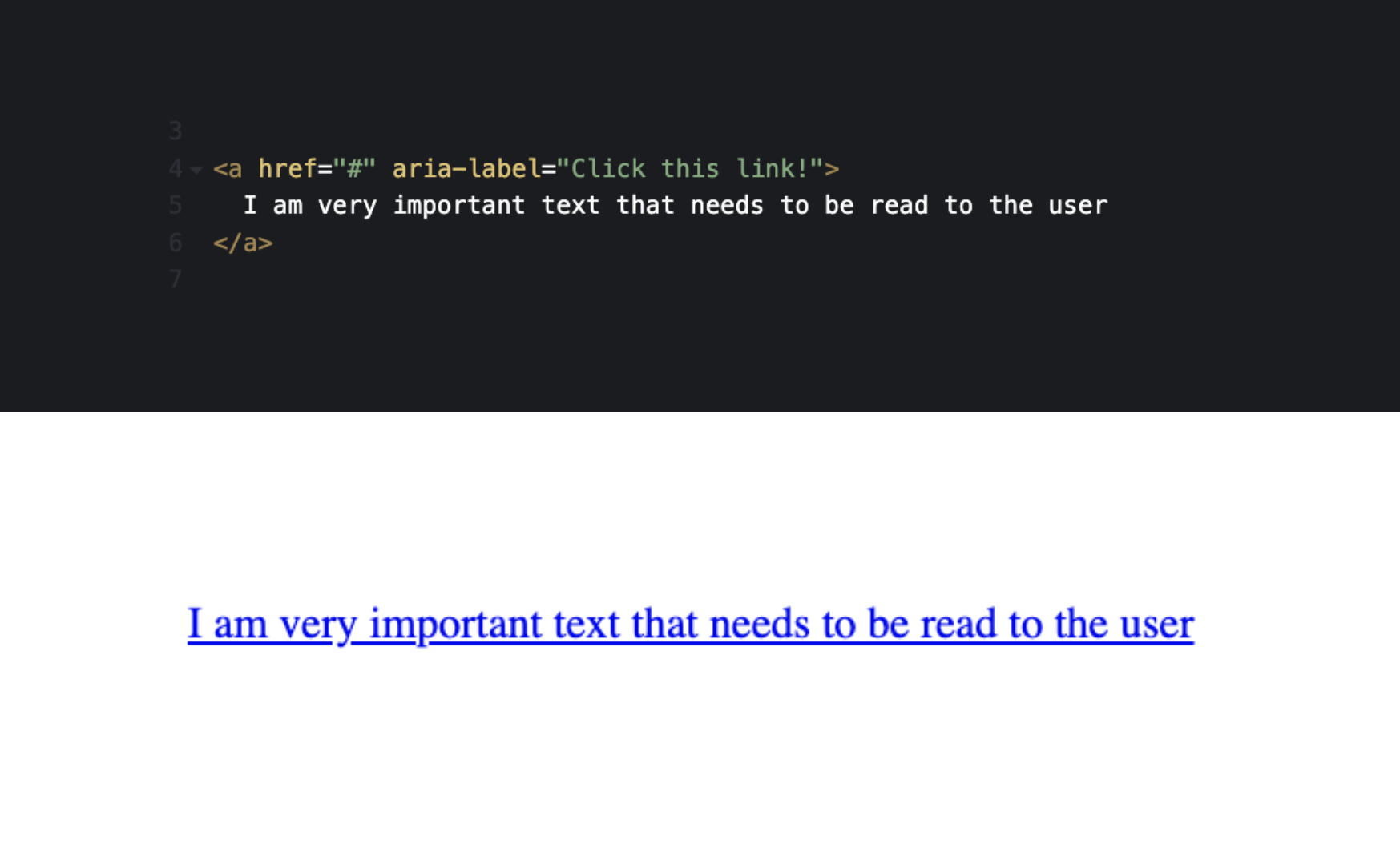
Aria-label is a property that takes a string value and labels an element. It can also be used to give context to a landmark when it is used more than once on a page. Adding an aria-label to an element is a way to ensure the element has an accessible name for screen readers.
Aria-label is great to use on elements such as links or buttons with icons for social media links, back to top buttons, mobile menu triggers, and drop-downs for navigations.
<a href="facebook.com" aria-label="Aten's Facebook"> <svg facebook-logo /> </a>
<a href="#top" aria-label="Back to Top"> <svg up-arrow /> </a>
<button aria-label="Menu"> <svg hamburg-menu /> </button>
<button aria-label="Open About Us Dropdown"> <svg chevron-down /> </button>
Aria-label is also extremely useful on landmarks that are used multiple times on a page, like a nav, which in turn, gives an accessible name to each nav on the page for more context.
<nav aria-label="main"></nav>
<nav aria-label="secondary"></nav>
<nav aria-label="breadcrumb"></nav>
<nav aria-label="footer"></nav>
Using aria-label can give amazing context for a user, however it is important to note that an aria-label on an element will override visible text within the element. It should only be used to give a label to multiple landmarks, or for interactive elements that do not have a visual label present. If text in the element is visible, it should not be overridden, to avoid confusion for those that are visual readers who also use a screen reader.
aria-labelledby
Aria-labelledby enables developers to reference other elements on the page to define an accessible name. This property can reference multiple IDs in the value.
This is great to use on interactive elements like accordions or links and buttons.
<h2 id="heading2">
  Aria-Labelledby is an important to know
</h2>
<p>
  There are over 50 ARIA states and properties, but aria-labelledby is one that really stands out.
</p>
<p>
  <a href="#1" id="link1" aria-labelledby="link1 heading2">
    Learn more
  </a>
</p>
It is also great to use on structural elements like landmarks when a heading is present.
<h2 id="heading2">
  Conntect with us on Social Media
</h2>
<nav aria-labelledby="heading2">
  <a href="facebook.com" aria-label="Aten's Facebook"> <svg facebook-logo /> </a>
  <a href="instagram.com" aria-label="Aten's Instagram"> <svg instagram-logo /> </a>
  <a href="youtube.com" aria-label="Aten's Youtube"> <svg youtube-logo /> </a>
</nav>
If an element has both aria-label and an aria-labelledby on it, the aria-labelledby takes precedence over aria-label, meaning that only the aria-labelledby elements will be read, and the aria-label will not be read to the user. And of course, both of these attributes override any visual text.
So what’s the difference between aria-label vs aria-labelledby?
- aria-label is used where text that labels the element is not visible to the user. It is found on the current element and takes a string value.
- aria-labelledby is used when there is visible text on the page that could label an element. It points to another element(s) via their ID(s).
aria-describedby
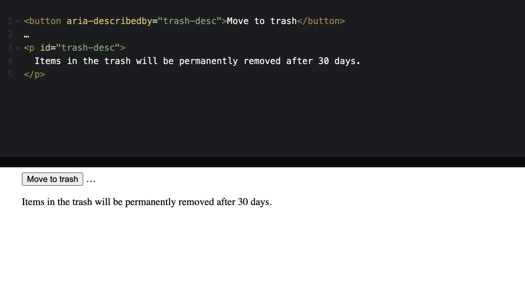
Aria-describedby lists the ID(s) of the element(s) that elaborate on the element at hand. It is used to establish a relationship between buttons, widgets, or groups and the text that describes them, it does not replace an accessible name. The aria-describedby text will be read immediately following the accessible name of the object. It can be used to describe an image or table in more detail, or to ensure that important text is not lost or skipped over in a form.
Aria-describedby must reference content strings in the DOM, visible or not. It is critical to know that if it is important enough to tell a Screen Reader user this association and more information, then it is probably important to tell everyone. So you should make sure it is visible.
This is great to use on elements like tables, forms, and complex images.
aria-current
Aria-current is great to announce an “active” state in a group of related elements. For instance, when you have a group of related elements, such as several links in a breadcrumb or navigation, and one element in the group is styled differently from the others. This visual difference indicates to the sighted user that this is the current element within its group, aria-current should be used to inform the assistive technology user what has been indicated via styling.
Aria-current is great to use on elements like breadcrumbs, navigation, multi-step flows, and tabs.
<nav aria-label="breadcrumbs">
  <ol>
    <li><a href="/">Home</a></li>
    <li><a href="/parent-page">Parent Page</a></li>
    <li><a href="/parent-page/child-page" aria-current="page">Child Page</a></li>
  </ol>
</nav>
It’s important to note that all ARIA can be targeted with CSS, so you can just target this aria-current=”true” rather than the just styling the .active class. Doing this is great because it ensures it works for both visual and assistive tech users.
a.active {
  font-weight: bold;
  color: red;
  border-bottom: 2px solid red;
}
a[aria-current="true"] {
  font-weight: bold;
  color: red;
  border-bottom: 2px solid red;
}
aria–haspopup
Aria-haspopup indicates the type of popup that can be triggered by the element on which this attribute is set. Unless otherwise noted, the default value is "menu".
aria-haspopup="true"
aria-haspopup="menu"
aria-haspopup="dialog"
Aria-haspopup does not use JavaScript to inject attribute changes, but is needed to ensure the popup element is keyboard accessible and has correct focus.
Aria-haspopup is great to use on elements like dropdown menus, and modal/dialog triggers.
aria–expanded
Aria-expanded tells users if a control is expanded or collapsed, and whether or not the elements are visible or hidden. It is added to the focusable interactive control, like a button, that toggles the visibility of an object.
aria-expanded="true"
aria-expanded="false"
Aria-expanded must use JavaScript to inject boolean changes, and perform the expand/collapse function. Remember that ARIA only conveys information to a user. It is up to the developer to ensure the appropriate functionality is created and works as expected for mouse, touch, voice, and keyboard controls.
Aria-expanded is great to use on any element that has a hide/show functionality such as accordions, dropdown menus, and mobile menus.
aria–live
Aria-live is used to announce to screen reader users of changes on the page that are visual, but does not announce the change to a user. If a section of the screen updates with new information, most sighted users will generally notice these live updates. Screen readers, on the other hand, only focus on one part of the page at a time; and that part may not be where the update is displayed. Leveraging dynamic ARIA like this is a way to ensure all users know of changes on the page.
This is great to use on anything that involves JavaScript to show or display a change of information on the page such as auto filtering views, dynamically showing more content with a “load more” button, and anything else that relies on Javascript to show a change of information.
aria-live="polite"
aria-live="assertive"
Polite vs Assertive
"Polite" is the recommended setting to use for almost all scenarios! It tells the screen reader to announce the change at the next graceful opportunity, such as at the end of speaking the current sentence or when the user pauses typing.
"Assertive" indicates that updates to the region have the highest priority and should be presented to the user immediately because it is time sensitive, like a user running out of time in a form. Avoid this unless absolutely necessary.
Major Rules to aria-live
This is a very robust property that has a lot of information to learn prior to using. Aria-live is an ARIA attribute that can be abused easily, so it is important to only use this if you completely understand what it takes and can do thorough testing. When in doubt, just use a page refresh to display these changes. A page refresh tells a user that content on the page has changed.
Aria-live must be set on an empty element on load
<div class="visually-hidden" aria-live="polite"></div>Developers must use JavaScript to inject unique text about the updates on the page into the empty element. Many times if the text is not unique and different every time, then the change may not be announced by the assistive technology.
<div class="visually-hidden" aria-live="polite">
  Now showing 3 results
</div>
- The notice must be kept short and succinct while still describing the page because It is only read once to a user and cannot be replayed, and it will cut off reading very long strings of information. Keep statements to one sentence or less.
When in doubt, just use a page refresh to display these changes. A page refresh tells a user that content on the page has changed.
No ARIA is Better than Bad ARIA
ARIA can be very helpful to users who rely on it, but only when it is implemented correctly. It is better to use no ARIA in your code at all, and to rely solely on normal HTML semantics, than to include too much or incorrect ARIA. If you are starting your ARIA journey, remember to learn the basics and background of WAI-ARIA, follow the 5 Rules of ARIA, and to rely on page refreshes and HTML semantics before jumping in.
If you are still looking for some more clarity, please take a look at my webinar, "Do More with Less ARIA".


