Defining web accessibility
For years, organizations have been working to make digital spaces more accessible, however many websites still fall short of being truly accessible for everyone. Whether it’s the rise in web accessibility related lawsuits, the Department of Justice's ruling requiring accessibility compliance for government websites, or the European Accessibility Act mandating accessible digital services — it’s clear that accessibility compliance is an essential part of building an inclusive digital world.
There is more work to be done, but what exactly does web accessibility mean and why is it so important? If you’re not really sure what web accessibility standards are or why they matter, this article is for you.
The web should be easy to use
The advent of the internet changed everything. Suddenly the world was at our fingertips, news from across the globe, entertainment, niche communities, the ability to shop, learn, and manage so many aspects of life on a single screen. Over the years digital designers and developers have worked to make online experiences faster, smoother, and more engaging. On its surface the internet has never been more usable.
But that’s not always how it feels.
You’ve probably experienced it before, hover menus that close too fast to actually click on the right link, squinting at microscopic text on a long form, or wrestling with a captcha that feels more like an intelligence test than a security feature. Maybe you’ve spent too long hunting for your account settings, trying to preview a simple change, or attempting to reach a human in support for help.
Few things are more discouraging than realizing a website simply wasn’t built with you in mind. Sometimes it’s oversight; other times it’s assumptions about users, or overfamiliarity with their own content to see the barriers they’ve built. And so you click and scroll, zoom and refresh, trying to make a digital world work in ways it was never quite designed to.
For millions of people, those small frustrations aren’t rare, they are constant. Despite decades of progress and a growing body of accessibility guidelines and laws, now strengthened by the U.S. Department of Justice’s ruling on accessible web content and the European Accessibility Act, it is clear that compliance is just the beginning. True accessibility means designing an internet where everyone, regardless of ability, can participate fully and freely.
Web accessibility is usability
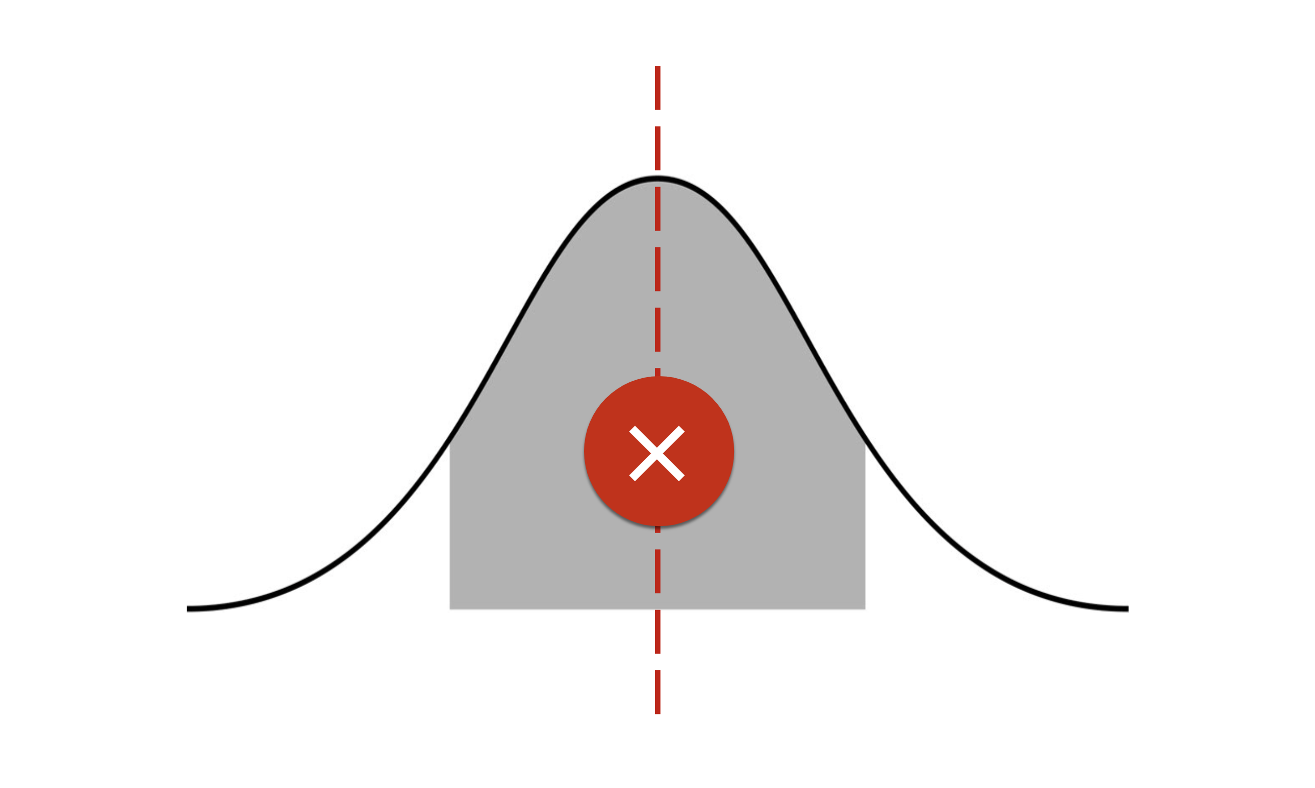
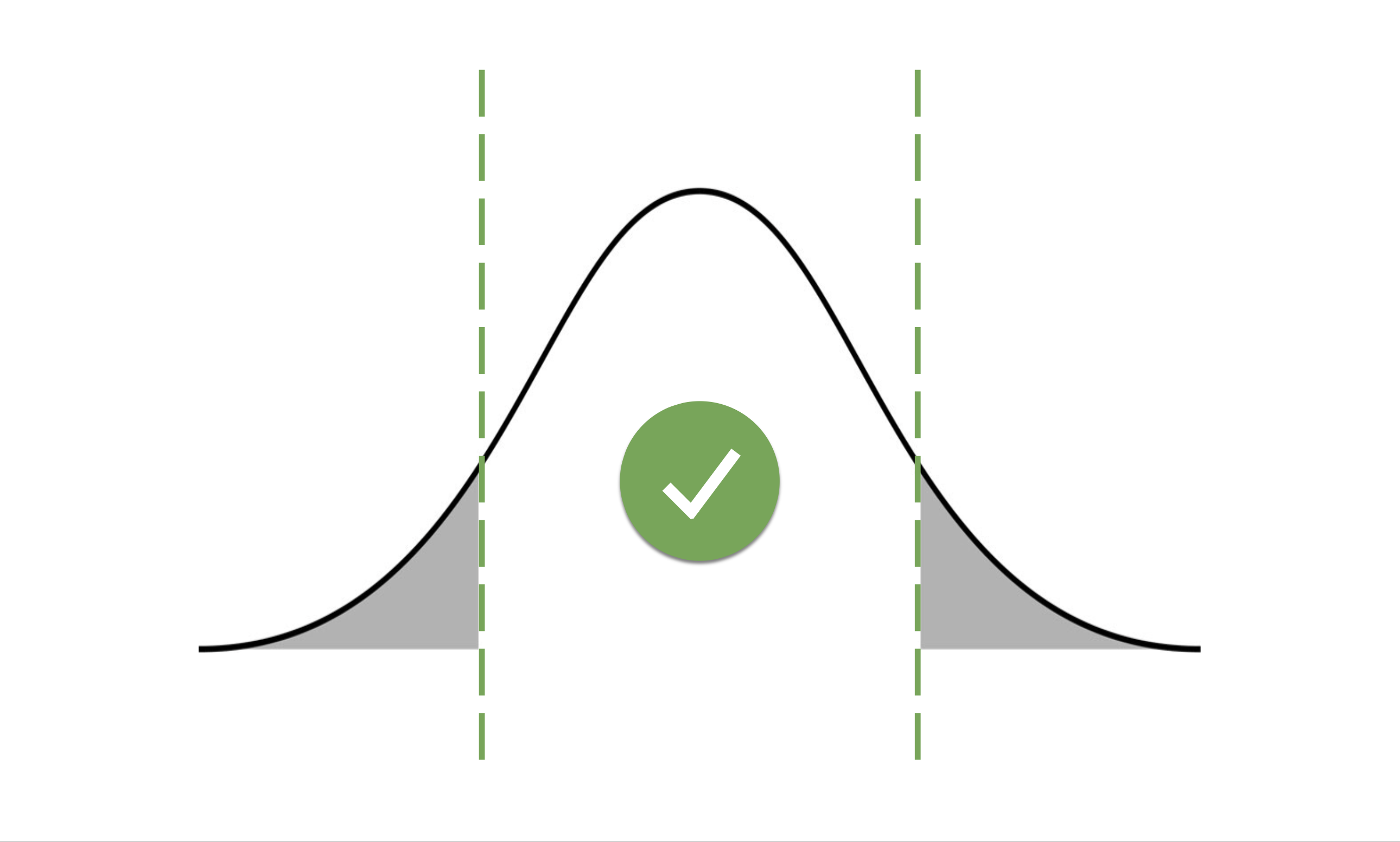
This is where web accessibility standards come in. These are tools to help us build technology that actually works for real people. For decades, tech companies designed interfaces with the goal of aiming for the “average user”, the fictional median that supposedly represents everyone. That assumption bakes in a lot more exclusion than you’d imagine.
When you design for the middle of the curve, you automatically leave out those at the edges. Design flaws like links that are the same color as regular text and poorly implemented (or altogether missing) keyboard navigation frustrate lots of users. Those frustrations are amplified and exacerbated for users with disabilities, from someone recovering from a broken finger, to those navigating the web with mobility, hearing, visual, or cognitive impairments, the “everyperson” design quickly becomes an invisible wall.
Designing for the most challenging use case doesn’t just help those who need it most, it improves the experience for everyone. Consider assistive technologies in the physical world: the “Walk” sounds at crosswalks, originally created for non-sighted people, also help anyone distracted by a phone or conversation notice the signal. That chirping sound is universally understood.
The same principle applies online. Clear, visible links, concise image descriptions, property implemented keyboard navigation, and a bevy of other accessibility focused features don’t just serve users with disabilities. These changes make the web smoother, faster, and more intuitive for all users. Accessibility isn’t a limitation, it’s a design approach that improves the experience for everyone.
POUR: The principles of web accessibility
At the heart of web accessibility are four guiding principles, often summarized by the acronym POUR: Perceivable, Operable, Understandable, and Robust. These principles serve as the foundation for building digital experiences, the World Wide Web Consortium’s (W3C) Web Content Accessibility Guidelines (WCAG) — the gold standard in modern web accessibility — are built around these principles.
- Perceivable: Users must be able to perceive the information. This means, among other things, providing text for those who cannot hear and audio for those who cannot see.
- Operable: Everyone needs to be able to operate websites with a variety of tools. Keyboard and screen reader controls must be present.
- Understandable: Perceptibility and operability don’t necessarily imply understanding. Websites should use clear, concise language and interfaces that encourage comprehension.
- Robust: Websites should operate and behave similarly across all major browsers and devices.
Think of the WCAG like a city building code — but instead of ensuring that homes and commercial buildings adhere to health and civil standards, WCAG makes sure web content is accessible to as many people as possible. Just as building codes guide architects and inspectors, WCAG provides a clear framework for designers, developers, and accessibility specialists to create digital spaces that everyone can navigate.
The latest release of WCAG 2.2 covers practical application of POUR principles, offering detailed guidance on how to make websites perceivable, operable, understandable, and robust. It also defines four levels of conformance, from non-conformant through A, AA, to AAA, making it easy to assess a site’s accessibility or guide a team towards compliance.
Applying these principles in practice means designing interfaces that work with a variety of assistive tools: screen readers, braille displays, keyboard navigation, screen zooming, and more. But accessibility isn't just about meeting a standard, it’s about creating experiences that work for everyone. A website that is clear, flexible, and inclusive reaches a broader audience and reduces frustration for all users.
The benefits of accessible content extend far beyond inclusion. Research on multisensory learning theories based on a large body of scientific studies (for example: Benefits of multisensory learning and The bond effect of haptic exploration), shows that interacting with content in multiple ways improves comprehension and retention. Even someone without a sensory limitation benefits from a website that provides captions with videos, clear text alongside interactive elements, or the ability to navigate by keyboard. Accessible websites aren’t just inclusive, they are better for everyone.
Web accessibility is more than a checklist
There are numerous automated tools that can check websites for some important accessibility benchmarks like missing alternate text for images or appropriate levels of color contrast. The Website Accessibility Evaluation Tool (WAVE) can quickly indicate problem areas for any website and provide a helpful starting point for accessibility evaluation. But automated tools only scratch the surface (read our take on it here).
Under the WCAG 2.2 guidelines, there are more than 70 success criteria used to measure accessibility, and the majority of them require a person to properly evaluate. Many accessibility requirements depend on context, clarity, and usability which is something that only a human can truly evaluate whether assistive technologies are implemented in a way that is actually helpful to users. A website might technically include alternate text for every image, for example, but only a person can tell whether that description would actually help a visually impaired user understand the content.
It’s important to remember that the whole point of web accessibility is about real people being able to use your website, no matter how they experience it. If someone with sensory impairments can’t navigate, understand, or interact with your content, then it’s not accessible, regardless of what an automated report says.
At Aten, we believe accessibility should never be an afterthought. That is why we integrate assistive technologies and accessible design from the very beginning of every project. From early discovery and planning, through design, development, and quality assurance, we apply the POUR principles and consider the full spectrum of users taking advantage of assistive technologies.
But accessibility isn’t something you achieve once and check off a list, it’s a moving target. The WCAG standards evolve every few years to reflect the latest advancements in accessible technology and understanding. Content updates, new frameworks, and emerging devices can all introduce fresh accessibility challenges. That is why continuous training, assessment, and improvement are essential. True accessibility is a process, Aten’s accessibility and usability experts care about one thing: the humans using the technology.
Human-centered, always
Our approach to accessibility puts people first. While meeting the latest accessibility standards is an important foundation, we know that true impact comes from creating real, positive experiences for users. That’s why we continually focus on the humans using the technology, providing hands-on experience, in-person client training to ensure content is genuinely accessible to everyone.
Are you excited about building a better internet for humans, too? Let’s work together.


