Authors

Ken Woodworth
VP of Design, Partner
I subscribe to a number of magazines that have great content and a really solid design. Wired, ReadyMade, Paste, and Bon Appetite are the four magazines at the top of my list these days. I enjoy them for their use of typography, or their interesting use of photography as an anchor for their articles. Within the bounds of still images, the possibilities in print are virtually limitless.
But wait a minute! The web has not been left in the dust. Lately I've been feeling pretty good about the direction the web is taking in regards to design and the things that can be accomplished online. More and more, sites are embracing grids, large photography, interesting layouts, and custom typography. Here are four of my favorite websites when it comes to design and why I think they're so strong.
If every page on the web was as expertly designed as the pages of these sites, I could die a happy man. That said, it's not like all print design is perfect. We can't all be Milton Glaser.
Design
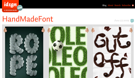
idsgn
idsgn is a blog about graphic design, branding, typography and sometimes video. This site uses large images and a tight grid to present topics ranging from Handmade Fonts to Michael Jackson to the latest Ritz packaging. I'm really digging the color scheme and typography (nice blockquotes!) and will definitely keep reading.
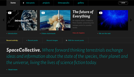
Space Collective
Click through the mesmerizing intro on this site and you'll find a wealth of posts, projects, and pictures all having to do with the "state of the species, their planet and the universe, living the lives of science fiction today." Sounds pretty cool, huh? The site pushes the futuristic theme with a clean layout, a combination of contrasting and complimentary colors, and some great sans-serif typography.
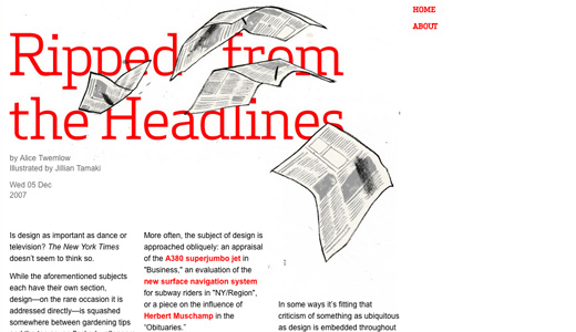
A Brief Message
Although it's been a while since it was last updated, I've always enjoyed the short form articles featured here. 200 words or less is quite a limitation and I can't help but wonder if that helps make these articles look like they came straight out of a magazine. The use of a single illustration with content wrapped around it creates a strong presentation with more visual punch than a simple blog post.
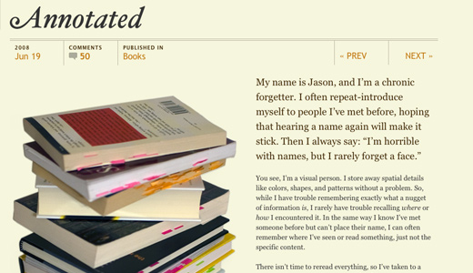
Jason Santa Maria
If you aren't familiar with his ever-changing website, take a minute or ten and look through all the different layouts used by Jason Santa Maria. I'm particularly fond of "What the World Needs," a comic-book themed post covering Jason's dreams of becoming an illustrator before he moved on to design (my life mirrors this pretty closely). This, people, is what the web is about. Each page is expertly laid out and every typographic detail has been considered.If every page on the web was as expertly designed as the pages of these sites, I could die a happy man. That said, it's not like all print design is perfect. We can't all be Milton Glaser.
Read This Next
- Website Design Audits: The Secret to Sustained Impact
- Celebrating Science: A New Logo & Identity for Sanford Lab’s Annual Science Festival
- 6 UX Exercises to Keep Users at the Center of your Website Redesign
- 6 Guidelines for Accessible Website Design
- Design and User Strategy Workshops Lead to Peak Performance for the City of Boulder’s New Site
Skip to footer
Comments