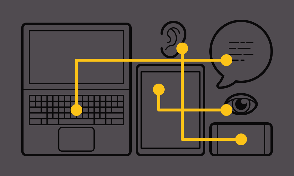
According to the CDC, 53 million adults in the United States live with some form of a disability today – roughly 22% of the adult population, or 1 out of every 5 of your users. Keep in mind, I said adult population. This statistic doesn’t even include all the children living with disabilities. With such a high percentage of the population potentially having a bad experience with your site, it is in your best interest to convey the value of inclusion and make the necessary steps towards a great experience for all.
Now, I personally do not suffer from a significant impairment, but I did grow up alongside a close family member who suffered from Duchenne Muscular Dystrophy, and she helped me see life from her point of view. For instance, how would she get the various showtimes for us to go see The Heat in theaters? Or, how would she find a place for us to eat in New York City, when neither of us had been there before? Seeing her struggle performing everyday tasks and activities that I took for granted, like those above, inspired my desire for accessible websites and apps.
I know when I first started thinking about accessible websites, my mind immediately went to someone with a visual impairment, and this is even with a family member struggling with a physical disability, but like others when I heard “web” I thought visual. After years with touch screen devices and advances in interactivity; however, the idea of who needs an accessible website has broadened significantly and become a bit more mainstream. Website accessibility needs can be broken down into four main categories: visual, physical, auditory and cognitive impairments.
Visual Impairments
Visual impairments doesn’t just mean completely non-sighted. Users suffering visual impairments also include someone with obstructed, constricted or tunnel vision, my color blind father, and my aging grandparents.
When creating a website that’s usable by people with visual impairments, there are a number of questions to ask yourself that directly reflect how users will interact with your site. Here are a handful of those questions:
- How does one navigate and interact with a page when a mouse isn’t an option?
- How do you create an understanding of where the user is within the content without the help of visual cues?
- How does one get the information from an image or chart if they cannot see it?
- Is there enough contrast in color for the user to read and understand this content?
- Is the typography choice easy to read at this font size, line length, or line height? What about in this color?
- Does the user have to strain their eyes or move their head to relate labels to its inputs?
Physical Impairments
Physical impairments have become an extremely important consideration with the rise in touch screen technology. These physical impairments can be something as drastic as a birth disability like my cousin, the use of prosthetics and how they interact with the screen, or even a broken arm or finger.
When creating a website that’s usable by people with physical impairments, there are a number of questions to ask yourself that directly reflect how users will interact with your site. Here are a handful of those questions:
- Is this content easy to reach and interact with on this device?
- How does one navigate and interact with a page when physical movement is difficult or non existent?
- Does your app or site require sensitive touches to interact with?
- Does your product require certain touch gestures or quick double taps for interaction?
Auditory Impairments
Accessibility recently made national headlines when UC Berkeley failed to meet standards for auditory impairments. As a result, the University had no option but to pull their entire collection of free educational material from their public site – obviously, with huge financial and reputational consequences.
When creating a website that’s usable by people with auditory impairments, there are a number of questions to ask yourself that directly reflect how users will interact with your site. Here are a handful of those questions:
- Can a user get all information from a video without physically listening?
- Can a user contact your business in another way besides phone?
Cognitive Impairments
Today, our understanding of the cognitive impairments is expanding rapidly when it comes to accessibility. This is something that many have not thought about until recent years with the increased awareness of autism diagnoses in children. This can also include down syndrome, someone with photosensitive and migraine disorders, dyslexia, to even me - who gets motion sick while scrolling on a website with too much movement. Yes, I said that. “Digital motion sickness” is a real thing and becoming more and more prevalent in the tech age.
When creating a website that’s usable by people with cognitive impairments, there are a number of questions to ask yourself that directly reflect how users will interact with your site. Here are a handful of those questions:
- Is the visual density of colors and images distracting the user or not enabling them to comprehend the content easily?
- Does the font work for users who are sensitive to particular typefaces?
- Is there too much movement as a user scrolls down the page?
Final Thoughts
In conclusion, by taking into account the 1 in 5 users who may have difficulty accessing your site and making the web easily accessible for this demographic, you’ll actually benefit every user's experience overall. Asking yourself these questions while creating your site will alleviate the stress of a disabled user and create a great experience for everyone.
