Alt text — alternative text for images in your web content — plays a big role in making your articles, pages and posts easy to understand for all your audiences. Unfortunately default settings provided by platforms like Drupal and WordPress don’t always set you up for success, and common sense might lead you into some familiar pitfalls. Skip to best practices & examples.
What is alt text for?
Alt text is read in place of images to users who have opted to use screen readers, and it is displayed visually when your images fail to load or your users choose not to view them. Primary audiences for image alt text include visually impaired persons and users with slow or unreliable internet connections, but users with non-standard devices and users consuming your content via hands-free operations — like using a screen reader during a morning commute — will also benefit from good alt text.
Image alt text and SEO
Writing good alternative text is also part of a holistic approach to improving Search Engine Optimization for your web content. Providing appropriate alt text for images — alongside a wide variety of other user-centered content practices — is recommended by Google Search Console to help expose relevant content to Google Image Search. It’s worth mentioning that Google’s guidelines all center around real-life user needs like improving content accessibility and screen reader function. A negative user experience can result in punitive ranking.
Image alt text: best practices & examples
Writing good alt text creates an inclusive environment for your users, makes your content more accessible, and contributes to improving findability among search engines. For many of us, good alt text isn’t second nature — there are a variety of special cases that require consideration. Follow these guidelines for the best results:
Context is king. Write alt text that conveys what the image adds to your content in terms of meaning or purpose. It’s important to consider the image in context — for example the image below may have very different alternate text for an article titled “Join our team!” compared to an article titled “Interpreting requirements documents: a workshop using Legos.”
In the first case, “Employees participate in a team exercise” would suffice, whereas in the second case “Three participants holding very different Lego models based on the same requirements documents” would make more sense. WebAIM takes a deeper dive into image context here.
Do: “Employees participate in a team exercise” for an article titled "Join our team!"
Don’t: “Three participants holding very different Lego models based on the same requirements documents” for an article titled "Join our team!"
Keep it short. Shoot for 5-10 words (or less!) when possible. Images should work with the surrounding text to deliver information — there’s no need to repeat yourself in the alt text or stuff in details not otherwise mentioned in your content.
Do: “Jon Bowman”
Don’t: “Jon Bowman, Full-stack developer, started with Aten in 2020”
Drop “image,” “logo” and the like. Screen readers read out “Image: [alt text]” for each image, so including words like "image", "logo" or "graphic" will be redundant.
Do: “Aten” or “Aten Design Group”
Don’t: “Logo of Aten Design Group with text ‘Aten’”
Text is text. If an image portrays or includes text, the alternative text should be the text from the image.
Do: “Drupal 9”
Don’t: “Drupal 9 with a shadow on a starry background”
Keep social media links simple. Alternative text for images, logos and icons linking to social media presences should read "Facebook," "Instagram," etc. For links to multiple presences or actions on the same platform use "Aten Facebook," "Michaela Blackham Facebook," "Share to Facebook."
Do: “Twitter,” “Facebook,” etc.
Don’t: “Aten’s Twitter feed,” “Our Facebook Page,” etc.
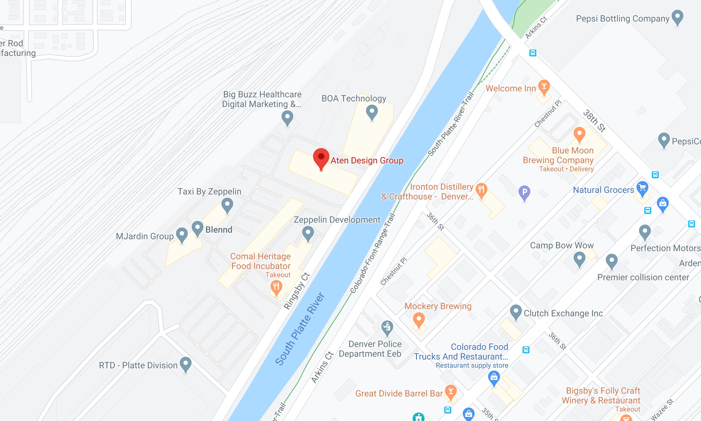
Describe complex images in the content. Charts, graphs, maps and other complex images should be described in the text of a page. If a description of the complex image is redundant or unnecessary for those who view the image, a link to a text description can be placed after the image.
Do: “Denver area map with Aten Design Group highlighted” as alt text, with a link “Directions to Aten Design Group” placed after the image.
Don’t: “Map of Denver with Aten Design Group highlighted along the South Platte River between BOA Technology and Comal Heritage Food Incubator in the Taxi by Zepplin complex,” or written directions in the alt text.
Use empty alt text for decorative images. For images used as visual weight or to break up text without adding meaningful content, use an empty alt tag — but don’t drop the alt tag entirely. Empty alt tags cue screen readers to skip the image, reducing interruptions for your users.
Do: Use an empty alt tag: <img src="images/decorative.png" alt="" />
Don't: “Laptop, tablet, phone, eye, ear and speech bubble connected by yellow lines”
Building good habits around content accessibility is an important part of quality content development — but it’s not always easy. If you get stuck, try thinking about alt text in the context of reading someone a webpage over the phone. How would you describe the images? Which ones would you skip altogether? How would you convey the contents of the page to whomever you’re speaking with?
At its core, accessibility on the web is about inclusion, empathizing with your users, and connecting with your audiences — no matter how they’re consuming your content.


