An introduction to building better websites for users
When it comes to the web, user experience and digital accessibility have surprising overlap. At their core, both disciplines are about building interfaces that people can easily understand and use. Usable, intuitive interfaces reach wider audiences and remove subtle obstacles between users and the interactions organizations on the web are trying to promote — purchases, subscriptions, likes, reads, etc.
Before we dive into the overlap between user experience and digital accessibility, let’s briefly visit them individually.
What is User Experience?
User experience is the quality of a person’s interaction with things in the world. When it comes to websites, you can judge user experience by how easy to use a digital tool or platform is. We call this usability. Here are Jakob Neilsen’s five components to determine how useable a given platform is:
- Learnability & discoverability. Can users easily find things & learn how things work?
- Efficiency. How quickly can users do things?
- Memorability. Can users easily remember how to use things when they return?
- Errors. Can users identify and fix their mistakes?
- Satisfaction. How pleasant is the design to use?
A website that is usable is cheaper to operate (less customer assistance), creates a positive impression of your brand, and results in more user success — whether they're trying to buy something, subscribe, connect with other users, or do whatever it is your website is for.
What is Digital Accessibility?
Digital or web accessibility is the degree to which websites, apps, and digital technologies are designed so that people with disabilities can use them. Building accessible websites means that we consider the following users:
- Blind or visually impaired. Non sighted, peripheral blindness, or color blindness.
- Deaf or hard of hearing. Non hearing or hearing impaired.
- Those with cognitive impairments. ADHD, Down Syndrome, seizures, age.
- Physical limitations. MD, arthritis, shaking, broken arm or other temporary injuries, age.
According to the Website Content Accessibility Guidelines (WCAG) developed by the World Wide Web Consortium (W3C), we can build accessible websites by adhering to the POUR principles:
- Perceivable. Users must be able to perceive the website’s content, which means providing text for those who cannot hear, and audio for those who cannot see.
- Operable. Users must be able to operate the website with a variety of tools, which means keyboard navigation and screen readers must be available.
- Understandable. Website content and functionality should be clear, concise, and easy to understand.
- Robust. Websites should work properly across all devices and browsers.
An accessible website connects with a wider audience, contributes to more inclusive workspaces, and conforms to the Americans with Disabilities act (ADA) which protects disabled persons from discrimination. It’s easy to see, however, that applying the POUR principles improves user experience across all audiences.
Usability is accessibility
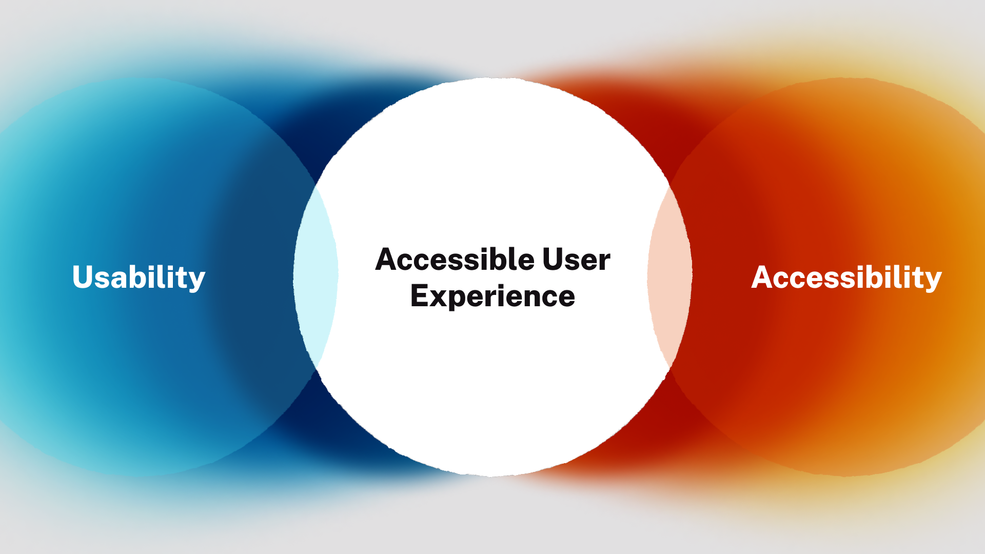
Traditionally, usability and accessibility have been treated as two separate disciplines with a small region of overlap. Upon close inspection, however, it’s clear that they aim towards the very same goals: delivering better experiences for users.
Web accessibility focuses on specific technical and functional aspects of creating interfaces for users with disabilities. Building robust digital experiences, however — with keyboard navigation, alternative to audio, clear design, easy-to-understand content, and objectively intuitive interactions — will benefit all of your audiences. By raising the standard of usability to a level where persons with disabilities can interact with our digital products, we guarantee a better experience for everyone.
Creating an accessible user experience isn’t just a theoretical approach to interface design. We’ve developed a collection of practical, easy to implement accessible user experience guides that focus on particular elements of digital product design from links, forms, and tables, to icons, menus, and much more.
Here’s three to get you started:
Don’t hide content
Users will not absorb a lot of content at one time — and they don’t want to hunt for pertinent information. Interface designers sometimes try to “cheat” these principles by cramming important information into hidden elements or forcing users to learn novel interactions that expose additional content. When important content isn’t readily available, users can become confused and frustrated. Worse still is the potentially disastrous effect on keyboard navigation, screen readers, and other assistive technologies. Here are some of the worst offenders:
- Image carousels. Carousels are essentially mystery navigation. The user must click through or wait as images auto-advance to find out whether the content is relevant to them — most won’t do either.
- Tooltips. Placing important information behind an interaction (click, hover) is a great way to make sure users don’t see it.
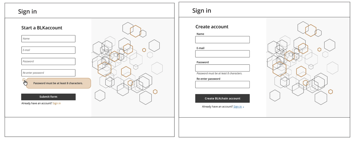
- Form labels inside form elements. This may seem streamlined, but their disappearance can confuse and frustrate users.
- Tabbed product or service comparisons. It is difficult to compare one body of content with another if we can’t see them at the same time.
Important content shouldn’t be hidden. Users shouldn’t have to guess, memorize, or experiment in order to use your website.
Design consistent menus
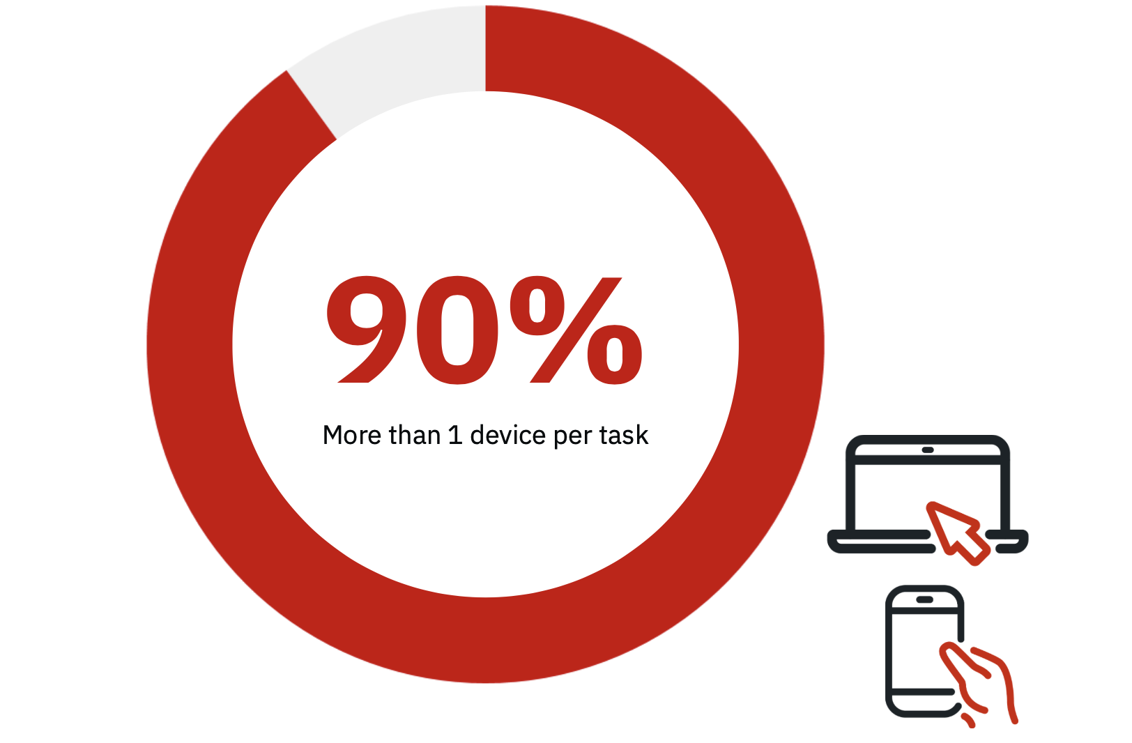
Menus are the backbone of a website. They shouldn’t rely on subtle visual cues, complex controls, or novel interactions to send users on their way — and they need to be consistent across devices. In a consumer study led by Google that investigated media consumption, 90% of digital media users reported beginning a task on one device and resuming that task on a different device.
If your menu changes significantly between mobile and desktop, you’re frustrating users. Avoid these pitfalls:
- Different device, different menu. Navigation on mobile should mirror desktop navigation as closely as possible both in interaction style and structure. Otherwise you can bet you’re frustrating multi-device users.
- Hover menus. These can be annoying for the most nimble fingered among us, and since there is no hovering on mobile they imply inconsistent navigation across devices.
- Split buttons / dual purpose buttons. Does the About Us navigation item drop down a submenu and serve as a link to the About Us page? You can bet plenty of your users don’t know that.
- Ambiguous interactions. Will clicking Men’s Clothing expand a submenu? Or load the Men’s Clothing page? Menu interactions and links to content should be visually distinct.
Users should intuitively know what’s going to happen when they click a menu item. They should be able to easily and confidently traverse your menu with straightforward mouse, keyboard, or assistive technology interactions.
Avoid overly architected experiences
Here’s Jakob Nielsen’s #1 Law of UX: Users spend most of their time on other sites. This means that users prefer your site to work the same way as all the other sites they already know. Translation: Don't reinvent the wheel.
If users need to invest extra time and attention into interacting with your site, many simply won’t. Avoid these common mistakes to keep your users happy:
- Overly complex interactions. Animations or visual effects (sliding, fading, etc) may look cool the first time you see them, but they quickly become irritating obstacles between users and their interactions.
- Rigid user flows. Forcing users into pre-architected experiences (consumers vs. distributors, national vs. international clients) frustrates anyone who doesn’t easily identify with one of your categories.
- Novelty for its own sake. Introducing novel styles for standard elements like links and bulleted lists — or using fonts and patterns meant above all to create an impression — often just annoys and slows down your users.
- Multiple architectures. When links to the same page exist in two or more menu locations, it’s likely your site is poorly organized or organized along multiple schemas, both of which can confuse and frustrate users.
Above all your digital platform should feel familiar and intuitive to users. That sense of natural usability largely relies on adhering to established norms, building interfaces in styles users already have experience with, and avoiding the temptation to “create a novel experience.”
More on the accessible user experience
Every overly complex interaction, counterintuitive navigation, or extra hurdle between users and their goals is exponentially compounded for disabled persons who rely on assistive technologies. Designing to accessibility standards and around the POUR principles grounds your website on solid usability fundamentals, and better connects all of your users with high value interactions.
Get in touch with Aten Design Group for the latest on accessible user experience guides including best practices for icons, tables, links, scannable text and more.


