As a user-experience designer, my goal is to generate and communicate concepts that aim to serve the needs of audiences in the best way possible. More so than not, I also need to find a way to accurately communicate these ideas without using up too much time or money. The best way to quickly and accurately convey these ideas is to collaborate on sketching throughout a project. Sketching helps client’s ideas come to fruition and the best sketching sessions are the ones where everyone in the room can share their ideas.
 We recently used this tool at a discovery and design on-site with our client, The National Center for Employee Ownership. The deck includes 80 double-sided cards with common website and UI elements, allowing us to quickly build and arrange possible layouts for key content of the future NCEO.org. We found that labels are still key to the process.
The cards helped to alleviate the pressure of sketching and presented our collective team with a range of UI elements to use throughout the website. This exercise provided a better visual of what a page can actually look like instead of simple sketches, which, in brought more excitement to the client.
Have you used UX Kits Wireframe Deck before? Are there any other tools that you’ve used to improve sketching experiences?
Design
Information Architecture
User Experience
Why Sketch?
For us, the benefits of sketching with our clients comes in three parts.- To help our clients bring their vision to life. We want them to think about two things: the content that should be on a certain page and the hierarchy of the content.
- To focus on the hierarchical needs helps us understand the relationships between different types of content.
- To provide clarity around the journey users should take while exploring the site.
When To Sketch
A critical point in our process where we utilize sketching is during our Core Model workshop. The goal of this workshop is to identify a core page that meets the goals of a user and the organization. As part of the workshop, we ask clients to list core content and identify elements that would help get the user to the next step. In order to enhance this workshop, we incorporate sketching. This allows for collaboration and creativity across a whole team. Now, sketching can be a little intimidating, especially when partnering with trained “designers.” But fear not, you don’t need to be Van Gogh to have a successful sketching exercise. So, if you find yourself struggling to convey a concept with a sketch, focus on labeling the elements instead of what they look like. You can also check out these other sketching tips from Roxy, UX Designer.Enhance Your Sketching
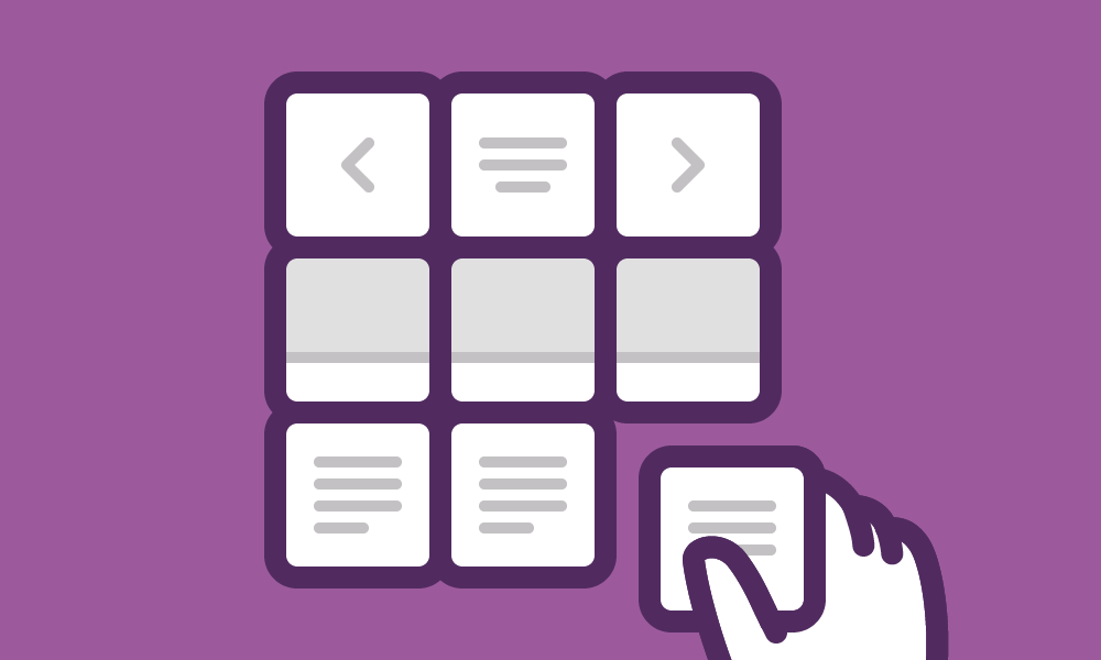
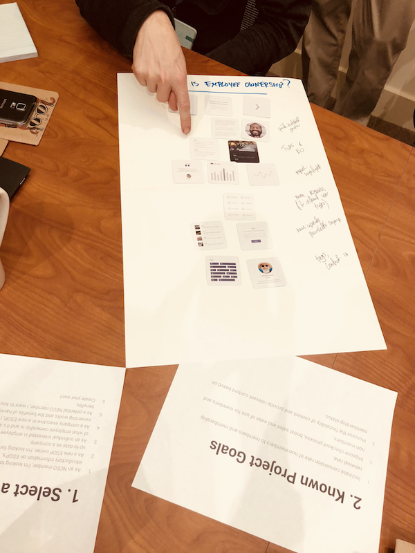
Still feeling intimidated? Try a different tool. UX Kits Wireframe Deck is a helpful tool we recommend to enhance this experience with our clients and lessen the pressure. We recently used this tool at a discovery and design on-site with our client, The National Center for Employee Ownership. The deck includes 80 double-sided cards with common website and UI elements, allowing us to quickly build and arrange possible layouts for key content of the future NCEO.org. We found that labels are still key to the process.
The cards helped to alleviate the pressure of sketching and presented our collective team with a range of UI elements to use throughout the website. This exercise provided a better visual of what a page can actually look like instead of simple sketches, which, in brought more excitement to the client.
Have you used UX Kits Wireframe Deck before? Are there any other tools that you’ve used to improve sketching experiences?
We recently used this tool at a discovery and design on-site with our client, The National Center for Employee Ownership. The deck includes 80 double-sided cards with common website and UI elements, allowing us to quickly build and arrange possible layouts for key content of the future NCEO.org. We found that labels are still key to the process.
The cards helped to alleviate the pressure of sketching and presented our collective team with a range of UI elements to use throughout the website. This exercise provided a better visual of what a page can actually look like instead of simple sketches, which, in brought more excitement to the client.
Have you used UX Kits Wireframe Deck before? Are there any other tools that you’ve used to improve sketching experiences?Read This Next
- Website Design Audits: The Secret to Sustained Impact
- Celebrating Science: A New Logo & Identity for Sanford Lab’s Annual Science Festival
- 6 UX Exercises to Keep Users at the Center of your Website Redesign
- 6 Guidelines for Accessible Website Design
- Design and User Strategy Workshops Lead to Peak Performance for the City of Boulder’s New Site
Skip to footer
Comments
