When organizations kick off the strategy portion of their website redesign project with us, there are a variety of user experience exercises we engage client teams in to define site strategy and design. One we often employ for websites is the User Journey exercise. While definitions may vary, a User Journey is a flexible tool for identifying opportunities to improve a user’s experience with important tasks on a website.
At Aten, we use User Journeys in two ways:
- As a workshop activity for facilitating stakeholder input around the site user experience
- As a deliverable in which we collate insights from across the strategy process to capture the ideal journey for a user, and where there are the greatest opportunities to improve this experience
Setting a site redesign up for success
Understanding external users’ priorities
User Journey activities help our team to gather information around how critical website tasks should best be accomplished on the website. Through the process of breaking down important use cases into steps, we are able to use this as a framework to map users’ interactions, common pain points, questions, and opportunities to improve the experience.
One of the biggest benefits of these activities is that they allow the website to evolve to fit the needs of your users and organization, rather than simply shuffling content during a website redesign. By speaking directly with stakeholders and/or users in a User Journey engagement, we are able to understand critical gaps in the existing website’s content or functionality.
Keeping content editors in mind
In addition to collaboratively identifying opportunities for improving external user experiences, the same can be said for internal users. This framework allows us to gather information on how internal processes support the external user’s experience in their journey through and around the website.
By identifying existing operations, such as manual tasks that support website functionality or data streams used to supplement existing content, we are able to build on how the website acts as an extension of your organization.
Where user journeys are more useful
User Journeys fill in some gaps from other data sources, but also leave their own blind spots.
The qualitative process of User Journeys can be used to supplement quantitative site analytics, unveiling why certain content might be highly engaged with or what users want to do on your website and are unable to.
But when is a User Journey less relevant? While the activity can support any kind of user experience, it might be less critical when your users’ needs on a website are straightforward and don’t require multiple steps or interactions. User Journeys are also less critical for any website whose primary purpose is to tell an organization’s story, rather than expecting users to come to the website and accomplish a task.
The process
Before starting any User Journey development, we first collaborate with our project team to review internal and external stakeholder survey results in order to identify who the users are for the website, how they are categorized, and what they will need on the website.
Once we have an understanding of which of these needs are of the highest priority, we establish scenarios which reflect a user coming to the website with those high priority needs in mind and how that scenario would break down into steps.
From there we are ready to begin workshopping with internal and external stakeholders to improve the user’s experience in that situation.
Client use cases
Environmental Defense Fund (EDF) Employee Intranet Redesign
We chose to run our User Journey Workshops for EDF in a virtual format, given the remote nature of the work done across this international organization. In a series of sessions with employees across departments from both the end user and content contributor perspectives, we used these workshops to review how staff would like to:
- engage with others across EDF.
- find resources and policies that are most up to date.
- learn about the work being done in an ever-evolving organizational framework.
In each session we divided into small breakout groups to review scenarios such as:
- “You’re starting a project with a team outside your division and want to learn who should be included.”
- “You want to add recent resources about your division so others can stay up to date with work.”
We explored the steps employees currently go through, how they would like to engage with the intranet, and how they currently contribute content. From there, we established a solid foundation to understand how content should relate across the intranet and opportunities to improve the current access and management of information.
Tampa International Airport Website Redesign
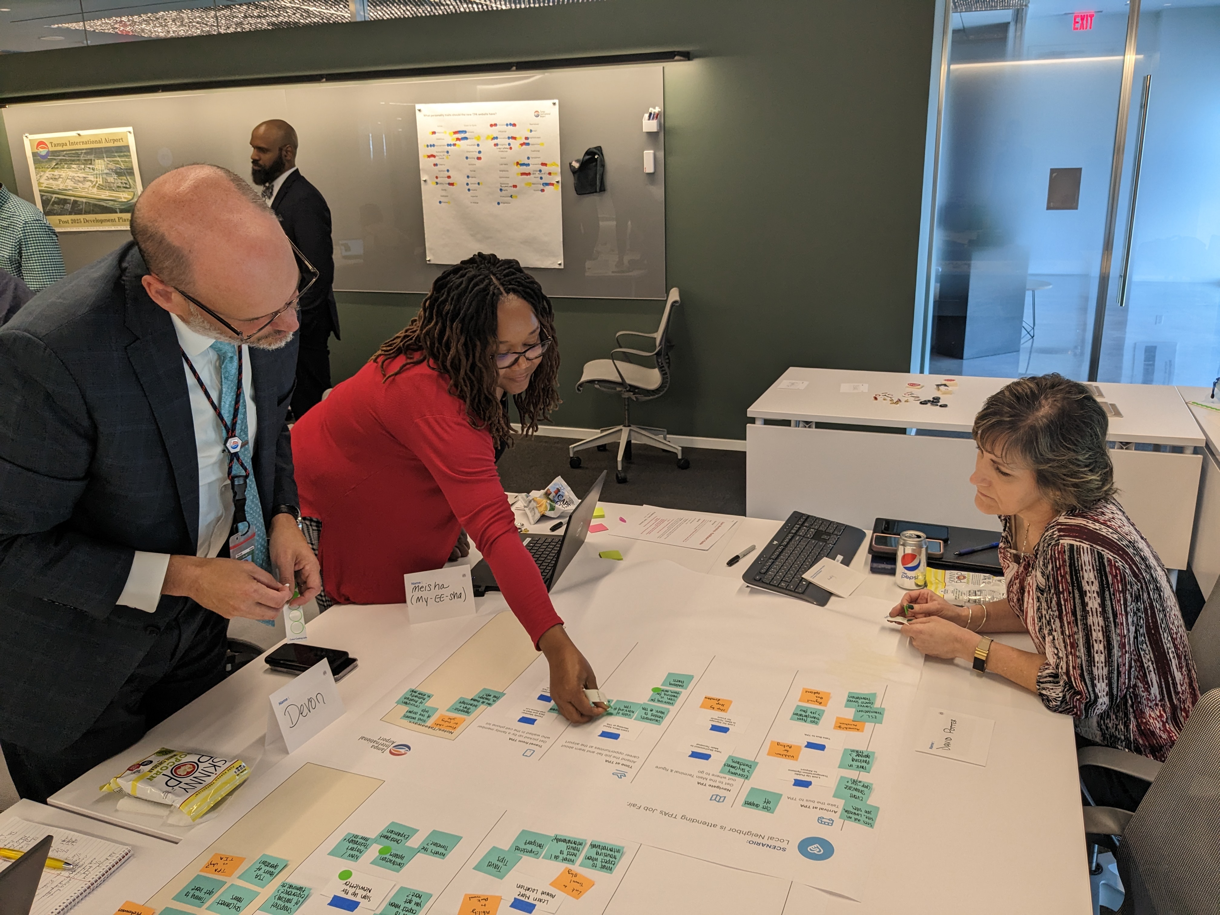
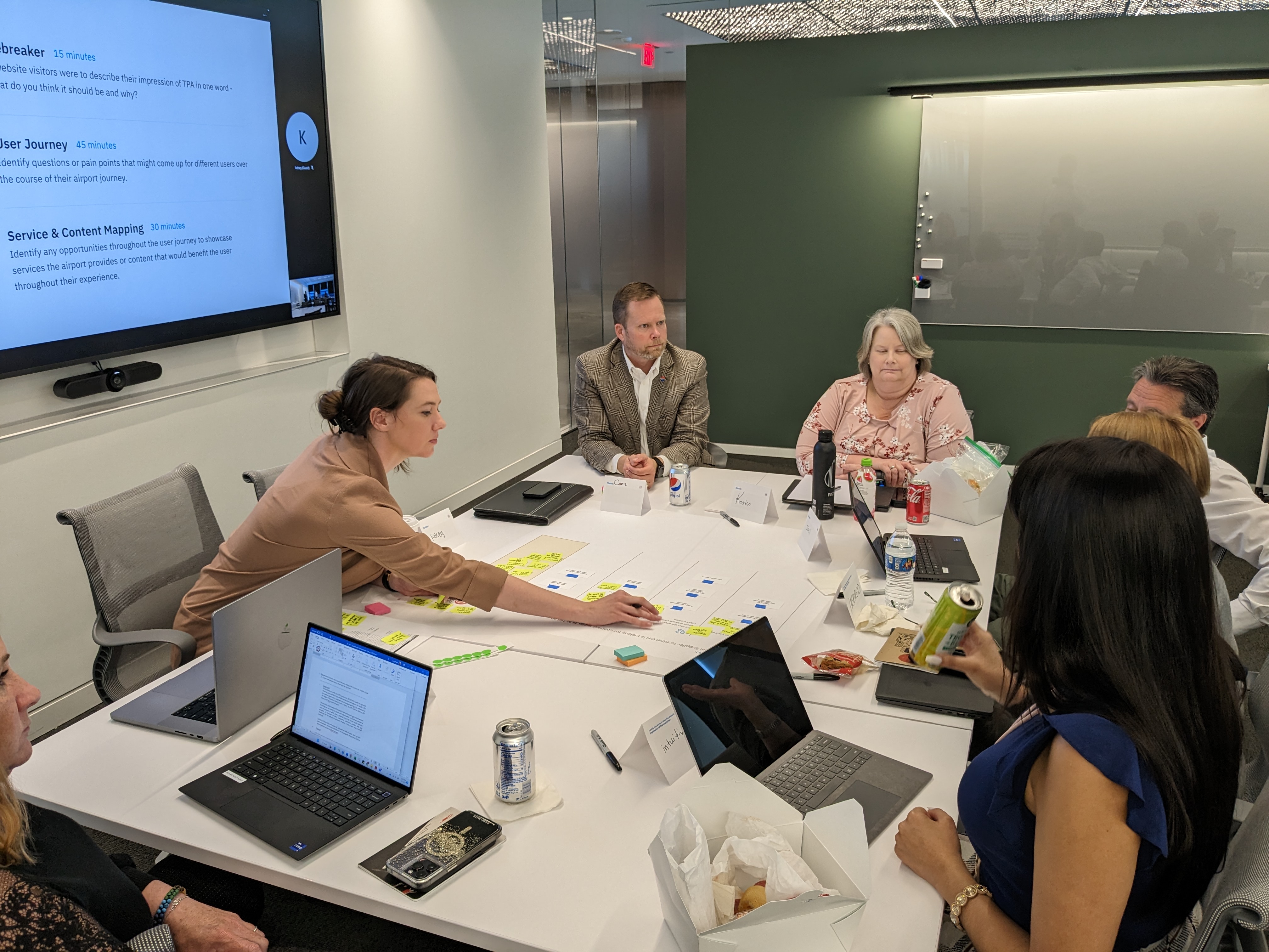
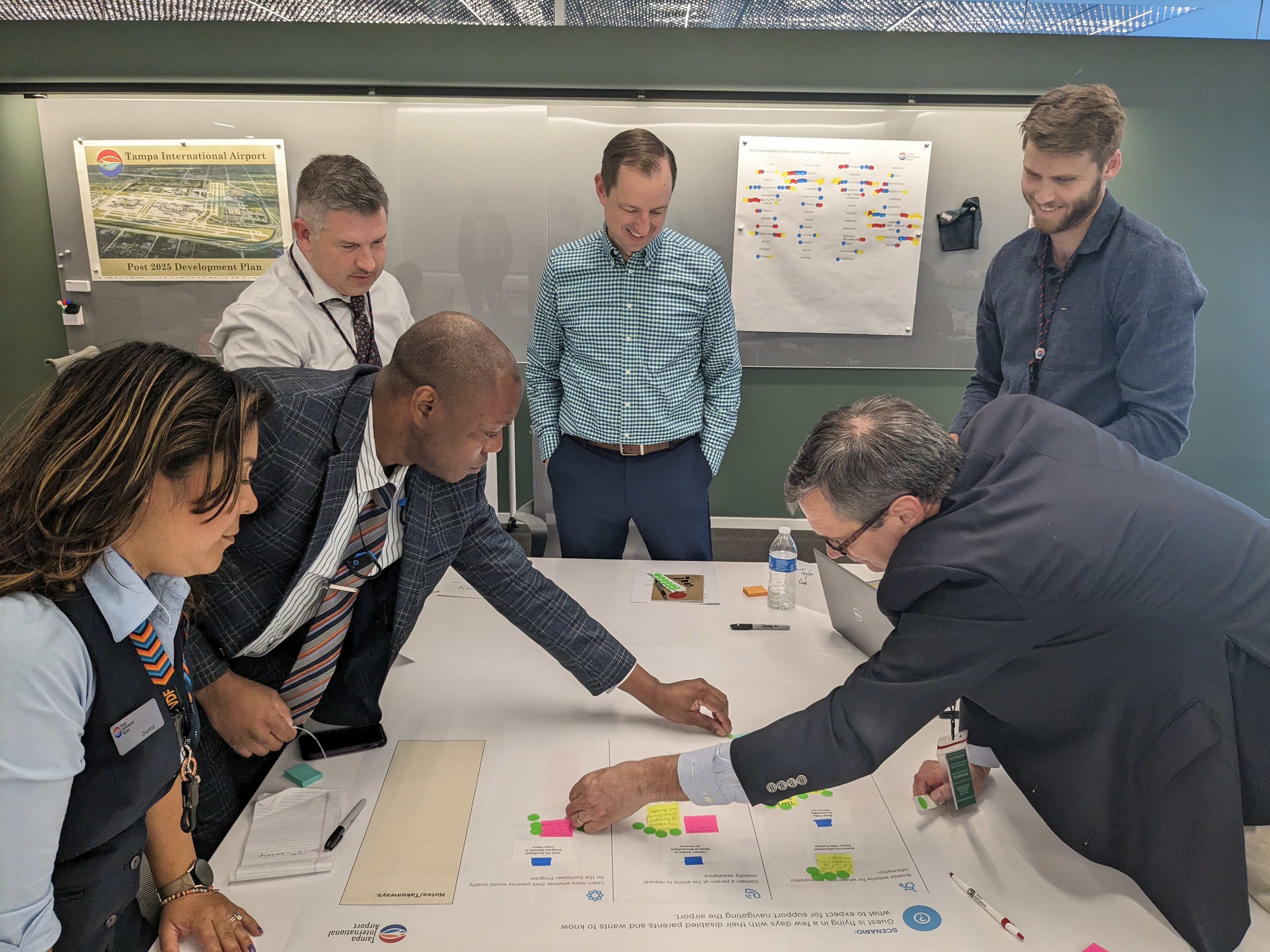
Given the in-person airport experience the website supports, our team recommended hosting a series of on-site User Journey workshops for this project. We not only engaged with departments across the airport such as guest experience, procurement, parking, and more - but also with external users who were excited to provide input for an airport they love.
With both internal stakeholders and users, we reviewed scenarios which represented use cases that might direct users to the website, such as:
- “A passenger is departing Tampa from their first business trip in the region, but realizes they forgot their iPad charger at the hotel”
- “A small regional business is interested in stocking its product in one of the tourism shops at the airport”.
Through these workshops, our team was able to hear directly from users about their questions and pain points when traveling with children with special needs, hosting international clients, getting to know the airport for the first time, and more.
With our internal stakeholder sessions, we identified common challenges for the users they support. From there, we can focus our efforts to support revenue-driving website functionality and aleve common frustrations by better directing users to information they need.
As a result of these sessions as we enter into the design phase of the project, we’re able to better prioritize how information should be displayed across the site and how we can seamlessly support users’ in-person experience, while also supporting organizational and regional growth.
Are you aware of how users are using your site successfully and where they're blocked from accomplishing tasks? Get in touch with us to review your overall site user experience strategy.
Read This Next
- Configuring Google Analytics 4 for your Website
- 6 UX Exercises to Keep Users at the Center of your Website Redesign
- Inclusive User Outreach: A Key Ingredient in Digital Accessibility
- Design and User Strategy Workshops Lead to Peak Performance for the City of Boulder’s New Site
- 5 Design Ingredients to Make a Great Website


