As an adult, designing interfaces for pre-k children presents a handful of challenges. Creating fun and inspiring games for children means understanding their needs and stepping into their (much smaller) shoes. Here are a few things we've considered when designing game interfaces for young users.


Design
Usability
User Experience
Passwords
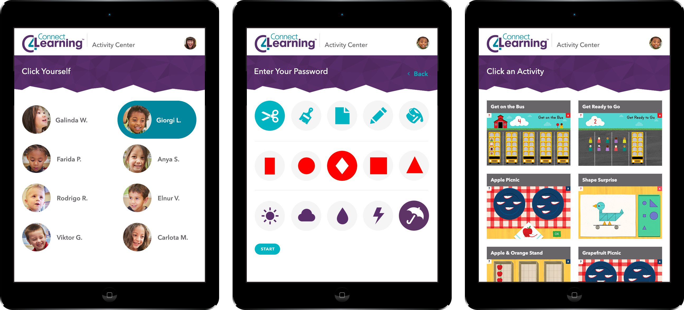
Young children may benefit from the ability to log in without having to be able to read or rely on an adult for help. For Connnect4Learning’s educational platform, we created a login system that involved selecting a combination of pictures instead of typing a password.
Students can select the three icons that match the printout provided by their teacher or guardian to log in on their own.
Device Usage
Children interact with devices differently than adults. Here are a few things to take note of when testing games with kids.- How does a child hold the device?
- Do they use one or both hands?
- Do their arms cover the screen?
- How hard do they press a touchscreen?
- How accurately can they select items in the interface?
Instructions
Verbal and Written Words
In situations where a simple interface alone can’t clarify what a user should do, audio instructions can ensure that children understand even if they can’t yet read. To take it a step further, supplementing verbal instructions with icons or animations can help reinforce a concept. It’s always best to err on the side of overly obvious instructions, eliminating as much room for confusion as possible. Keep instructions and stories short and to the point.
As the narrator gives instructions, this game highlights the object a player needs to interact with.
Vocabulary
How likely is it that your target age group understands certain vocabulary words? Words that you wouldn’t think twice about as an adult may pose a challenge for some children, so it may be advantageous to simplify terminology as much as possible. If simplification isn’t a possibility, including a new word could also be a learning opportunity. During testing with kids between ages three and four, we heard questions like “What’s progress?” which inspired us to change wording to something clearer. We replaced wording like “You’re making good progress” with “You’re almost there!”Colors
Color can be an important aid in communicating a message. However, depending on color as the sole means to communicate to your audience is risky. For example, using green to represent yes or go and red to represent no or stop may make a game unusable for vision impaired users. Colors can be used to communicate in this way, but they must be supplemented with verbal words or icons. This applies to all age groups.
When asked if you want to play again, the game highlights the yes and no buttons as they are read, so players who are visually impaired or cannot read can understand which option to pick.
Actions
With every action a child takes, we want to make sure that correct responses are counted as correct. When a child knows a correct answer in a game, the interface must minimize the potential for errors due to physical agility in using the device.
In testing an initial prototype of this game, we noticed that you had to be precise in where you touched the tower to get the answer correct. To make it easier to select the response you intend to, we extended the acceptable hit area beyond each tower.
Sounds
Not everyone interprets sounds the same way and, as expected, kids respond to sounds differently than adults might expect. Test assumptions with your target age groups. We learned that a sound we were using for incorrect answers was incredibly amusing to some testers, which motivated them to intentionally respond incorrectly just to hear it. Everyone interacts with interfaces in different ways, and children are no exception. Observing kids in the appropriate age group interacting with a game is the best way to test your solutions to some of these challenges. In the process, you’ll gain insight into necessary improvements to the interface. After all, the easier a game is to understand and play, the more successful and fun it will be.Read This Next
- Website Design Audits: The Secret to Sustained Impact
- Celebrating Science: A New Logo & Identity for Sanford Lab’s Annual Science Festival
- 6 UX Exercises to Keep Users at the Center of your Website Redesign
- 6 Guidelines for Accessible Website Design
- Design and User Strategy Workshops Lead to Peak Performance for the City of Boulder’s New Site
Skip to footer
Comments