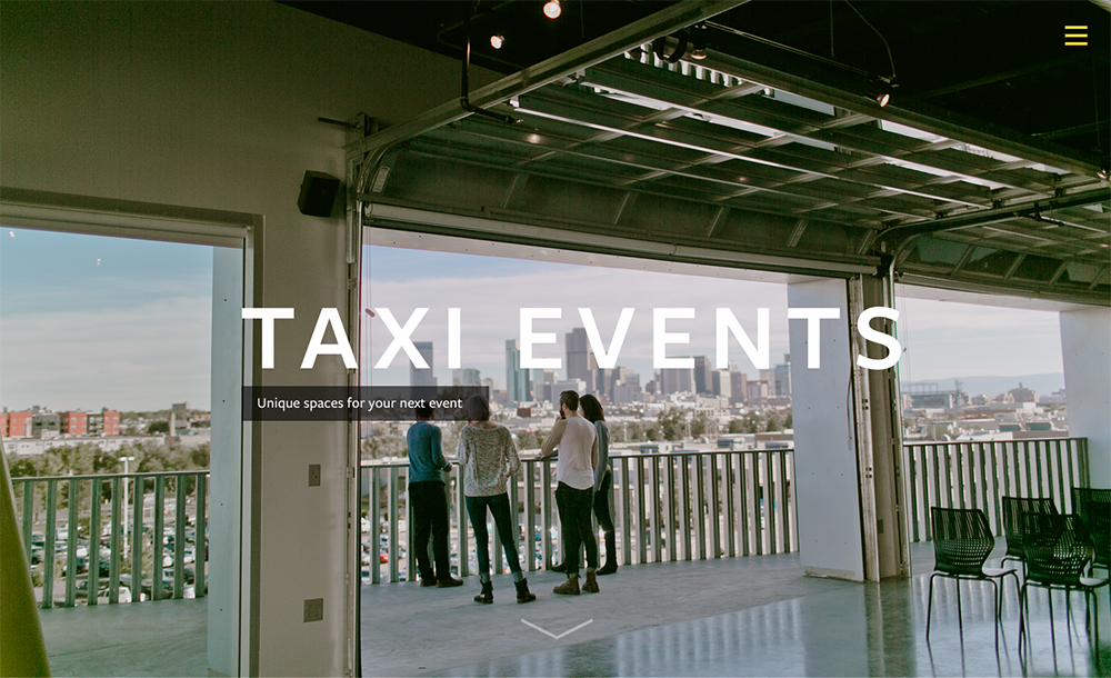
We recently worked with Zeppelin Development in Denver, to design
a site for one of their events spaces. This project gave us room to explore a few ideas before landing on the final design.
Given a style guide and a few sites in the Zeppelin canon, we had plenty of design work to pull from. We decided to try a new direction for Zeppelin, playing off of the flexibility of the event space, using “space” itself as a defining characteristic of the design.
The simplicity of the site—with straightforward navigation and clear hierarchy of content—offers clarity and allows the user to see their event within the borders of a modern, hip space.
Design
Read This Next
- Website Design Audits: The Secret to Sustained Impact
- Celebrating Science: A New Logo & Identity for Sanford Lab’s Annual Science Festival
- 6 UX Exercises to Keep Users at the Center of your Website Redesign
- 6 Guidelines for Accessible Website Design
- Design and User Strategy Workshops Lead to Peak Performance for the City of Boulder’s New Site
Skip to footer
Comments
