_Part 3 of 4 in the series, The Anti-Handoff: A Better Design & Front-end Relationship_
Design
Process
Part 3: Design Quality Assurance
Here we are again. The familiar sinking feeling where front-end goes off into their corner to start building. Should I offer to buy them lunch, knowing this is going to be a bit tedious? Hopefully, if you are following something similar to what we’ve outlined in the last post no one is going to be bribing anyone with baked goods (you should be bringing those in anyway, out of friendship). Regardless of how tight the previous phases were, there are always going to be things that need to be improved upon during implementation. Type will *NEVER* look the same in the browser as it does in Photoshop, it’s just a fact of life. Here are some ways to make this as painless as possible.Chrome Dev Tools
As I said earlier, type will always render differently between Photoshop and the browser. In fact it will render differently from browser to browser and platform to platform. This is just one example of a few things that can change between the designed page and the coded page. Because of this, we figure out what elements are worth exploring more in the browser than Photoshop during the design phase. A way that we can give more exact feedback to the front-end dev is to just jump right into the code itself and start adjusting things. Since Google Chrome has the highest user rate, we conduct design quality assurance (QA) here to try to capture the issues affecting the largest percentage of people we expect to reach. From there we can adjust a number of things and report back to the dev with more targeted answers than “increase the leading of the summary copy.” After we have made the necessary adjustments, we’re able to communicate exactly what we’re looking for to front-end using a common language. This is my favorite way to QA—not only can I jump in the code in a non-destructive way, but it prevents a ticket from going back and forth too many times by providing a more concrete direction.Marked Up Comp
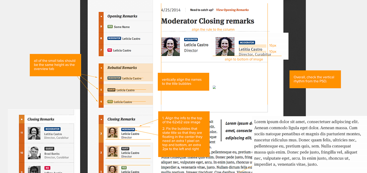
Sometimes, jumping into the code isn’t going to work. A designer may not feel comfortable enough in their skill set to make too many adjustments, or it might take too much time when marking up a side-by-side comp could easily do the trick. As designers, we may have an attention to detail that’s not fair to push on other members of our project team—including front-end. Simply giving instruction to “push this up,” “swap this,” “create more white space” isn’t enough. Including a side-by-side of the comp and the coded page/portion of the page gives the dev more context to suggested changes and how the page is intended to look. Here, I will adjust margin guides, insert pixel values where they are needed, and make annotations about whatever needs work. This is a great way to go about design QA, especially if you and your front-end dev aren’t in the same office or they need to work asynchronously. I tend to do this in Photoshop, since this is what I am most comfortable with, but Skitch can work just as well and tends to be easier when we work on smaller changes.Pulling up a Chair
Project tickets that include HTML/CSS changes or marked up comps are great for sticking in a queue to get back to later. They provide a lot of context for an issue that can be picked up later at the front-end dev’s choosing. However, there are times when the most efficient way to handle a problem is to pull up a chair next to your dev and talk things over. Seriously, it’s as simple as that. This is especially effective when we start getting to the end of a sprint. Being available and on-call to your dev is critical at this point so more time can be spent doing and less time spent looking through tickets. While it’s technically not part of the design/dev handoff (or anti-handoff), QA is an important phase in making sure your dev is supported as they go about their own portion of the project. As much as front-end needs to be engaged and accessible at the beginning of the project, so do we designers toward the end. These tools and approaches will help you to start and finish strong. Next time, we’ll wrap this series up by getting into how we create a rapport with our colleagues and check our ego at the door.Read This Next
- Website Design Audits: The Secret to Sustained Impact
- Celebrating Science: A New Logo & Identity for Sanford Lab’s Annual Science Festival
- 6 UX Exercises to Keep Users at the Center of your Website Redesign
- 6 Guidelines for Accessible Website Design
- Design and User Strategy Workshops Lead to Peak Performance for the City of Boulder’s New Site
Skip to footer
Comments