As a User Experience Architect here at Aten Design Group, a big part of my job is creating effective navigation systems for our digital projects. We start by learning everything we can about our clients’ goals and their users. We ask a lot of questions: what are your users looking for? What tasks are important to them? How and where do they expect to find the information they seek? Seeing things from your users’ unique perspectives is incredibly valuable – and it can be difficult.
At Aten, we’ve used card sorting for years to help provide insight into a user’s point of view. In this post, I’d like to share a few simple takeaways to help get the most out of card sorting.
First, Some Background on Card Sorting
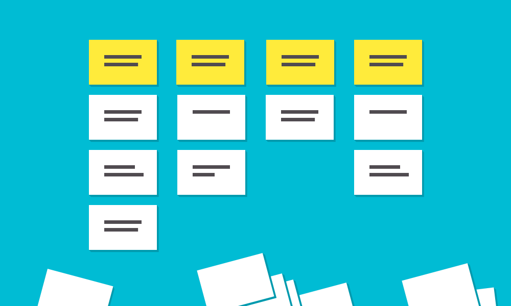
As you might already know, card sorting is a tool for understanding the way an individual expects content to be organized. Card sorts can help shed light on how to structure website content in a way that follows a user's mental model. The exercise basically consists of participants grouping index cards that represent content, then labeling the groups. For more information on card sorting check out this article at usability.gov or a previous Aten blog post on how to get the right results.
Now that the bases are covered, here are a few pointers I’ve learned from personal experience for helping get the most out of card sorts:
Virtual Card Sorts vs In-Person Card Sorts
Sometimes personal schedules and project logistics require that card sorts are conducted online. In those instances, we take advantage of usability software like OptimalSort to help conduct the exercise. That said, we strongly prefer in-person card sorting with good ol’ fashioned tools like index cards and markers. Either way, the takeaways should be the same: content organized by your users’ needs. I’ve found that when you occupy the same space, manipulating physical objects, there’s more opportunity for open discussion and team-building – and it’s just more fun.
Open Card Sorts vs Closed Card Sorts
In both open card sorts and closed card sorts, participants are asked to organize their cards into groups based on similarity. During closed card sort, participants are provided a list of categories to group their cards into. In an open card sort, users choose both the number of categories and the names of their categories.
I almost always prefer open card sorts because they give better insight into your users’ thought processes, how they group content, and the terminology they would use – rather than forcing them to use predefined categories. Gathering users’ ideas and suggestions for names, labels and even the number of categories to use goes a long way toward better understanding their mental model, and as a result, makes your website more intuitive.
Also, open card sorts can produce really interesting – and surprising – results. We once had a participant who quickly sorted his cards into three groups and labeled them, “read now,” “read later,” “throw in the trash.” While that’s obviously not what we went with for navigation labels, the experience provided valuable insight into how at least one user prioritized content.
Schedule at Least an Hour
When it comes to the amount of time to conduct the exercise, I recommend scheduling at least an hour for each session. This provides the participants with enough time to digest the cards and properly categorize them as well as time for an open discussion once the exercise is complete. This also allows you, the facilitator, to observe and ask questions.
Don’t Get Stuck on the Labels
Often times people (especially those closest to a project) can get tripped up thinking too much about labels for their categories. Some participants think the cards are going to translate directly into navigation labels, which can cause them to overthink the exercise. I always let participants know I’m much more interested in the categorization itself – that is, which things go together – than in labels themselves.
Fresh Perspective is Important
I’ve run card sorts with project teams, staff, internal stakeholders, clients’ customers, and outside volunteers who had no involvement in the project whatsoever. It’s helpful to get as many unique perspectives as possible. A path that one user would take might be completely different than another user – especially when they belong to two different audiences (i.e. a staff member versus a customer). It’s important to understand these different points of view in order to effectively prioritize them and create the best user experience possible. Your actual users’ perspectives are the most valuable: a card sort with customers typically provides far greater insight than a card sort with staff.
What’s Your Experience?
Card sorting is an effective tool for providing insight into a user's point of view and informing your decisions around categorization of content. These are a few of my own takeaways that have helped make a difference between good results and great ones. What are some tips you follow for card sorting? I’d love to hear your feedback.
