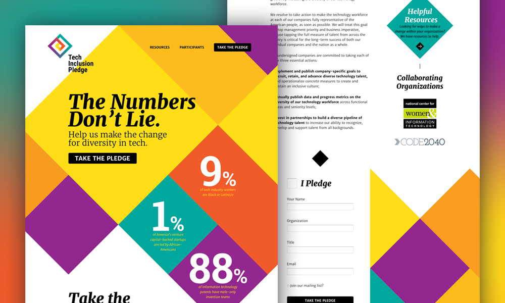
Digital tools have transformed the way people connect with organizations and altered how we engage with campaigns and movements. When Aten was invited to join up with the National Center for Women and Information Technology and create the Tech Inclusion Pledge microsite the goals were clear: design an experience that petitions a pledge from senior leadership at major tech companies to recruit, retain and advance diversity in the technology workforce.
The platform needed to be simple and avoid hosting large, cumbersome amounts of content while maintaining an informative and appealing quality capable of leading prominent technology leaders to take the pledge. Most campaign and advocacy sites have an intended course of action and the Tech Inclusion Pledge is no different, but instead of content being king the design needed to take the lead to engage users effectively.
According to Ken Woodworth, Aten’s Vice President of User Experience, “Establishing user goals early on is key to the success of the work.” When designing action-driven digital products it’s beneficial to apply user experience best practices, conduct core model exercises and have a deep understanding of the audiences who will be visiting and using the tool.
Everything we build at Aten puts users first. Understanding how to align content with user needs and business goals is a big part of that user-centric process. Collaborative kickoff conversations are necessary to identify audiences and understand campaign goals. While the team tasked with designing and developing the Tech Inclusion Pledge had free range to create the platform, taking initiative to realize goals early meant moving in the right direction from the start. Getting it right the first time was essential due to the quick turnaround time.
For this project, the design came first. One of the initial ideas was to move away from using traditional horizontal bars to break up content. Instead, the design concept employs a diamond motif allowing the site to highlight quick and important facts in a bold manner and draw users down the page. Early conversations also informed unique color schemes that wouldn’t be associated with any one group of the Tech Inclusion coalition. In place of recognized brand colors, using a color scheme that was original and inspiring was necessary. The bold saturated colors you see on the pledge highlight facts and contrast with the white space for an active and lively design.
Check out the Tech Inclusion Pledge and let us know what you think. If you’re interested in learning more about the project or any of the practices mentioned contact us.
Read This Next
- Website Design Audits: The Secret to Sustained Impact
- Celebrating Science: A New Logo & Identity for Sanford Lab’s Annual Science Festival
- 6 UX Exercises to Keep Users at the Center of your Website Redesign
- 6 Guidelines for Accessible Website Design
- Design and User Strategy Workshops Lead to Peak Performance for the City of Boulder’s New Site