
I am sure as you browse the web today you have come across a familiar pattern for displaying content within card-like rectangles. These cards introduce a unique new way of presenting content and there is a clear trend driving their use by big web players, including but not limited to Pinterest and Google+. The question is: are these cards right for your interface? The answer: It depends.
 As with all design, the intent is to help users achieve their goals. Users have different needs but mostly they either want to find something quick or they want to kickback, explore and find things at a leisurely pace. Both needs require very different approaches in order to create the best user experience.
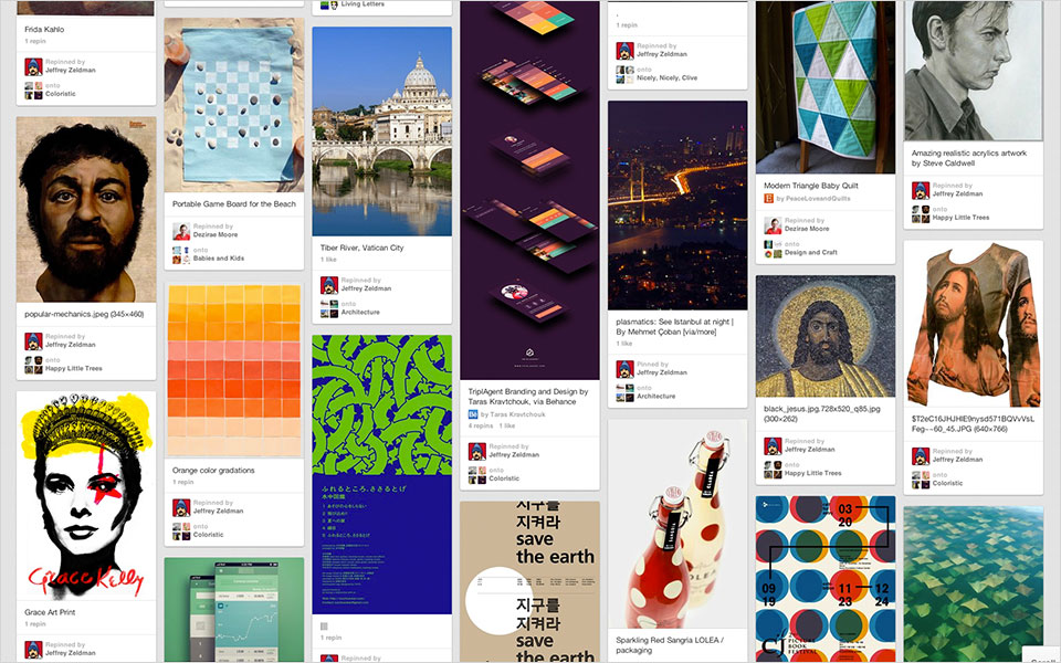
 This works great for a service like Pinterest, since their goal is to help users explore their site for as long as possible while making it possible for authors to display variable lengths of content. On the contrary, this method is problematic when the goal is to help users quickly and easily find what they are looking for.
 However, even with its improved structure, this method might not be optimal when faster scanning is required, especially in the case of search results or chronological lists.
Design trends emerge and it’s important for us as designers to pay attention and try to capitalize on them, but not blindly. Intriguing as they might be, new trends don’t always serve your users. The key lies in knowing how to bend trends enough to improve the user experience.
Design
Usability
User Experience
As with all design, the intent is to help users achieve their goals. Users have different needs but mostly they either want to find something quick or they want to kickback, explore and find things at a leisurely pace. Both needs require very different approaches in order to create the best user experience.
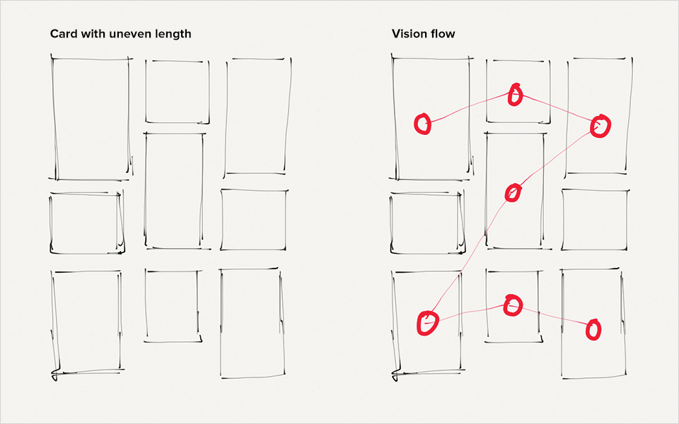
Uneven Length Cards
Let's first look at the method allowing for cards to have uneven lengths. This method is more flexible and fluid since variable heights mean cards can stack one against the other without conforming to a strict grid system. This approach encourages exploration by making it difficult to follow a structured orientation of content and eliminates any visual patterns for users to follow.
This works great for a service like Pinterest, since their goal is to help users explore their site for as long as possible while making it possible for authors to display variable lengths of content. On the contrary, this method is problematic when the goal is to help users quickly and easily find what they are looking for.
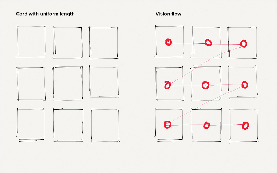
Uniform Length Cards
In the second method, enforcing uniformity to their heights, cards will organically stack along a structured grid. This will result in similarity and creates a faster path for users to follow.
However, even with its improved structure, this method might not be optimal when faster scanning is required, especially in the case of search results or chronological lists.
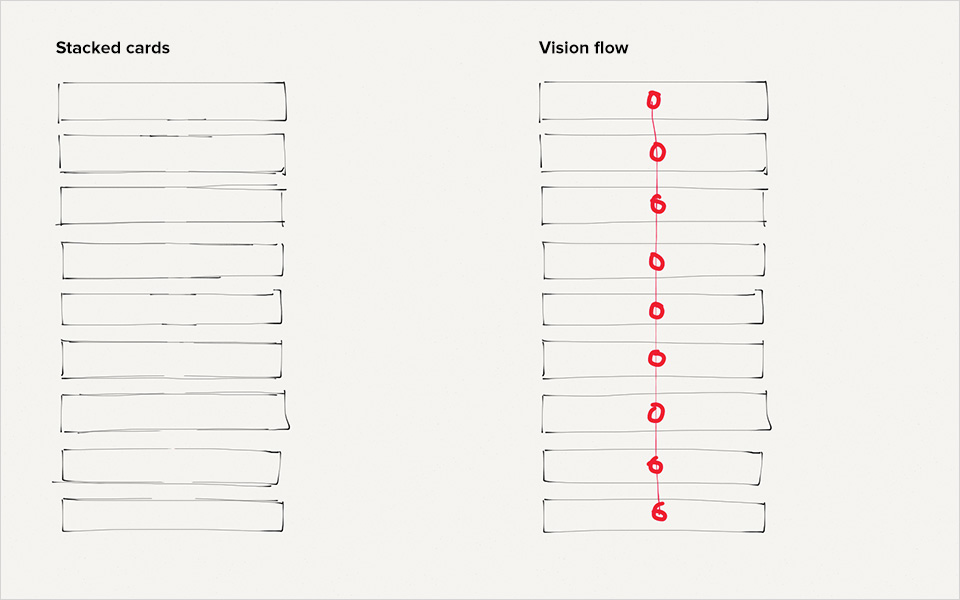
Need For Speed
To smooth out the flow further and speed up readability, a single column structure must be introduced by widening cards to take the full width of the column. This creates a stacked tower that facilitates free fall flow for users’ vision to follow and eliminates any zig zag eye movements.
Design trends emerge and it’s important for us as designers to pay attention and try to capitalize on them, but not blindly. Intriguing as they might be, new trends don’t always serve your users. The key lies in knowing how to bend trends enough to improve the user experience.
Read This Next
- Website Design Audits: The Secret to Sustained Impact
- Celebrating Science: A New Logo & Identity for Sanford Lab’s Annual Science Festival
- 6 UX Exercises to Keep Users at the Center of your Website Redesign
- 6 Guidelines for Accessible Website Design
- Design and User Strategy Workshops Lead to Peak Performance for the City of Boulder’s New Site
Skip to footer
Comments