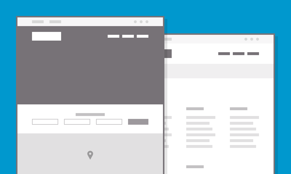
Wireframing is an integral part of our process. Our UXAs (User Experience Architects) use wireframing as a way to convey content hierarchy, content groupings and general structure. As a visual tool it helps our clients to see the weight and relationships of their content in an easy to digest format that content maps just don’t deliver. That’s why wireframing is a staple in our UX toolbox.
As great as our wireframes are, I’ve been throwing around the idea of taking them further by creating them from the perspective of a UXD (User Experience Designer), and hence with a more design-centric focus. Where they stand now, (a black and white document with grey boxes and system fonts, little focus on visual design) they provide concrete ideas about content hierarchy, but sometimes mistakenly convey layout and design as well. If we're going to imply layout and design, we might as well imply the right layout and design.
Using wireframes as a way to explore architecture and design simultaneously seemed like an interesting path to follow. Could producing higher fidelity wireframes be a way to get into design quicker and improve the UXD’s understanding of the content hierarchy and structure, all while creating more rapport between our architects, designers and the client?
I recently experimented with this approach while working with the Alda-Kavli Learning Center for Science & Communication by creating wireframes myself from the content maps provided by the UXA. I still went in with a black and white tool set and still used boxes to convey content sections and groupings -- but this time, the grid started to come alive. Instead of waiting until the design phase to integrate the grid system, I set it in wireframing. All of those boxes started to neatly line up. I applied the client’s brand fonts and started dipping my toes into what the design could be.
Getting a jump on design wasn’t the best part. The UXA and I started having more conversations about the content than we ever had in the past. I found that the project goals and objectives -- and specifically how they applied to each page we wireframed -- became clearer, much faster in the process. I also felt much more confidence moving into design as a result.
Presenting the wireframes to our client went great. The normal “Don’t look at this from a design perspective,” conversation was replaced by a natural and productive segway into layout and font choices. It removed the compartmentalization I often experience between architecture and design efforts. I was able to talk about the design and content more confidently and as a result the client and I found ourselves in a much more collaborative place. Instead of adjusting the wireframes based on the client’s reactions, we applied their feedback in design because I had a firm grasp of what exactly needed to change. Designer wireframing win!
In some cases experimenting and innovating within our process can help to better serve clients and improve collaboration. If you’d like to read about our design process at large, check out this great post by our VP of UX, Ken Woodworth.