Imagine you are visiting one of your favorite websites. You type in the URL address into your browser and hit the enter key on your keyboard. You wait a couple of seconds (because that is all we can really expect to wait for a website nowadays) and nothing.
That’s okay though, because being your favorite website, you can afford the extra couple of seconds for the page to light into life… You wait another couple of seconds… that’s okay because you’re sure there is a lot of magic happening behind the scenes to send you to the land of website awesomeness. The browser’s circle spinny thing continues to rotate peacefully as your sense of peace begins to dwindle; we’ve all been there. A few more seconds pass by with the website unabated by its loading…
Why We Optimize Images
For some, or most of us, this experience is altogether too familiar. And if we happen to be visiting a website that isn’t as important to us, we won't be willing to wait as long for it to load. For a lot of websites, load times can greatly affect the way that users choose to navigate the web.
What is the main source of these increased load times? It is almost always images and other file resources that have not been optimized. Even just one megabyte worth of images or other media could cause a website not to be as snappy upon load, and if users are viewing a website from a mobile device on a cellular network, websites without optimized images and resources may never even see the light of day.
This is where image optimizations in Drupal come in. The Drupal content management system offers easy-to-configure means of optimizing images and other resources so that users across the web, across devices and networks and connections, can easily access your website and its content with ease. The following set of steps will take you through the very first, and most important part of optimizing images on your Drupal website.
Step 01 - Modules
There are several Drupal Core modules that are responsible for formatting your images in a way that makes them more responsive and optimizes them at the same time.
- Breakpoints: The Breakpoints module is a core Drupal module, so it is available to you right away when setting up a Drupal system. This module integrates the breakpoints.yml file as system events that can trigger changes for different breakpoints.
- Responsive Image Module: The Responsive Image module is also a core Drupal module, and is also available to you right away when setting up a Drupal system. This will allow us to define and ultimately curate those images into an HTML5
- Optional Modules: Media and Media Library are both Drupal Core modules and although optional in the image optimization process, both will offer site editors easy interfaces and simplified media entity management across your website.
Step 02 - Breakpoints
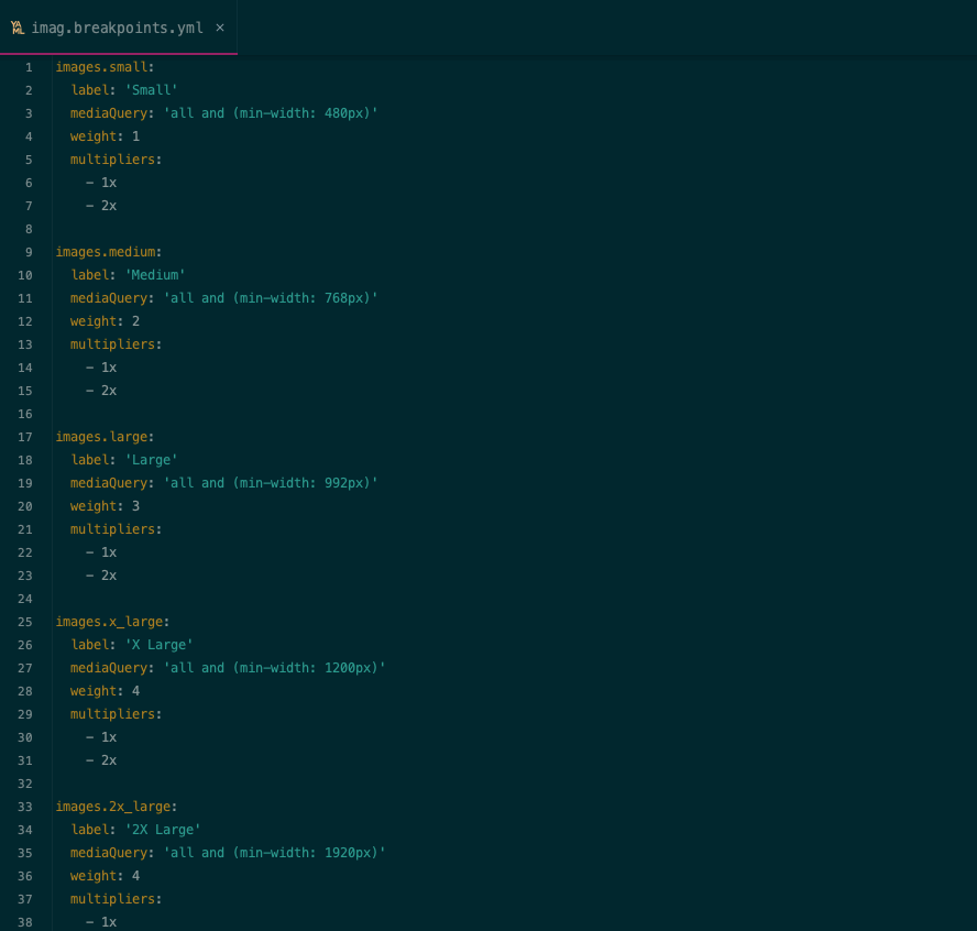
This is the only part of this process that requires a bit of code configuration, which will reside within our website’s theme directory. A YAML file, with the extension .yml dictates at which screen size or device width to show different variations of images. This is important so that we are loading the smallest available images on smaller devices, while maintaining optimized, high resolution images on larger desktops and devices.
- Keep it simple: When defining breakpoints and when ultimately creating the image styles that are applied to images at different breakpoints, we want to keep it as simple as possible. With each image style that you create in Drupal, Drupal will be generating a related image file. So we definitely do not want to be generating a ton of images for just one picture element.
- CSS Media Syntax: Breakpoints are defined using CSS media arguments. These read different types of media (screen, print, etc) and use CSS properties to set specific theming. In this case, we’ll use them in the Picture tag we are building.
- Retina: With the innovation of high-density graphics displays, HTML5 image elements now include pixel density settings. Computers such as newer generations of Macs have more advanced graphics settings and can load even higher quality images at double, or even triple the amount of pixels.
Step 03 - Image Styles
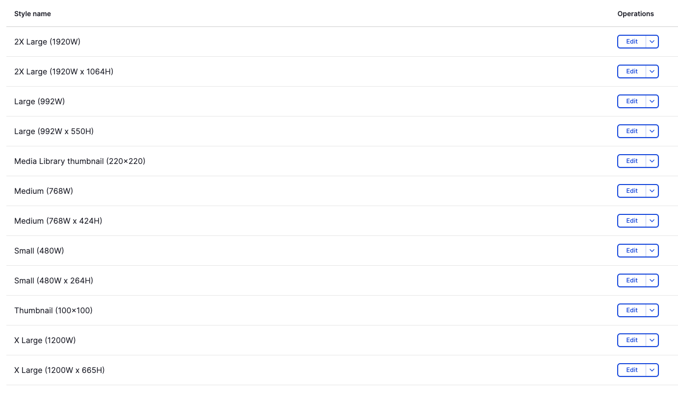
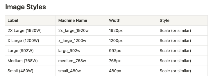
Now we’ll get back to a part of the process that you may be more familiar with and does not require even the slightest bit of code. In Drupal we’ll be creating image styles to plug into each of our different breakpoints that we’ve just defined.
- Navigate to the Image Styles configuration page in Drupal – /admin/config/media/image-styles
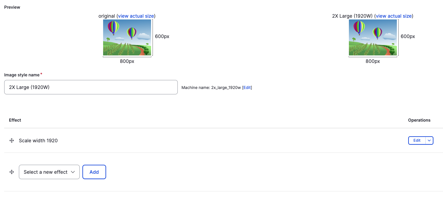
- Click on the “Add Image Style” button, defining the human readable label, as well as any effects that you feel are necessary for that individual image style. These settings will most likely be something to the effect of scaling and cropping and further optimizing sizes of images that you want Drupal to output from uploaded images.
- Add image styles for each applicable breakpoint, as necessary for the final image sizing on your website.
Step 04 - Responsive Images
Now it’s time to plug and play. We’ll be injecting each of our Image Styles, where necessary, into Responsive Image Style settings in Drupal.
- Navigation to the Responsive Image Styles configuration page in Drupal – /admin/config/media/responsive-image-style
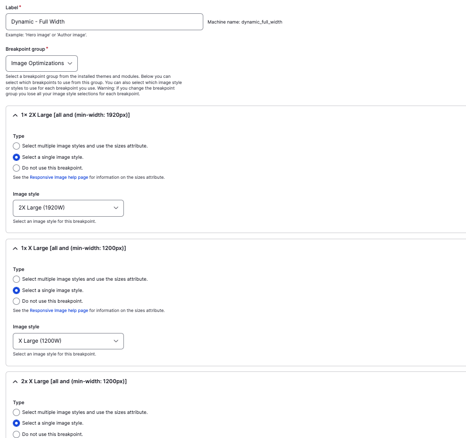
- Click on the “Add responsive image style” button, defining the human readable label and selecting the custom Breakpoint Group that we defined using the YAML file in step 02.
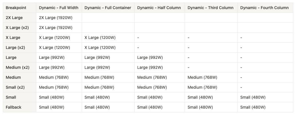
- Under each applicable breakpoint, select the corresponding image style that we had just defined in step 03 by selecting the “Select a single image style” and selecting the image style.
- Notice that the smaller the situation or the image that you need as the final output on your website, the fewer image styles and breakpoints that you need to set. For instance, teaser images only ever display as smaller and never get as big as, say, a banner. So we only need to set up to a certain breakpoint size and we only need to define a smaller set of image styles.
Step 05 - Media Entities
As previously mentioned, setting up media entities through Media and the Media Library in Drupal is an optional step, but one that is detailed here, and one that is the recommended approach for easy media management in Drupal.
- Navigate to, and create view modes for media entities that are consistently named according to the Responsive Image Styles defined in step 04 – /admin/structure/display-modes/view
- Now, when we are configuring the “Manage Display” for an image media entity, we will be able to enable the newly defined view mode.
- Set the image field widget to “Responsive Image” and select the corresponding Responsive Image Style.
- When applying widgets to media entity reference fields across the website now, select “Rendered Entity” and the view mode for which we just set on our media entity, to display any uploaded images as responsive images.
Example Configuration Sets
Here is a table laying out the sets of Image Styles into their respective and appropriate Responsive Image Styles. These are purely examples of how a Drupal website may be set up, but because of the curative nature of the
Performance Check
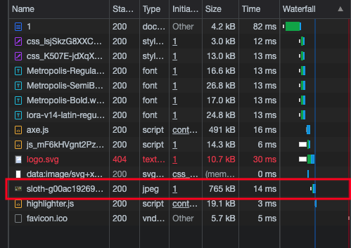
Now that we have all of the Image Styles and Responsive Image Styles set up, and we’ve applied these configurations to image fields across the website, we can now see the differences and effects that these configurations have on overall website performance. Checking the website load time and Google Lighthouse scores shows us that images now respond to load at a faster rate, and the smaller versions of a single uploaded image are now being used on smaller devices, cutting the load time on these devices substantially.
To Infinity and Beyond
Through the Drupal media management system, we’ve now built in a way for Drupal to build a responsive Picture element for us, all while only needing to upload one single, high resolution image. We then unlock a way of loading in a single – appropriate to the size of the device it’s being viewed on – image from a set of images that have been created for us by Drupal. With this all in place, it now takes a fraction of time and resources to display an image within any given device: mobile, desktop, tablet, etc. Search Engines like Google also see these picture tags and appropriate responsiveness as important and rank that content higher in search.
Read This Next
- Introducing Entity Webhook: Config-Driven Webhook Integration for Drupal
- Simplified Drupal Views Styling with Custom Style Plugins
- Leveraging Laravel to Modernize Guttmacher Institute’s Database
- Enhanced Bot Protection with Cloudflare
- The Hidden Costs of Choosing Budget Hosting for Your Drupal or WordPress Website


