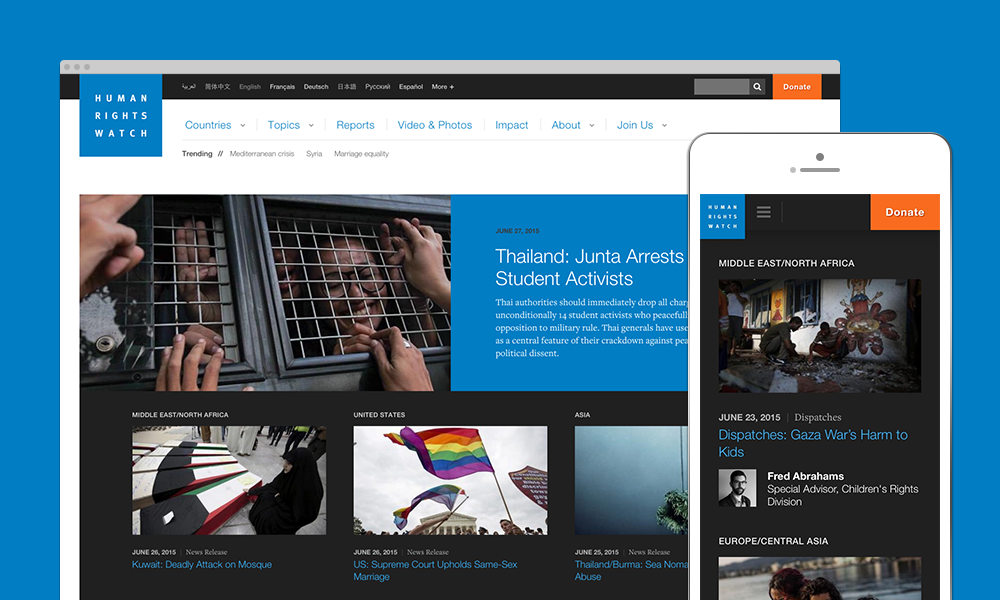
Earlier this week the new, responsive HRW.org went live. The launch follows months of strategy, design and development collaboration between my hard working colleagues at Aten and the passionate, talented team at Human Rights Watch.
The process began a year ago with in-depth strategic conversations and discovery workshops at HRW's NYC headquarters. For an organization with so many stakeholders, each with roles and concerns vital to the overall mission, crafting a digital content strategy that aligns diverse internal perspectives with user-centered information architecture was absolutely critical. We started with audience surveys, stakeholder surveys and days of in-person interviews to learn as much as possible about the diverse goals and needs for the project.
Over the months that followed, we worked with HRW to create a flexible information architecture and design system that is bold and content-forward. We designed for readability, making certain that HRW readers would have a pleasurable and unencumbered reading experience however they are accessing the website. Long-form reports feature highly functional, in-page navigation. The redesign is beautifully responsive, serving an exploding range of screen sizes and devices.
We built the new HRW.org in Drupal 7, migrating tens of thousands of distinct nodes – in more than eight languages – from their legacy system.
We are honored to have been a part of this redesign and thrilled with the outcome of the project. Look for a full-length case study in the days ahead; in the meantime, visit the new HRW.org.
