Whitespace is an invaluable asset to design. Aesthetically, it gives a sense of professionalism and modernity, which can lead to increased credibility and trust. From a more utilitarian standpoint, it has the power to improve legibility, making it easier for a message to be absorbed by its audience. When people are able to quickly absorb information, it’s more likely the goals of the site will be met.
Emphasize visual relationships
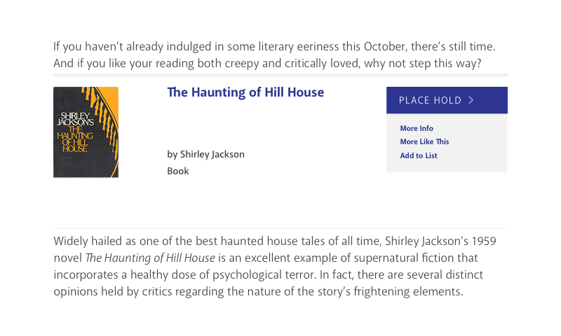
One key task of whitespace in the context of legibility is establishing visual relationships and associations between different elements on a page. For example, in the image below, it’s hard to absorb the content and understand how the pieces relate to each other.

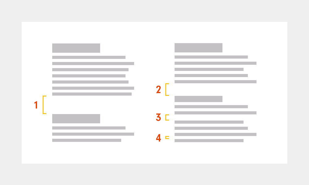
In this next image, a strategic hierarchy of padding is established, creating associations between sections of content. There’s a smaller amount of space between items that are the most closely related, such as items within the same paragraph or element. There’s a slightly larger space between items that aren’t as closely related, such as items in different sections.

Consider the whole system
Vertical padding must be considered in both the context of an entire page and an entire site—not just isolated areas. In order to maintain the scale of hierarchy between very closely related elements, on the opposite end of the spectrum, there might need to be a relatively large amount of whitespace to differentiate separate sections of the site.
Next time you’re thinking about removing whitespace in a specific place on your site, consider the implications such a change might have wholistically. What may seem like a minor change could have a huge influence on overall site usability, which ultimately impacts the success of organizational goals.