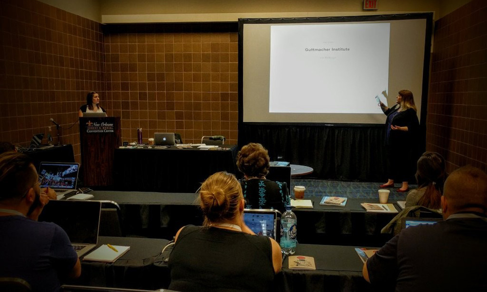
At this year's DrupalCon in New Orleans we had the opportunity to teach our Design & UX Discovery Workshop. We were expecting the conference to be flooded with Drupal 8 trainings, so we jumped at the chance to participate in the User Experience track to shake things up a bit.
We engage our clients in a very similar, albeit more expansive workshop to immerse ourselves in their brand and project needs at the beginning of an engagement. We’ve found so much success in this model that we decided to help our nonprofit and higher education in-house teams find ways to incorporate it into their workflows.
If you weren’t able to attend our workshop, here are the three things we think you should know about starting your project off right:
- Our favorite discovery session, the Core Model, focuses on the intersection of user tasks and business goals, balancing the focus between the organization’s needs and their users’ needs. We were excited to watch one of our students have a real content revelation while she was mapping content paths for her own organization. It helped her realize that she didn’t need the same content on many different pages, that with clear content paths she could achieve guiding her users to the content they need. If you would like to dive deeper into the Core Model, read our post.
- We engage in a Sketching Exercise as a follow up to the Core Model. We create rough sketches for the core content that we’ve identified. I use sketch loosely because we are really trying to establish content hierarchy, so no drawing skills required! But when we can get our ideas out loosely and quickly… we find that we treat them less preciously and can get to the best idea faster. In our training we were pleased to see that one particular group had made 3 or 4 different sketches as a way to challenge and evaluate each other’s sense of hierarchy.
- Creating a Comparative Design Analysis is a great way to survey the landscape of competitors across a variety of design concepts. We compare competitor’s sites and branding to the goals of the project and determine where the organization would fit in the spectrum of concepts like color, imagery, and interactivity. It was a great way to engage the room and help guide them through something that feels intuitive, breaking it down into a more analytic process where we identified colors, typography and imagery. Everyone seemed to enjoy the exercise and felt comfortable learning to speak a common design language.
Have any questions or tips and tricks for kicking off a successful discovery phase? Let us know in the comments!