Authors

James Nettik
Senior Developer Manager
Icons seem like a small implementation detail until a site has a large design system, multiple authoring workflows, and content that changes independently of the theme.
Then a basic question becomes important: who owns the icon?
For some parts of an interface, the answer is clearly the theme. Alert states, event metadata, and other stable UI patterns should remain predictable.
Other icons behave more like content. Authors may need to choose an icon for a navigation item, card, banner, or other component. In those cases, hardcoding the choice in the theme creates a dependency between content and code that becomes difficult to maintain.
The goal is not to move every icon into Drupal. It is to give the right people control over the right decisions.
Start with ownership
I generally think about icons in two groups: icons whose meaning belongs to a fixed interface pattern, and icons whose meaning belongs to authored content.
An alert is a good example of the first group. Drupal or an author might determine that an alert has a warning status, but the theme should decide which icon represents “warning.”
Event metadata works the same way. Date, time, and location have stable meanings within an event teaser. Those icons belong to the component, not to an individual event.
Hardcoding those relationships protects consistency.
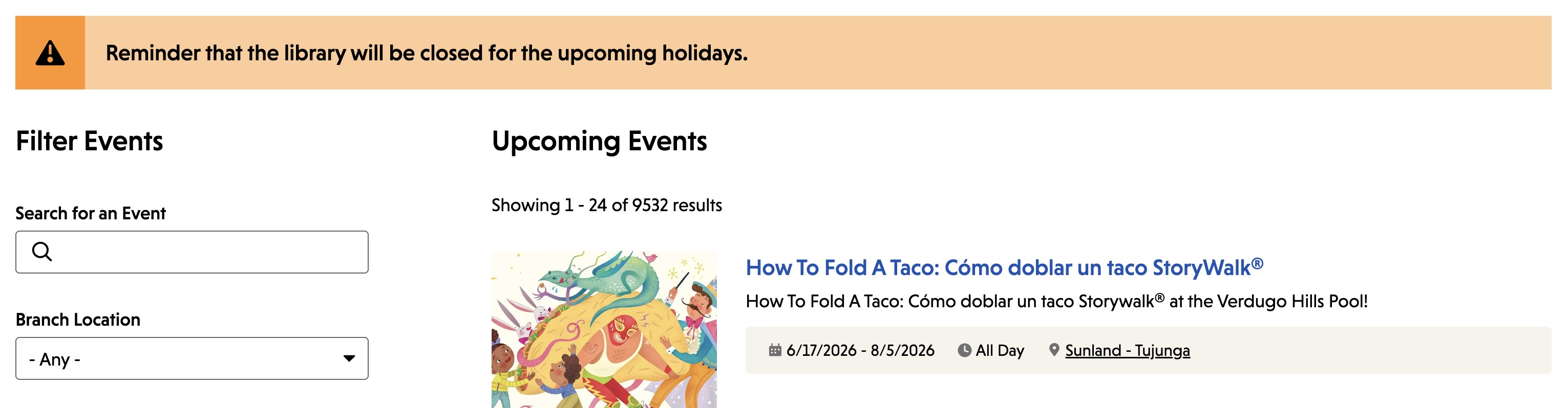
A site menu is different. Authors add, remove, rename, and reorder menu items. If an icon describes the purpose of a particular link, it should usually travel with that link rather than with its position in a template.
Component-based authoring introduces the same issue. An author might select an icon for a card or a decorative treatment for a banner. If that component moves or is reused, the visual choice should move with the content.
Most interfaces contain both models at once. A card might have an author-selected icon and a hardcoded arrow that communicates that the card is a link. A menu item might have an author-selected icon on the left and a fixed chevron on the right when it has children.The useful boundary is not Drupal versus the theme. It is which part of the system owns each decision.

When authored icons live in code, things get brittle
Menus make the problem especially visible.
A developer can attach an icon to the second menu item with CSS, but that relationship breaks as soon as an author inserts another link above it. Targeting a specific menu item identifier is more stable, but it still creates a developer-maintained connection between content and theme code.
A select list is another common approach:
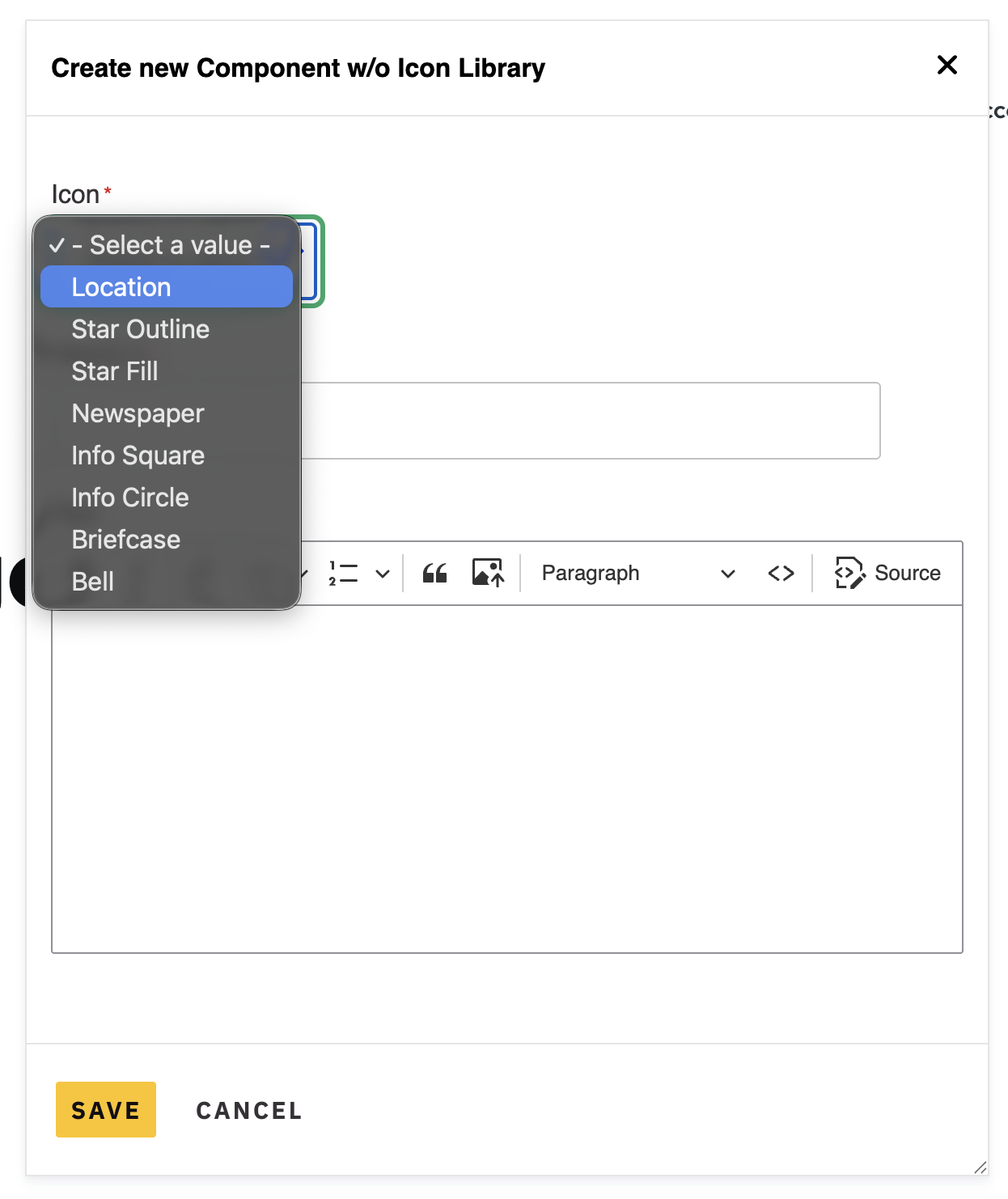
For a small icon set, this can be perfectly reasonable.
The problem appears as the library grows. Authors are asked to understand the design system through filenames. The distinction between calendar, calendar-outline, and calendar-filled may be obvious to the developer who added them and much less obvious to someone building a page later.
Adding a new option may also require a theme change and deployment.
From the author's perspective, this is a content problem. From the developer's perspective, it is a theme problem.
Drupal already has a better interaction model for choosing visual assets.
Use Media when the icon is an authored choice
When authors choose an image, we do not normally give them a dropdown containing every filename on the site. Drupal's Media Library gives them visual previews, search, filtering, reuse, and asset management.
That interaction makes sense for icons too.
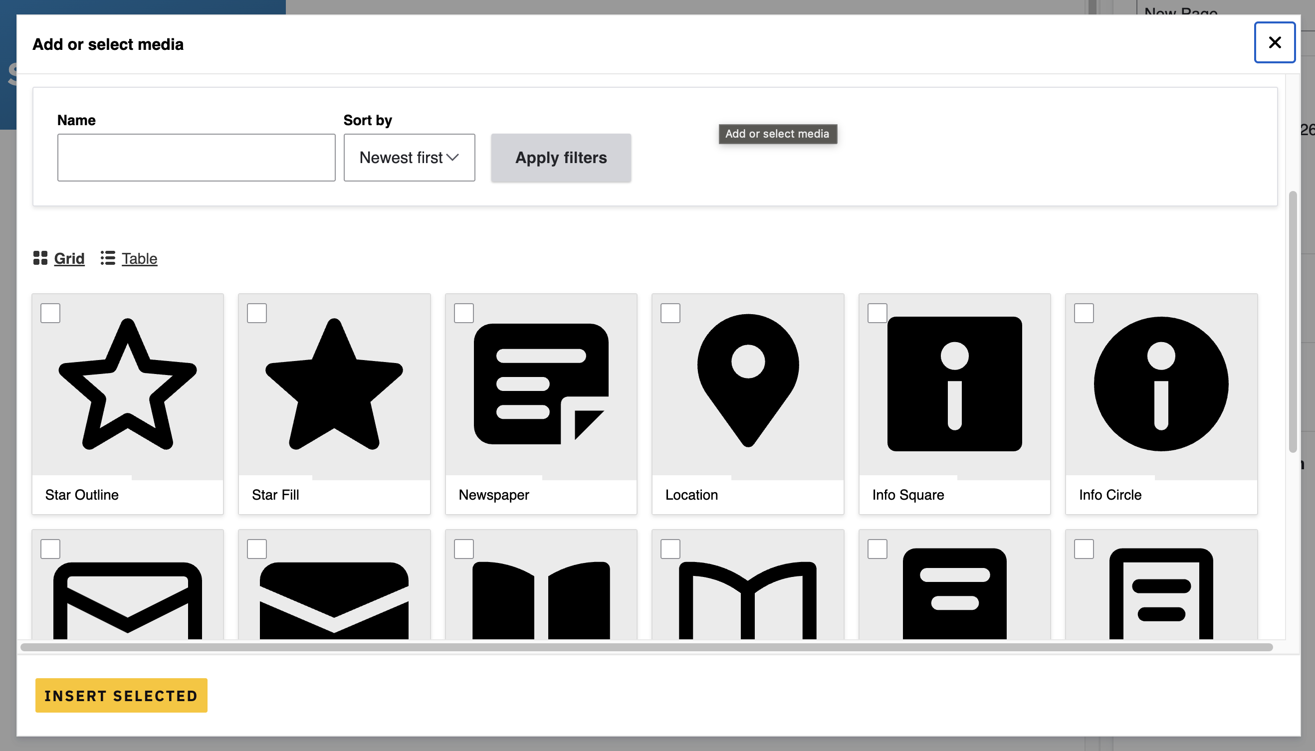
With SVG Image, SVG files can participate in Drupal's image field ecosystem and can be rendered as image elements or inline SVG markup.
Once icons become Media entities, they can also use Drupal's normal content model. They can have useful names, categories, permissions, and usage guidance. Views and reference configuration can limit which assets authors see in a particular context.
That matters because an icon library is rarely one undifferentiated collection.
Graphical UI icons used in menus or calls to action likely aren’t used in the same way more decorative accents are. The overhead of deciding which icon type should be used in which context shouldn’t be left to the author if we can provide clear guardrails.
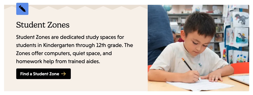
This is where Media becomes more than a nicer picker. It provides a governance model.
Menus can gain Media reference fields through tools such as Menu Item Extras. Component systems based on Paragraphs can attach icon choices directly to the structured component. Style Options - Media Reference provides another way to expose Media selections in component configuration.
The exact implementation will vary by project. The important part is that once an icon becomes an entity, Drupal's existing fields, permissions, and filtering tools can manage it without requiring a custom icon picker.
Keep rendering predictable
Moving icons into Media improves the author experience, but the theme still needs a reliable rendering model.
The rule I use is simple:
HTML chooses the icon. CSS styles it.
Drupal or Twig should determine whether an icon exists and which icon it is. CSS should handle size, spacing, alignment, color, and interaction states.
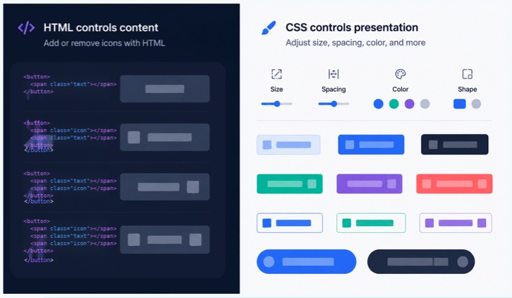
That separation works particularly well with inline SVG. The SVG can inherit color from the component, respond to interaction states, and remain part of the markup rather than being hidden inside a stylesheet.
It also keeps accessibility decisions closer to the rendered interface. Decorative icons can be hidden from assistive technology, while meaningful controls can rely on appropriate accessible names rather than asking the icon itself to carry all of the meaning.
I previously built a small Twig helper in the Utility Belt module to make theme SVG rendering easier. It solved a practical problem, but Drupal's newer Icon API offers a more standardized direction.
Drupal 11.1 introduced an Icon API that allows themes and modules to expose icon packs through a common rendering system. Contributed projects such as Icon Media Pack are exploring how Media bundles can participate in that model.
That creates an interesting division of responsibility: Media can handle author-facing governance, while the Icon API can provide developers with a predictable rendering path.
There are still exceptions.
Native form controls sometimes need icons as CSS backgrounds or masks because their markup cannot easily contain rendered SVG children. In those cases, keeping a small set of duplicate assets in the theme can be a reasonable tradeoff.
The point is not to eliminate every exception. It is to make the boundary intentional.
Give each part of the system the control it needs
An author-friendly icon system is not one where authors can change every icon.
It is one where authored decisions are actually authorable.
If an icon belongs to a stable interface pattern, keep that relationship in the theme. If the icon represents something an author is creating or organizing, consider modeling that choice in Drupal.
Media can provide the visual browsing and governance authors need. The theme can continue to protect rendering and presentation.
That division is more maintainable than treating icons as entirely theme code or entirely content, and it better reflects how complex Drupal sites actually operate.
Read This Next
- The Cost of Waiting: Why CMS Maintenance Belongs in Every Website Budget
- Choosing a Multisite Approach in Drupal
- A/B Testing in Drupal Without the Enterprise Price Tag: A Practical Guide Using the A/B Test JS Module
- Using AI to Moderate Content in an Existing Drupal Workflow
- Drupal Metatag Module Basics for Content Editors