Drupal website redesign Tampa International Airport
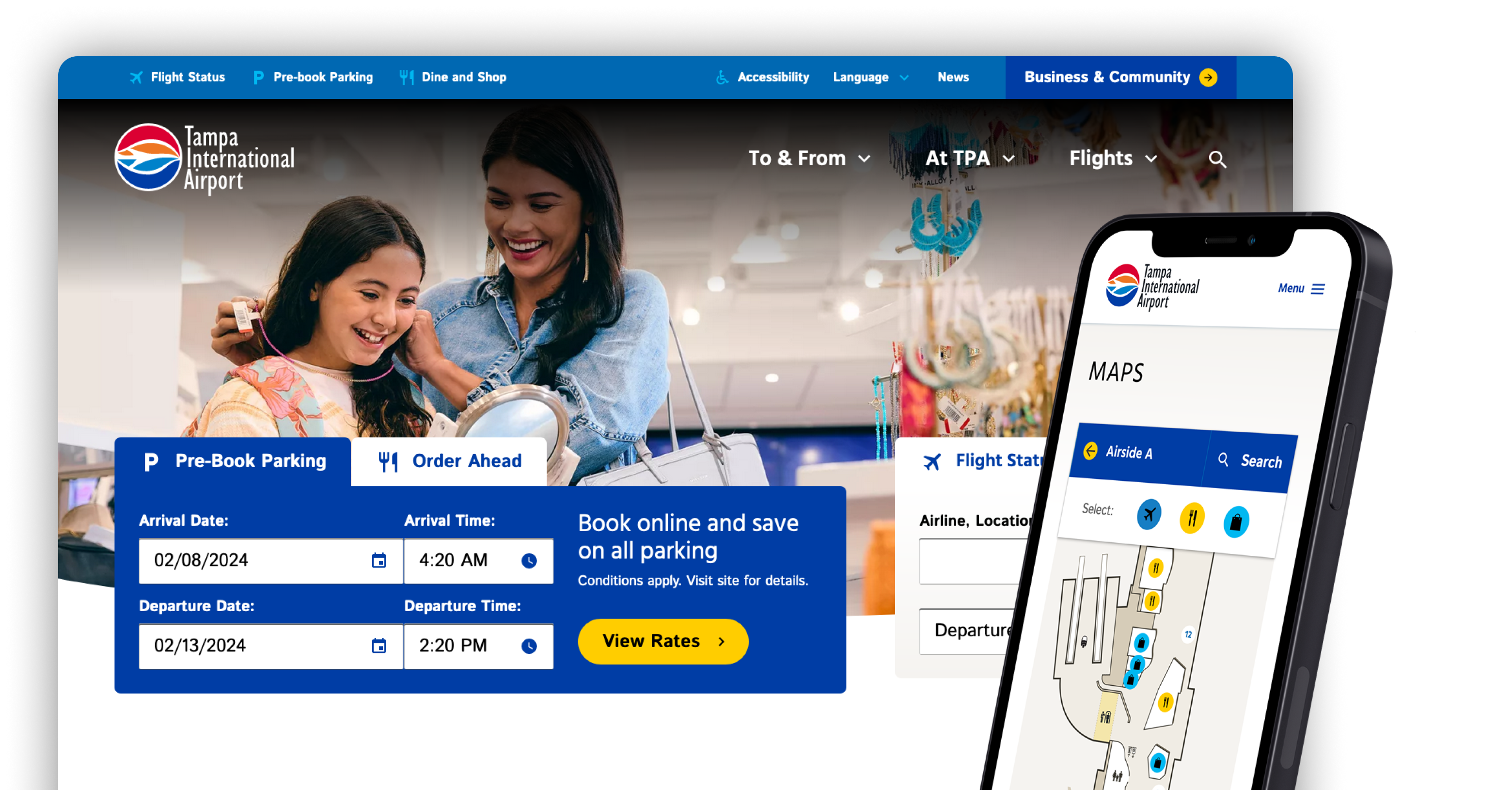

User- and Revenue-Driven Drupal Website Redesign
Recently ranked as the nation’s No. 1 large airport for customer satisfaction according to J.D. Power, Tampa International Airport (TPA) has built a reputation as a traveler- and community-friendly destination. While TPA hosts 21 million passengers annually, its website serves not only travelers but also employees, businesses, partners, airlines, and more.
Given the airport’s traveler-friendly reputation, TPA hoped to mirror its user-focused and easy-to-navigate airport experience via a redesigned website. Additionally, stakeholders wanted to not only drive concessions pre-ordering and parking revenue but also ensure they understood and then met the needs of the airport’s myriad user groups.
Aten launched the project with an in-depth discovery phase meant to identify the needs of multiple user groups and craft a clear reference point to drive decision-making. Using the resulting insights, we devised an intuitive and easy-to-navigate Drupal 10 website hosted on Acquia. We put diverse user needs top of mind, baked revenue drivers into the navigation, and featured the same bright and open aesthetic that greets TPA visitors every day.
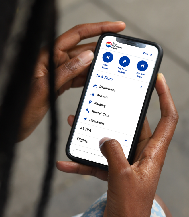
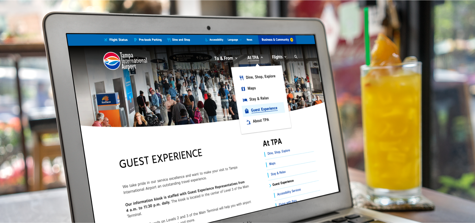
Myriad Stakeholders, Diverse Needs
We first needed to clearly categorize and understand the needs of TPA’s user base, comprising travelers as well as partners/businesses (e.g., airlines, retailers, restaurants, job seekers, airport executives, employees, and more).
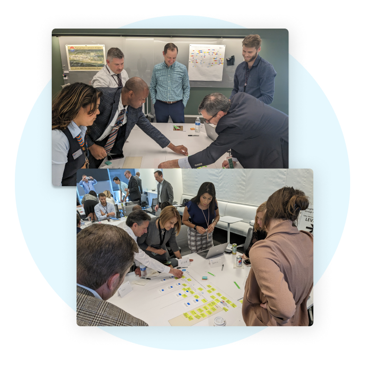
We paired site analytics and heatmap analyses with direct user feedback. The latter featured distributed surveys of more than 1,200 users, along with 2 days of in-person workshops. Led by Aten staff, in-person workshops drew insights from 40 users and stakeholders, from frequent business flyers, to local parents, procurement staff, information desk attendants, and more. This in-depth discovery gave Aten a vision of users’ needs to guide the new information architecture.
Refocus on Revenue Drivers
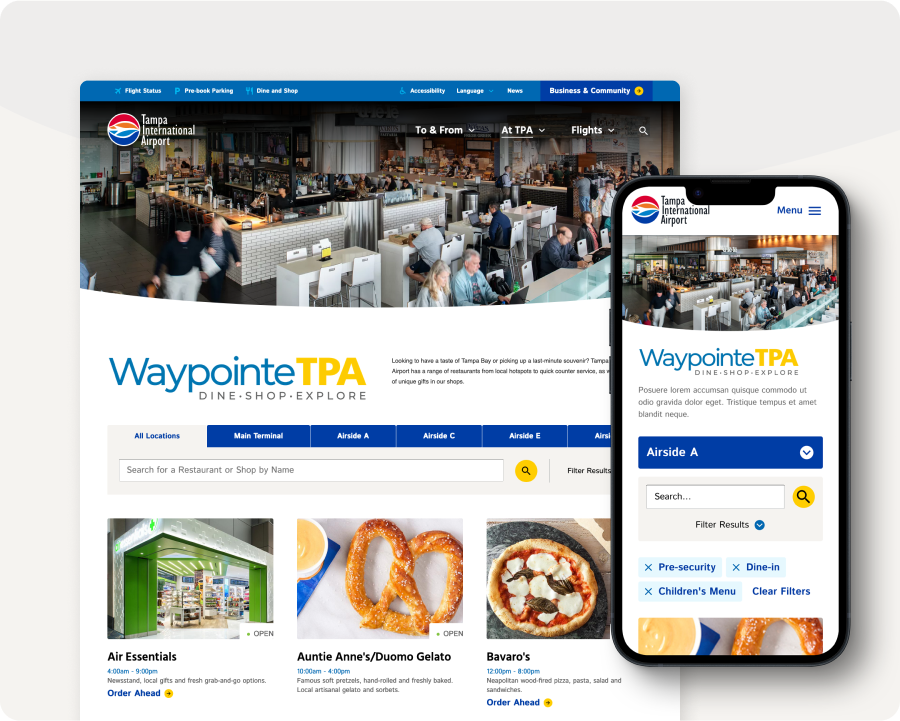
TPA’s parking and online food-ordering services are key revenue drivers. However, the airport’s previous website included these tools as added-on functionality, rather than a seamlessly embedded and designed aspect of the user experience.
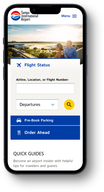
Along with flight-status information, the main navigation bar, airport map, and homepage now offer visitors the opportunity to pre-book parking and order ahead from restaurants. These revenue streams are further baked into the design, showcasing key calls to action throughout the passenger journey from parking availability, to restaurant descriptions, dynamically displayed retail hours, terminal maps, and ordering capabilities.
Refreshed, On-Brand Design
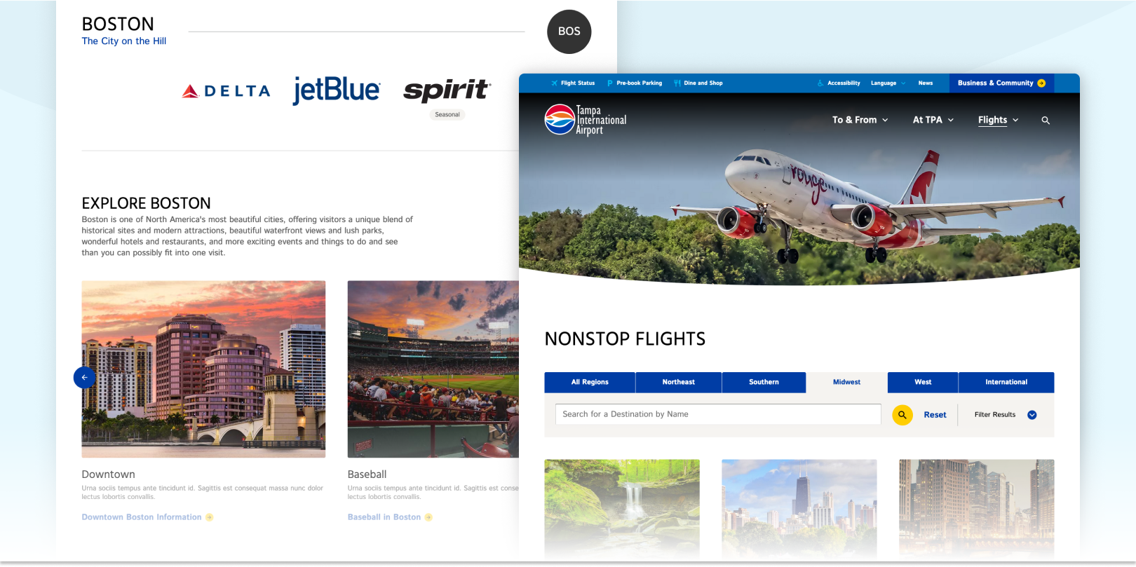
TPA travelers were accustomed to a seamless, easy-to-navigate airport experience that met all their needs. The airport’s online experience, however, didn’t offer the same ease of use nor friendly and open aesthetic. Plus, it didn’t effectively address the needs of both travelers and business/partners.
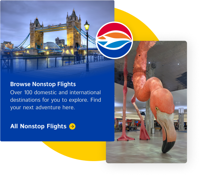
The site uses two-tiered navigation—one for travelers and one for businesses/partners—that meets users where they are in their airport journeys. Despite users’ varied needs, the site focuses on simplicity and usability, employing the airport’s bright, open, and beachy aesthetic (meet their infamous 21-foot Flamingo, Phoebe), not to mention the same iconography employed in its wayfinding signage.
Drupal Customizations Support both Site Users and Editors
To facilitate airport navigation and enhance visibility for retailers, restaurants, and airlines, we crafted a custom, interactive and mobile-friendly airport map that pulls in live data regarding restaurant and shop hours and location, etc. Aten developers built the map with future airport changes in mind, making the map fully editable by web content managers.
We also created a brand new flight status application using a custom Drupal API that aggregates TPA flight data and displays it using React. Because 70% of TampaAirport.com traffic is on mobile, we built the app to work seamlessly on any device. Finally, in order to streamline the content editing process for the TPA marketing staff, we implemented Mercury Editor, our drag-and-drop Drupal publishing solution onto the new site.
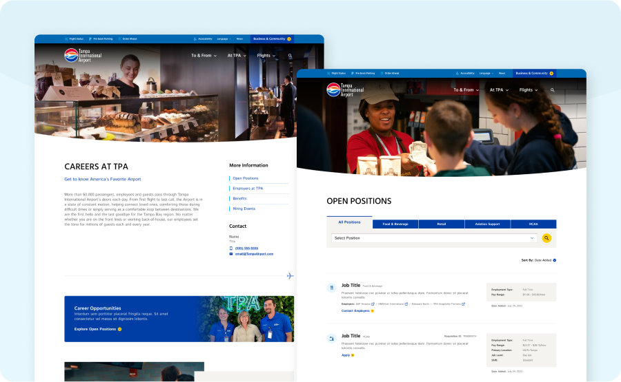
Communal Career Board
Aten morphed multiple career-related pages on TPA’s former website into a single experience. The new career board allows job seekers to filter by positions, employers, and benefits to find opportunities working for retailers, restaurants, parking facilities, security, and airport operations.
Outcomes of the Redesign
Due to the great collaboration between the Aten and TPA teams, the website design earned a 2024 silver w3 award and better served both its users and TPA’s business goals. The new website saw a vast improvement in bounce rates, more revenue from pre-paid parking and concessions, and more interaction with the custom airport map we built.
Total users increase +25%
Bounce rate decrease -22%
Map users increase +40%
Map bounce rate decrease -74%
Total revenue from the website increase +25%
Comparing one year of data from the new site vs. the old site since tampaairport.com launch
Is your website pushing your organization's goals and revenue drivers forward while also supporting its users' needs?