Smithsonian National Museum of Natural History Q’rius Exhibit App

Q?rius (pronounced “curious”) is a 21st-century evolution of traditional look-don’t-touch museums.
The interactive and experimental learning environment, formally dubbed Q?rius: The Coralyn W. Whitney Science Education Center, is housed within the Smithsonian’s National Museum of Natural History. It houses more than 6,000 unique assets that are literally within visitors’ reach. Featuring hands-on activities and exploration, Q?rius tempts visitors to unleash their curiosity.
Due to COVID-related concerns and visitors’ evolving info-consumption preferences, Q?rius hoped to transform the center’s outdated touchscreen experiences into forward-thinking and COVID-conscious learning encounters. Q?rius envisioned a user journey guided by visitors’ personal devices (i.e., phones or tablets) that enabled people to interact with its physical objects and dive deeper with relevant digital content.
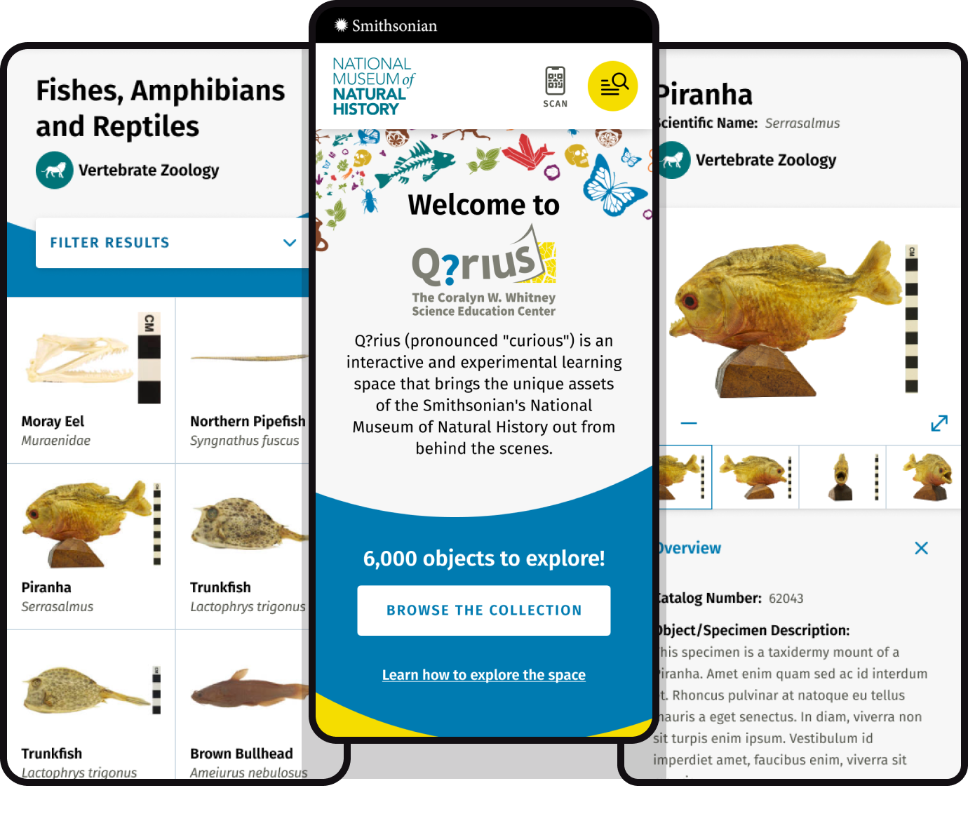
Aten devised a mobile-first web application that allows visitors to peruse museum objects in person and then scan an object-associated QR code to access additional online content. It includes not only images and text but also access to related collection objects and a search function connecting curious users to more content. Featuring a simple yet visually rich design, the app ties to existing museum design elements, creating a digital extension of the iconic museum experience.
Key Challenges
- Functionality was key, as Q?rius wanted to promote curiosity-inspired actions such as scanning, browsing, and searching. Stakeholders also hoped the design would visually link to the physical space via stunning but simple imagery and text—as opposed to an overcomplicated design.
- Crafting the information-dense app required transferring and reorganizing information within the Smithsonian’s existing API (application programming interface) into a format consistent with the new app design.
- The Smithsonian’s data and objects are literally priceless, which means gaining access to them typically involves jumping through a few hoops—or 20. Additionally, the organization has strict brand guidelines to follow.
Key Solutions
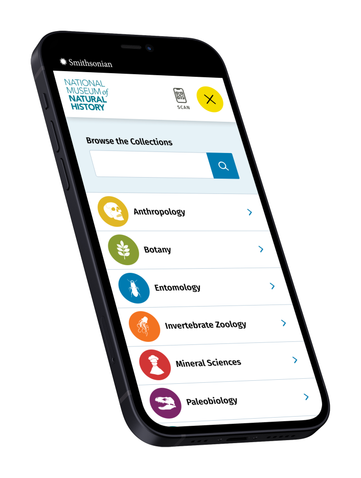
- The resulting app design repeated recognizable elements from the museum space. Full-color object images and color-coded icons representing the various collections drew the eye and aided navigation. A Solr-based search feature and collections browser propelled visitors along their own curiosity-driven journey.
- Smithsonian reps needed guidance to rework some of the information architecture, which would ultimately allow visitors to consume the collections-based content in a logical manner. Aten designers and developers also facilitated data cleanup and reorganization with Q?rius staff and completed significant user testing and verification to ensure quality delivery.
- Given the Smithsonian’s complex security system, Aten staff went through rigorous verification steps—e.g., fingerprinting, security clearances, etc.—to access the data for app-creation purposes. Additionally, the design team not only worked within existing brand guidelines but also developed a style guide to aid any future iterations of the app.
Mobile-First Design
To curate a mobile-first design that linked the physical museum space with the digital experience, Aten first level set with Q?rius stakeholders via a series of strategy and exploration discussions. The team presented several type options and graphic styles to help establish a visual language to be used in the design. Designers then paired these selections with the existing brand color palette, museum graphics, and icons to craft a cohesive experience between the two mediums.

QR Code Variations
Housing a QR code reader solely within a web app opens a can of permissions worms that can limit usability. Thus, Aten ensured the code reader was accessible via camera apps (which automatically recognize QR codes), third-party QR code readers (which visitors could download if their phones failed to read via the camera), and an option within the web app (which may or may not require a little help from trained museum staff).

Staff Education and Training
In addition to understanding how to navigate the app for administrative purposes, Q?rius staff also need to be able to assist museum visitors with QR code troubleshooting. While the vast majority of visitors could read the codes by simply pointing their smartphone cameras at them, staff needed to know how to navigate issues related to permissions on users’ devices. To assist with this, Aten provided two training sessions—one for the digitally inclined and one for less technical staff.
Want to connect users to your content with an app?
Get in touch with us to see how our team of strategists, designers, and developers can create a user-focused app to build your brand and tell your story.
