Drupal Design System Smithsonian Institution
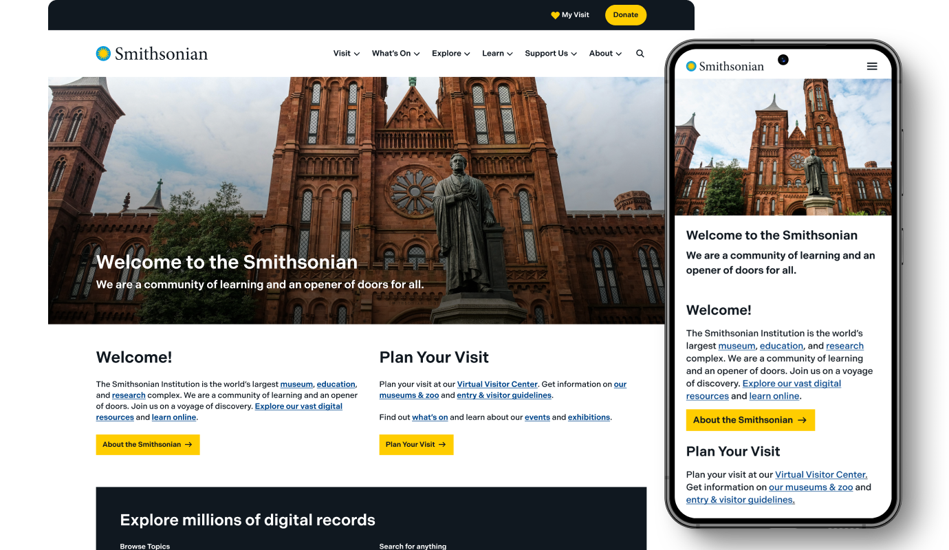
The Smithsonian Institution was established by an act of the U.S. Congress in 1846 as an independent federal trust entity. It is an American beacon of knowledge, culture, and history with 21 museums, 21 libraries, many education and research centers, and the National Zoo.
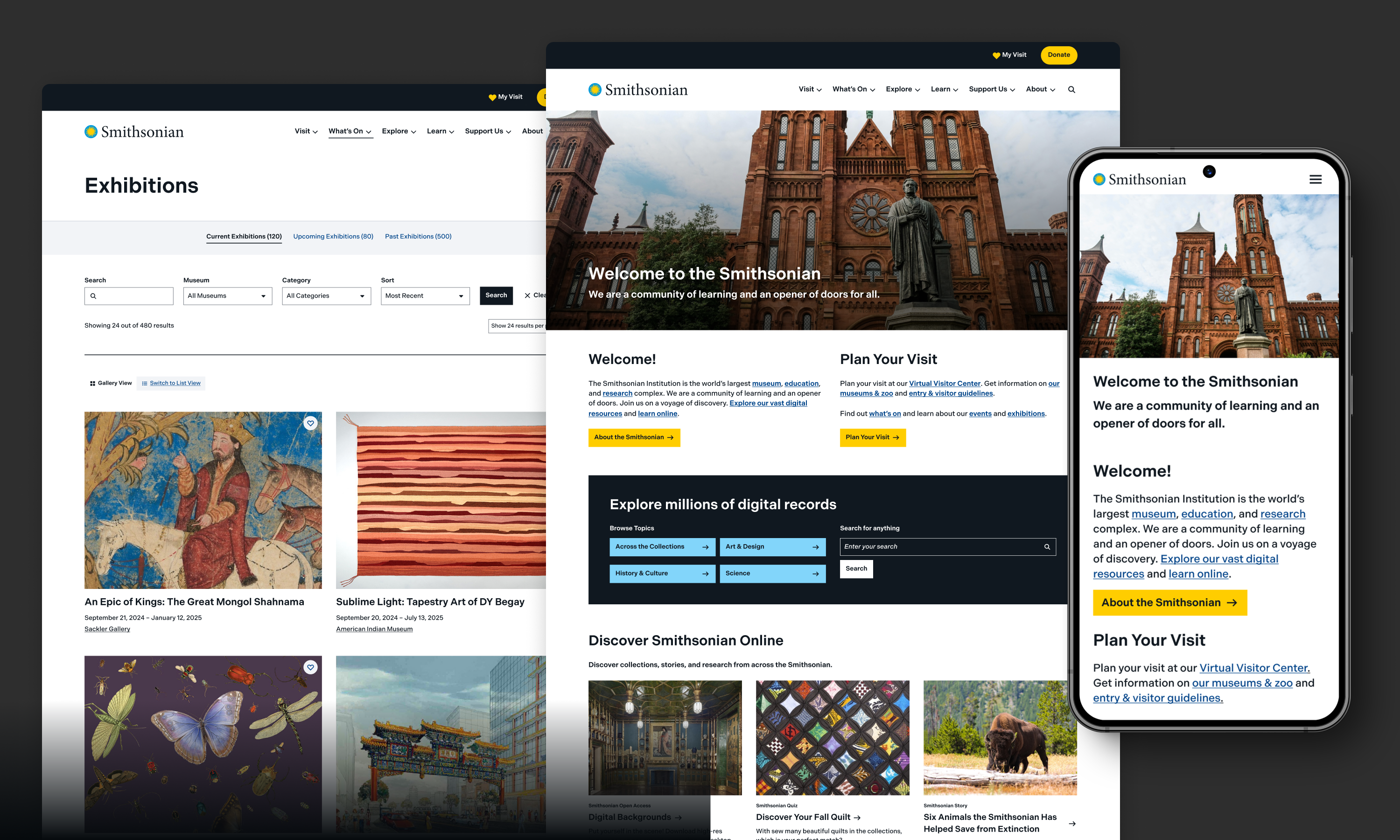
With well over 100 websites living under their umbrella, they needed to audit and enhance the design system for their flagship site, SI.edu which could then be translated and adapted for other sites within the web distribution. This would require robust documentation for future adaptations across their ecosystem.

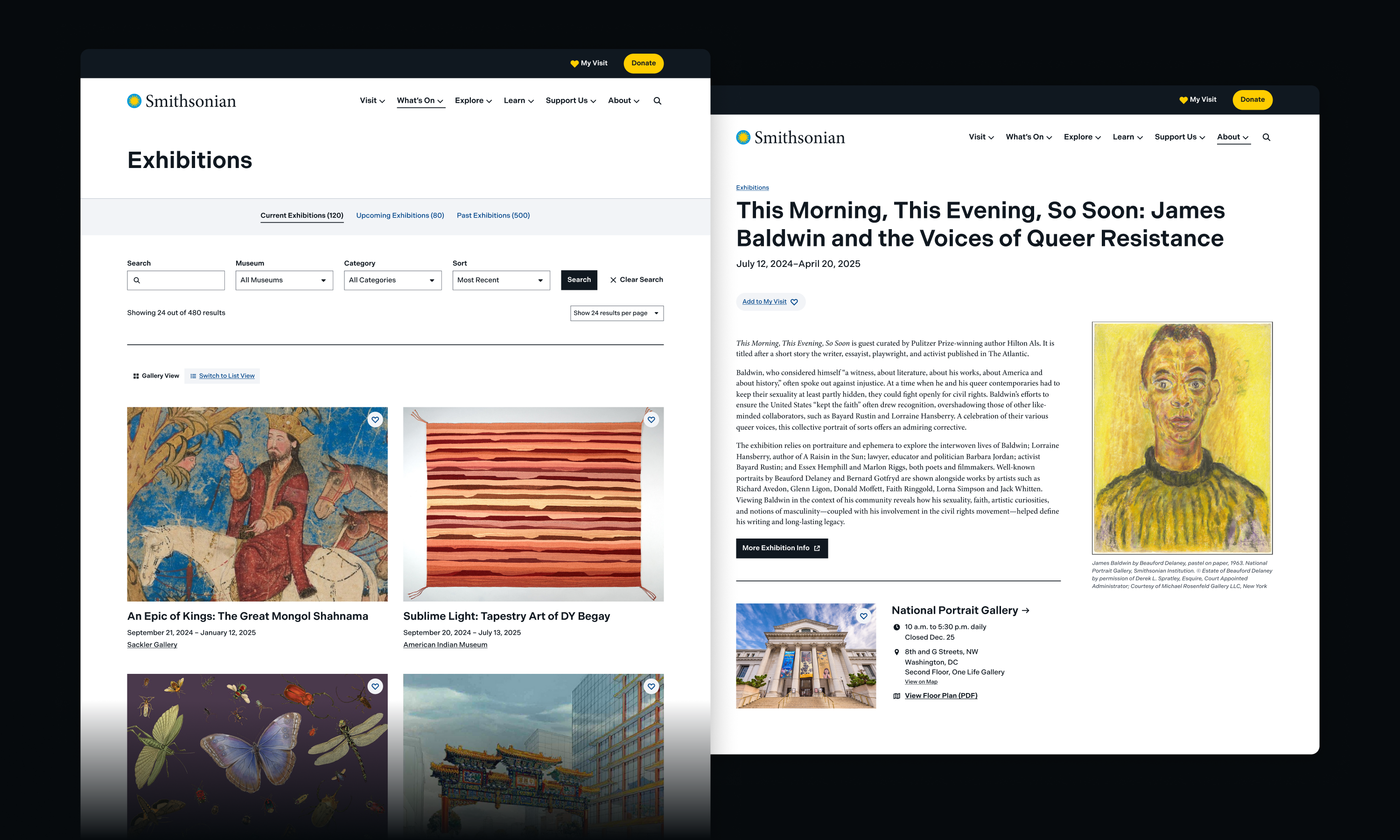
Visual goals to accommodate the Smithsonian ecosystem
From our initial design exploration meetings with the client team, we learned that the design should stand out and remain true to the established brand but should be simple and understated enough to scale up and apply to many different use cases and sub-brands across the Smithsonian brand landscape.
We landed on a minimal color palette focusing on black and white with splashes of blue and yellow. Together, we selected Indivisible, a sans serif body font to complement Minion Pro, the serif font used in the Smithsonian logo and headings.
For their respective sites, Smithsonian’s various entities can select their own fonts and colors to resonate with their unique brands while keeping the structure of components in place.
Design system documentation in Storybook
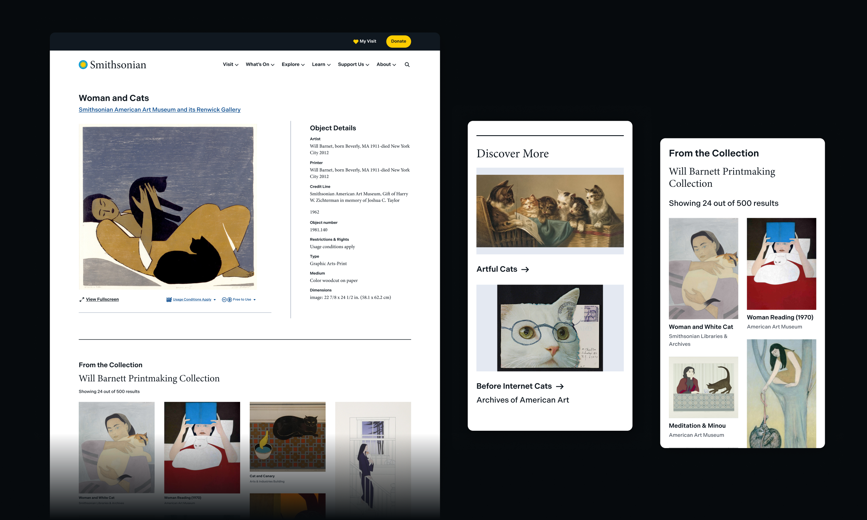
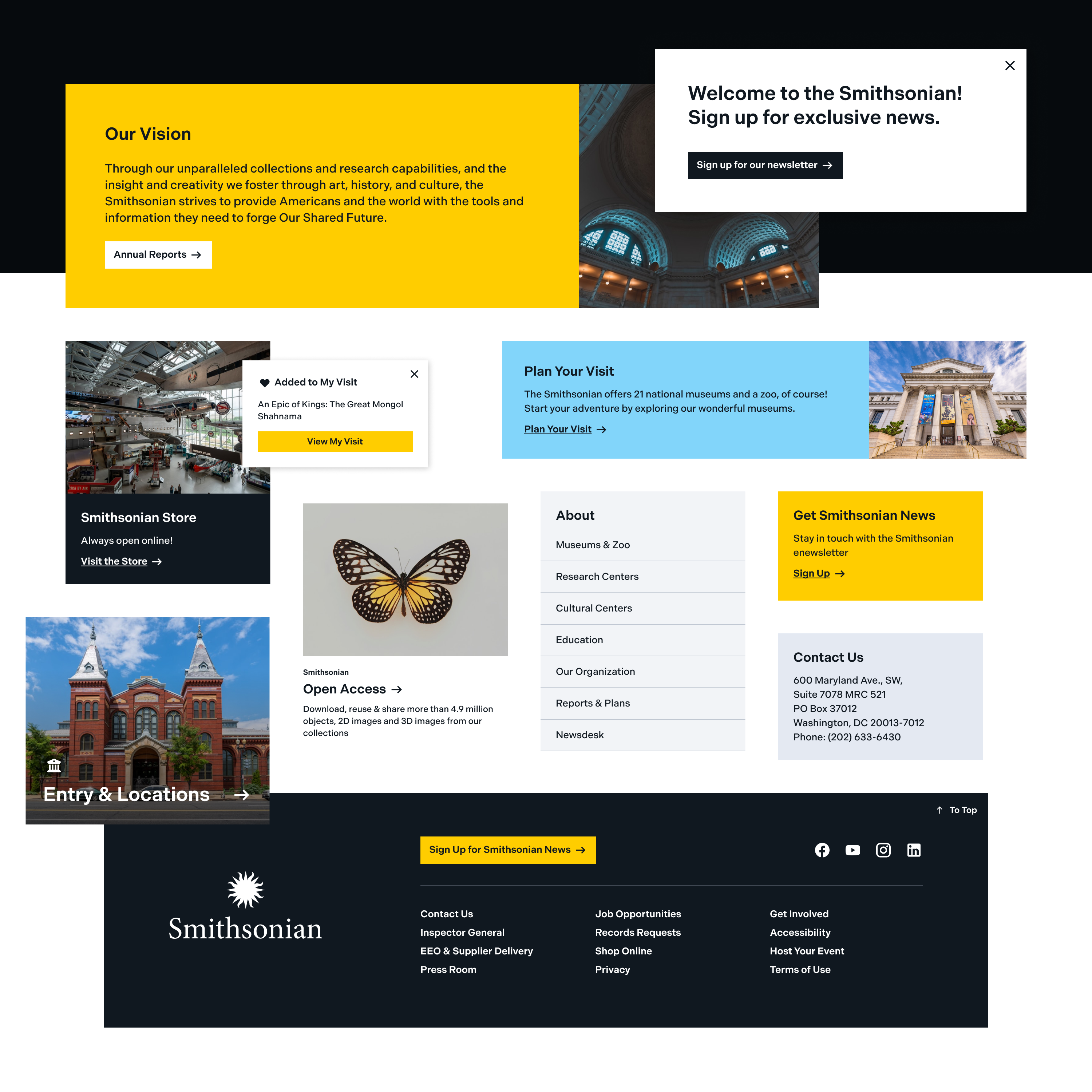
Once the design system was approved in Figma, our developers took the newly created components and translated them into Storybook to create an interactive, visual documentation of the updated design system. Storybook is a dynamic software that allows us to demonstrate how each component should look and function. Building on that foundation, our team transformed the Storybook components into Single Directory Components (SDC) within a new Drupal theme that will serve as the baseline theme for Smithsonian Drupal websites.
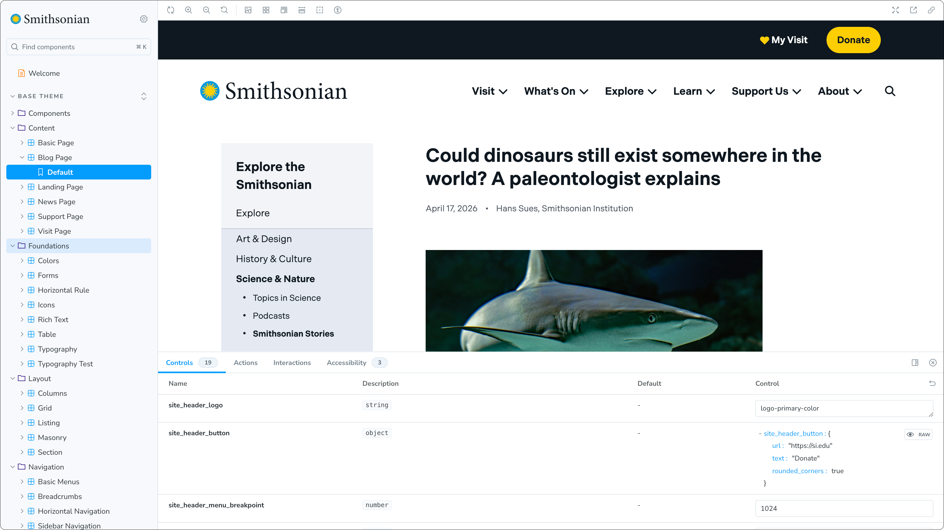
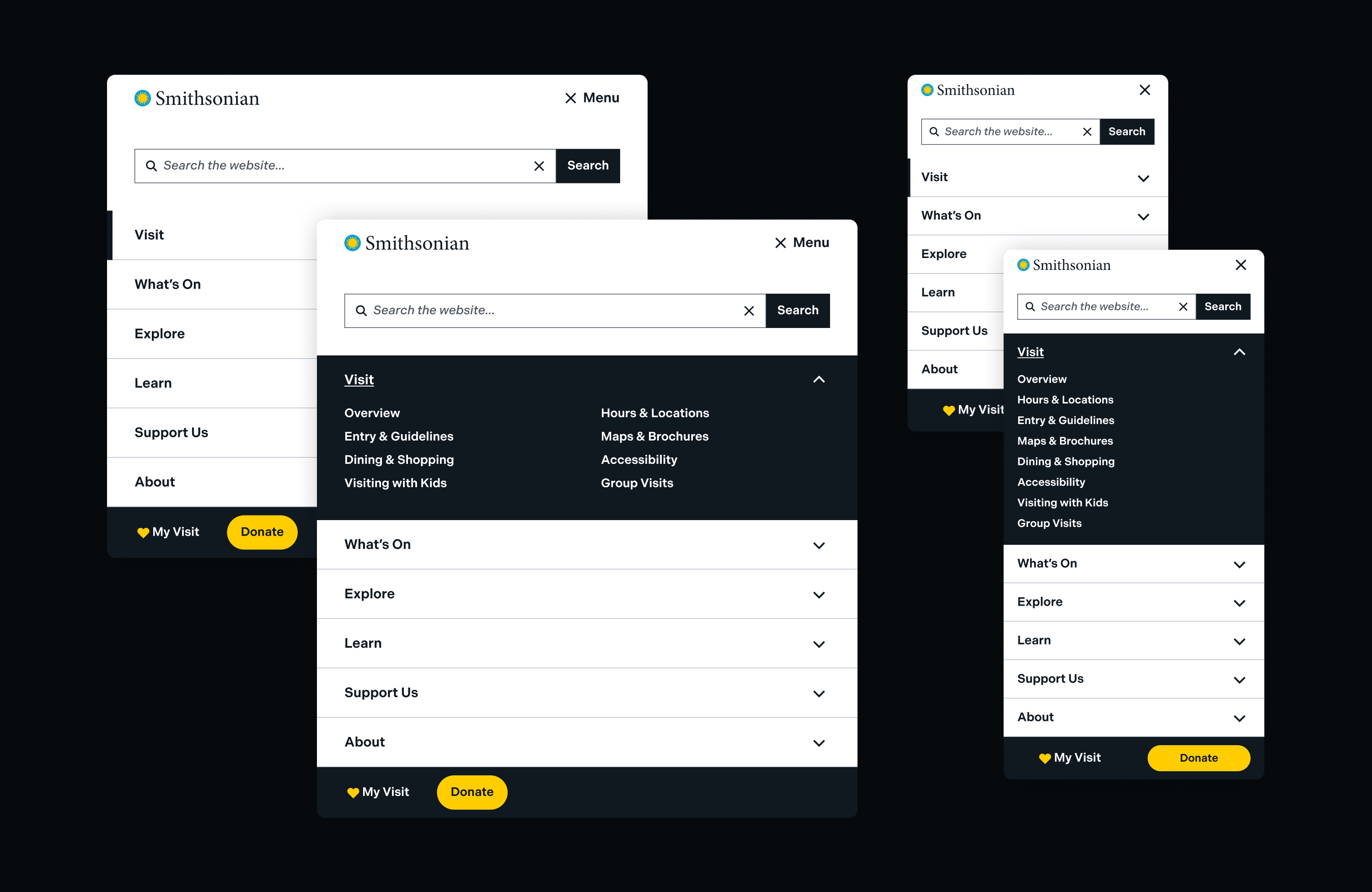
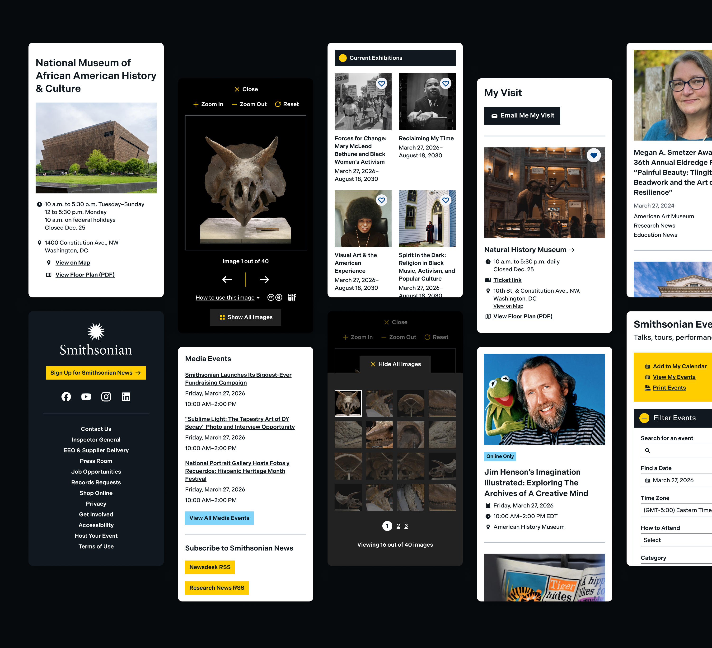
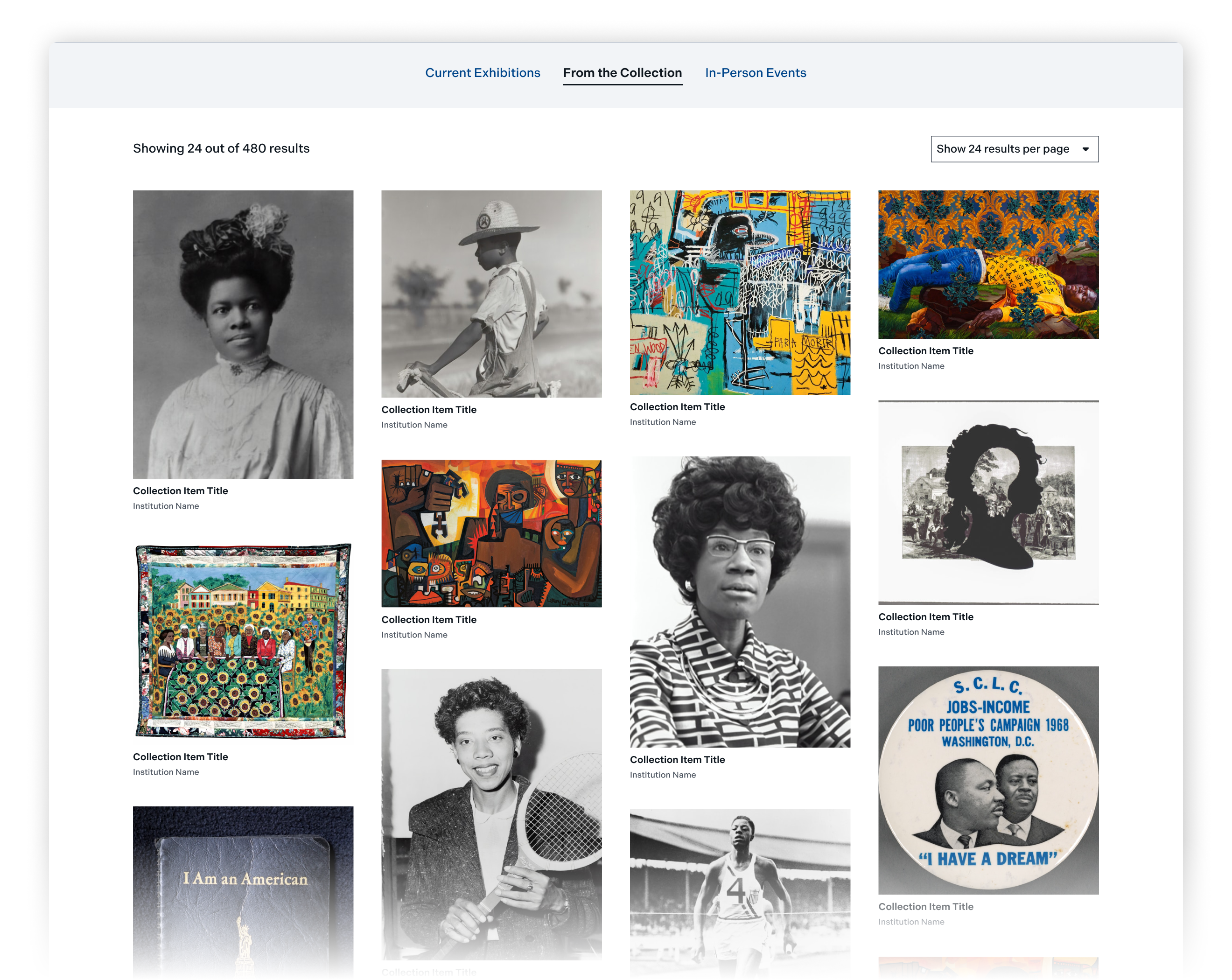
We designed over 70 components, each accompanied by developer notes, accessibility considerations, image size requirements, and detailed usage guidelines including recommended placement within content and body copy best practices. Finally, we developed specific examples showcasing how different page types (such as blog posts, news items, and support pages) could be created leveraging these new components, providing robust documentation for future users.
Accessible, Secure, and Upgraded
With the new design system in Storybook, the next step was to replace the Smithsonian’s Drupal 7 theme, which had reached end of life in January 2025, with a brand-new Drupal 10 theme.
During the design phase, our teams reviewed each component to ensure they were compliant with WCAG 2.2 AA standards, taking into consideration color contrast, semantic structures, and interactive elements. The new scalable and accessible baseline theme can be customized and implemented across their ecosystem in conjunction with the new design system.
Do you want to align the design structure of your web distribution while allowing for flexibility to adapt to various use cases?