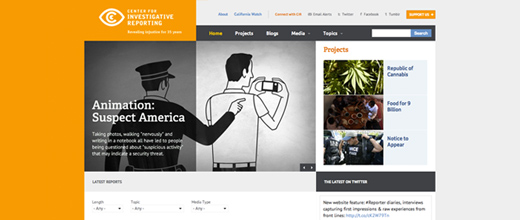
Yesterday we launched cironline.org, along with the incredible team at the Center for Investigative Reporting. The website looks fantastic (if we do say so ourselves) — on your phone and tablet, as well as your computer.
The new information architecture, design, and features deliver on a broad range of communication goals, including:
- Supporting long-form video with convenient functionality for saving your place (even between devices)
- Tools for sorting and filtering content by topic, media, and length
- Sensible categorization -- users can find content by topic, media-type, or project
- Fully-featured project pages, allowing CIR to bring special focus to its curated collections of reporting on a massive range of topics
We're thrilled with the outcome.
You can learn more about the project by reading CIR's blog post on the redesign, or by just visiting the website directly at cironline.org.
Read This Next
- Website Design Audits: The Secret to Sustained Impact
- Celebrating Science: A New Logo & Identity for Sanford Lab’s Annual Science Festival
- 6 UX Exercises to Keep Users at the Center of your Website Redesign
- 6 Guidelines for Accessible Website Design
- Design and User Strategy Workshops Lead to Peak Performance for the City of Boulder’s New Site
Skip to footer
Comments
