Skip to main content
Menu
About
Services
Articles
Webinars
Work
Contact
Open search form
Keyword
Tampa International Airport
See the Work
Website Design Audits: The Secret to Sustained Impact
Design
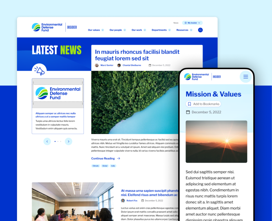
Environmental Defense Fund
See the Work
City of Oxnard, California
See the Work
Sanford Underground Research Facility
See the Work
Sanford Underground Research Facility
See the Work
Celebrating Science: A New Logo & Identity for Sanford Lab’s Annual Science Festival
Design
6 UX Exercises to Keep Users at the Center of your Website Redesign
User Experience
Current page
1
Page
2
Page
3
Page
4
Page
5
Page
6
Page
7
Page
8
Page
9
…
Next page
Last page