

Ken Woodworth
We've been working for the past few months on a redesign for aashe.org and are glad to announce that the site is live and ready for the public. We're still ironing out a few kinks but I thought I would take this time to cover a bit of the process around the redesign. This project was unique in that AASHE had a development team that would be implementing the site. It was great working with Julia, Matt and the rest of the AASHE team and they did an excellent job tackling the development side of things. So with development taken care of, we were able to focus solely on design and front-end interaction.
Before I get too far in covering the details of the redesign, a little background on AASHE would probably help. From AASHE's About page;
"AASHE is an association of colleges and universities that are working to create a sustainable future. Our mission is to empower higher education to lead the sustainability transformation. We do this by providing resources, professional development, and a network of support to enable institutions of higher education to model and advance sustainability in everything they do, from governance and operations to education and research."
One thing that stands out is the part about providing resources, professional development, and a network of support. The design needed to facilitate this goal with a clean, well-structured interface and navigation that enables users to quickly find and filter the content they're looking for. Alright, enough talk. Let's dive in to the design.
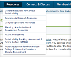 First, there is a **LOT** of content on the AASHE website. Providing users with simple and unobtrusive methods for browsing content is key to the success of a website. We often talk about progressive enhancement and best practices for creating websites that work without javascript but get better when it's available. In this case, we created a simple navigation bar at the top of the page and a more extensive site map at the bottom. With javascript, we pull the sub-pages of the site map to build drop-down navigation to the primary navigation, allowing users to quickly browse to other pages in the site.
 Another method we used frequently throughout the site adds javascript-powered tabs to certain groups of content. Users without javascript see well-structured content that can be read normally while users with Javascript enabled get an added interface for quickly switching between blocks of content, and sometimes sub-blocks of content.
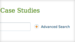 Finally, search filters can be a complex but useful way to control search results. Throughout the AASHE website we've adjusted the way search filters display by collapsing everything but the Search Terms field into an Advanced Search interface. The advanced search is there if you need it but neatly tucks away when it's not in use.
These methods all work to enhance the interface and improve navigation throughout the site, getting users to the content they're looking for without a lot of fuss. So take a minute and check out the all new aashe.org.
Read This Next
- Website Design Audits: The Secret to Sustained Impact
- Celebrating Science: A New Logo & Identity for Sanford Lab’s Annual Science Festival
- 6 UX Exercises to Keep Users at the Center of your Website Redesign
- 6 Guidelines for Accessible Website Design
- Design and User Strategy Workshops Lead to Peak Performance for the City of Boulder’s New Site