

James Nettik
In part one we looked at setting up Drupal’s Breakpoints and Picture modules in order to serve appropriately cropped images at different breakpoints. This enabled us to optimize page performance on all devices, and maintain design requirements. However, clients often request the ability to control the crop of the images. In this post we will look at the Manual Crop module, and apply it to what we set up in part one.
Installing Manual Crop
Download and install Manual Crop as well as its dependency, Libraries API. Currently, the dev release of Manual Crop (from January 26, 2015) has Media module support and better documentation for installation. I would recommend using that over the recommended release (dated June 22, 2013).
Setting up the image styles
While the slogan for responsive web design has been “mobile first,” when thinking about images it’s best to think the opposite. You want to start with the largest, highest resolution image you can. Scaling down images is rarely an issue. Trying to scale up images leaves them looking pixelated and blurry.
With that in mind, what we need is to enable content creators to control the crop on the largest image style. The smaller image styles will inherit that selection before scaling down the images for smaller devices.
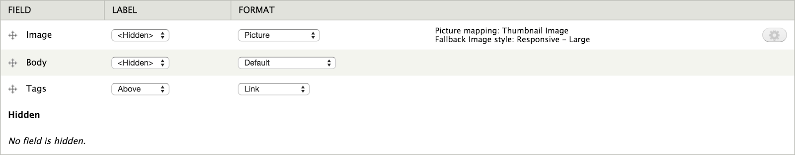
Let’s edit the Responsive - Large we created in part one. If you look at the effects list, there should be four new effects to choose from. We want to add the Manual Crop: Custom crop effect.
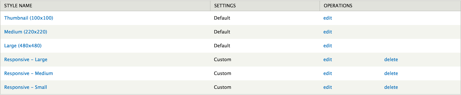
It’s important to mention only one Manual Crop effect can be applied to each image style, and it must come first in the list. Next provide the same dimensions from the Scale and crop effect that was already there.
Notice I left the Fallback cropping style field empty. We could have created an entire new Image Style, and the set our Responsive - Large style as the fallback. Instead, we’re applying the manual crop effect first, and then scaling the image down to the size we want. You end up with the same result either way, but keeping it all in one style feels more organized to me. You also don’t have to set your image fields to to use a new style.
Now we need to set the rest of the Image Styles in our stack to inherit the crop selection from Breakpoint - Large, and then scale that down. On the styles Breakpoint - Medium and Breakpoint - Small, add the effect Manual Crop: Reuse cropped style and select Breakpoint - Large from the dropdown.
Enabling cropping on your image field
The next step is to visit the image field we want our users to be able to manually crop. Expand the Manual Crop fieldset on the field settings page, and you should see the following options:
First, click Enable. The rest you can leave as their default. Now under Styles list, check the Breakpoint - Large style. Because we made sure there was a fallback style in place, we don’t need to make cropping this style required.
Next, create a new node and upload an image. You should see a Crop button available after upload.
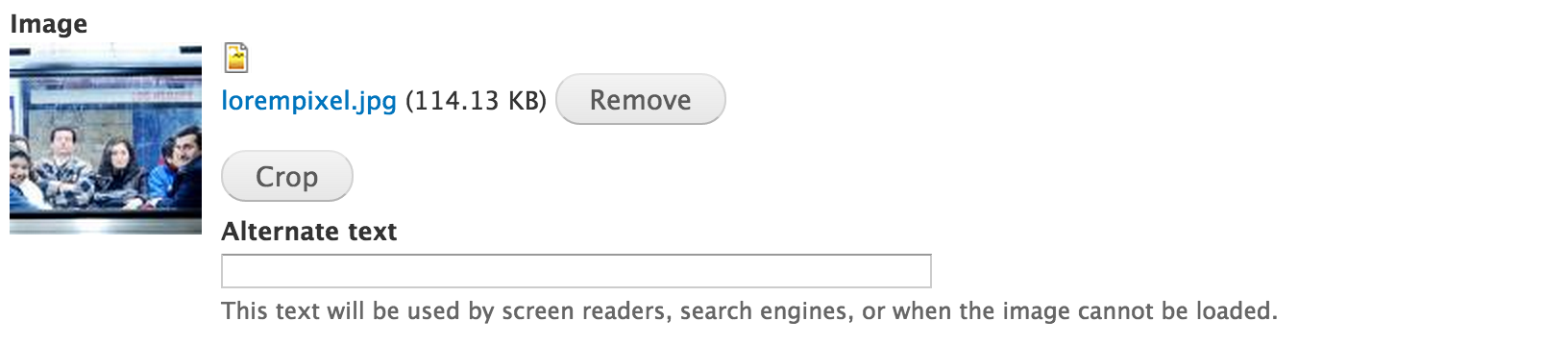
Not surprisingly, if you click that button you’ll be able to crop the photo.
Save the node and the first thing you should notice is the image cropped to the area you specified. If you look at the Network tab of your browser’s inspector, as you resize the window you should notice the other images load at their appropriate breakpoints. Depending on the changes in the images, as well as bandwidth, this may be the only way to ensure this is working.

Other use cases
In our example, we addressed the performance use case for responsive images. Content creators needed to control only one crop because we needed only scaled down photos for smaller breakpoints. What if we’d wanted to serve uniquely cropped photos to each breakpoint instead?
To allow cropping for each breakpoint, add the Manual Crop: Custom crop effect to each image style, and check those Image Styles on the field configuration page. The Crop button will change to a select list, and content creators can choose which Image Style they wish to crop.
Tip of the iceberg
We’ve covered a lot about responsive images in the last two posts, and still haven’t scratched the surface. Hopefully you now have enough understanding to start using these tools in your own projects. We’ve laid a foundation you can expand upon and really begin to create highly optimized experiences.